uni微信小程序自定义tabBar
根据自己的业务需求去进行变更导航栏的样式,当然也可以采用不删除 page.json 中的 tabBar 的方案,只是把 TabBar 当个组件,先在 App.vue 中的 onLaunch 中使用 uni.hideTabBar(OBJECT) 去隐藏 tabBar,然后再每个页面中引用 TabBar 组件,也是可以实现该功能的
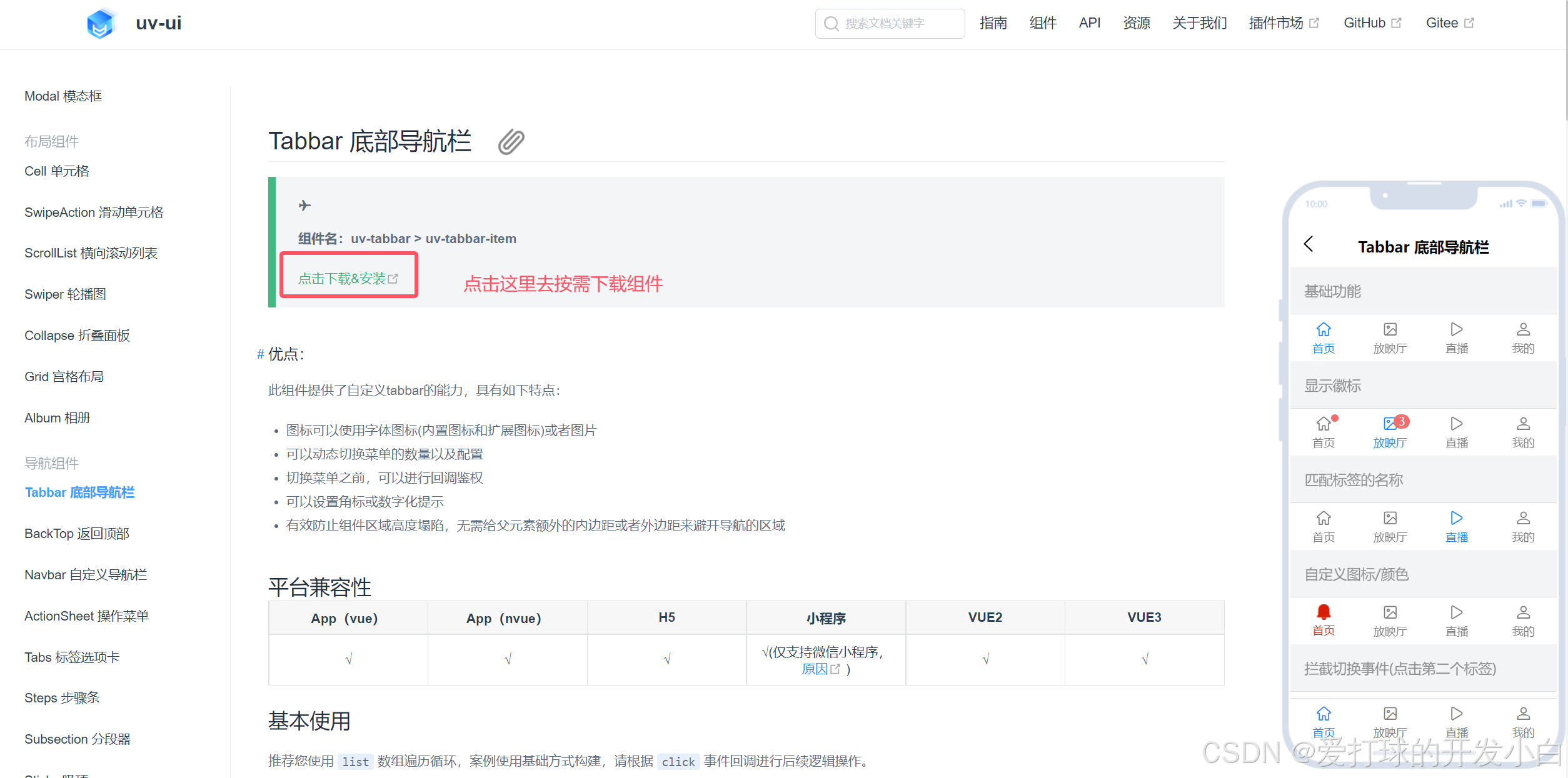
如何使用 uniapp 开发微信小程序自定义底部导航栏呢?
在我们实际的开发过程中我们总会碰到各种各样的需求,比如:小程序中根据用户角色的不同展示不同的底部导航栏
像这个功能我们要怎么实现呢?
下面让我们一起来完成一个自定义导航栏吧
需求
根据用户角色的不同给用户展示不同的底部导航栏(tabBar)
功能实现
首先我这里应用了组件库,没办法,本人有点懒
不过这个不重要实现功能最重要。
本案例使用的框架:
第一步:下载所需的组件库
由于小程序有主包大小限制,所以我们这里采用按需引入组件的方式下载,由于这个只是为了演示实现功能,所以我就不写复杂的样式了,主要就是实现功能和业务逻辑。
第二步:删除 page.json 中的 tabBar
为什么我没有像别人一样在 App.vue 中的 onLaunch 中使用 uni.hideTabBar(OBJECT) 去隐藏呢?
其实我第一遍实现这个功能的时候确实是使用这个功能去实现的,但是呢,这种方式是有问题的。
由于,我的这个项目是一进入微信小程序就会进入到 首页 ,使用上面的这个方案我发现会有一个闪屏的情况出现,出于这个考虑我就没有采用这种方案。
我这里采用的方案是,将首页、功能页、我的页面封装成组件,用户一进入其实是进入了 TabBar 页面。
然后通过 选中组件的不同去切换 页面,从而实现页面切换效果。
下面进行代码讲解
第三步:创建 TabBar 组件
代码示例
<template>
  <view class="tabbar_box">
    <uv-tabbar :value="value" :fixed="false" @change="index=>value = index" activeColor="#088A1B" inactiveColor="#8B8D8F" :safeAreaInsetBottom="false">
      <uv-tabbar-item v-for="item in tabBarList" :text="item.text" @click="clickTabBar(item.index)">
        <template v-slot:active-icon>
          <image class="icon" :src="item.activeIcon"></image>
        </template>
        <template v-slot:inactive-icon>
          <image class="icon" :src="item.inactiveIcon"></image>
        </template>
      </uv-tabbar-item>
    </uv-tabbar>
    <view class="tabbar_bottom_box"></view>
  </view>
</template>

<script>
  export default {
    name: "TabBar",
    data() {
      return {
        value: 0,
        tabBarList: [
          { text: '首页', inactiveIcon: '/static/tabbar/tabbar1.png', activeIcon: '/static/tabbar/tabbar11.png', index: 0 },
          { text: '功能', inactiveIcon: '/static/tabbar/tabbar2.png', activeIcon: '/static/tabbar/tabbar22.png', index: 1 },
          { text: '我的', inactiveIcon: '/static/tabbar/tabbar3.png', activeIcon: '/static/tabbar/tabbar33.png', index: 2 },
        ]
      };
    },
    methods: {
      clickTabBar(index) {
        this.$emit('clickTabBar', index)
      }
    }
  }
</script>

<style scoped lang="scss">
  .tabbar_box {
    position: fixed;
    bottom: 0
  }

  .icon {
    width: 54rpx;
    height: 54rpx;
  }

  .tabbar_bottom_box {
    width: 100vw;
    height: 32rpx;
    background-color: #fff;
  }
</style>
后续你可以同通过前后端约束调用接口,去替换不同的 tabBarList 值就好了,这里就不做详细的赘述了
第四步:在 TabPage 中引入这个组件
代码示例
<template>
  <view>
    <NewHomePage v-if="index == 0" :isNavBar="isNavBar"></NewHomePage>
    <IotPage v-else-if="index == 1" :isNavBar="isNavBar"></IotPage>
    <MinePage v-else></MinePage>
    <TabBar @clickTabBar="clickTabBar"></TabBar>
  </view>
</template>

<script>
  export default {
    data() {
      return {
        isNavBar: false,
        index: 0
      }
    },
    onPageScroll(e) {
      // e.scrollTop 表示当前页面滚动的距离
      // 在这里编写你的滚动相关逻辑
      if (e.scrollTop > 88) {
        this.isNavBar = true
      } else {
        this.isNavBar = false
      }
    },
    methods: {
      clickTabBar(index) {
        console.log(index)
        this.index = index
      }
    }
  }
</script>

<style scoped lang="scss">
</style>
<template>
  <view>
    <NewHomePage v-if="index == 0" :isNavBar="isNavBar"></NewHomePage>
    <IotPage v-else-if="index == 1" :isNavBar="isNavBar"></IotPage>
    <MinePage v-else></MinePage>
    <TabBar @clickTabBar="clickTabBar"></TabBar>
  </view>
</template>

<script>
  export default {
    data() {
      return {
        isNavBar: false,
        index: 0
      }
    },
    onPageScroll(e) {
      // e.scrollTop 表示当前页面滚动的距离
      // 在这里编写你的滚动相关逻辑
      if (e.scrollTop > 88) {
        this.isNavBar = true
      } else {
        this.isNavBar = false
      }
    },
    methods: {
      clickTabBar(index) {
        this.index = index
      }
    }
  }
</script>

<style scoped lang="scss">
</style>
到了这里 我们就能够实现自定义导航栏的功能了,小伙伴们可以根据自己的业务需求去进行变更导航栏的样式,当然也可以采用不删除 page.json 中的 tabBar 的方案,只是把 TabBar 当个组件,先在 App.vue 中的 onLaunch 中使用 uni.hideTabBar(OBJECT) 去隐藏 tabBar,然后再每个页面中引用 TabBar 组件,也是可以实现该功能的。实现功能的方案有许多,请小伙伴们根据项目所需自行考虑用那种方案。
结语
当你看到这里的时候,那么恭喜你,你可以在 uni 中自定义一款独属于你的导航栏了,你很优秀哦!!!
这篇文章的内容就到这里了,如果你感觉这篇文章对你有帮助的话请点赞、收藏 ➕ 关注。
感谢您的阅读,这里是开发小白,期待与您的下次相遇(●’◡’●) ~

前往低代码交流专区
更多推荐

 4
4 0
0- 0


 已为社区贡献1条内容

所有评论(0)