uniapp水波纹效果
uniapp水波纹效果。
·
非常简单的水波纹实现效果使用样式使用scss预编译:
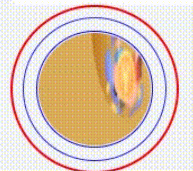
效果图如下:
标签代码如下:
<template>
	<view>
		<view class="transcribe">
			<image src="../../static/mainImges/invite.png"></image>
            <!-- 下面view控制波纹的个数,波纹的个数跟动画的持续时间以及动画的延迟时间有所关联 -->
			<view style="--speed: 1;"></view>
			<view style="--speed: 2;"></view>
		</view>
	</view>
</template>
scss代码如下:
<style lang="scss" scoped>
	$big: 300rpx;
	$small: 200rpx;
	@keyframes animat {
		0%{
			width: $small;
			height: $small;
		}
		50%{
			opacity: 1;
		}
		100%{
			width: $big;
			height: $big;
			opacity: 0;
		}
	}
	.transcribe{
		box-sizing: border-box;
		width: $big;
		height: $big;
		border-radius: 50%;
		border: 2rpx red solid;
		display: flex;
		align-items: center;
		flex-wrap: wrap;
		justify-content: center;
		position: relative;
		image{
			width: $small;
			height: $small;
			border-radius: 50%;
			z-index: 100;
		}
		>view{
			box-sizing: border-box;
			position: absolute;
			width: $small;
			height: $small;
			border-radius: 50%;
			border: 2rpx solid orangered;
			z-index: 1;
			animation: animat 2s linear infinite;
			animation-delay: calc(-1s * var(--speed));
		}
	}
</style>注意事项:上方代码示例中为两个波纹数量, 每个波纹的view有个内联变量--speed它用来控制延迟, 可以看到上方代码中每个动画的持续时间是2s, 那么我们最后一个波纹它的间隔就应该是也是2s这样才会看起来流畅, 而不会出现动画执行完一次后出现停顿

为开发者提供学习成长、分享交流、生态实践、资源工具等服务,帮助开发者快速成长。
更多推荐


 1
1 0
0- 0


 已为社区贡献1条内容

所有评论(0)