uniapp圆环进度条组件
uniapp圆环进度条
·
1.progress-circle 组件代码
<template>
  <canvas :canvas-id="'progress'+id" :style="{width: sizeNum + 'px', height: sizeNum + 'px'}"></canvas>
  <slot></slot>
</template>

<script>
export default {
  props: {
	  id:{
		type: String,
	  },
    progressColor: { //进度颜色
      type: String,
      default: '#409EFF'
    },
    bgColor: {   //轨道颜色
      type: String,
      default: '#F9FAFB'
    },
    size: {   //整体大小
      type: Number,
      default: 100
    },
    strokeWidth: { //轨道宽度
      type: Number,
      default: 20
    },
    percent: {  //进度百分比
      type: Number,
      default: 0
    }
  },
  data(){
	return{
		sizeNum:this.size,  //最终的整体尺寸
		strokeWidthNum:this.strokeWidth,  //最终的轨道宽度数值
	}
  },
  mounted() {
    this.drawProgress()
  },
  methods: {
    drawProgress() {

	//尺寸与轨道宽度自适应处理
	const screenWidth = uni.getSystemInfoSync().screenWidth;
	this.sizeNum=(this.size/750)*screenWidth
	this.strokeWidthNum=(this.strokeWidth/750)*screenWidth


      const ctx = uni.createCanvasContext(`progress${this.id}`, this)
      const centerX = this.sizeNum / 2
      const centerY = this.sizeNum / 2
      const radius = (this.sizeNum - this.strokeWidthNum) / 2
      const startAngle = -Math.PI / 2
      const endAngle = startAngle + (this.percent / 100) * 2 * Math.PI
      // 绘制背景圆
      ctx.beginPath()
      ctx.arc(centerX, centerY, radius, 0, 2 * Math.PI)
      ctx.setFillStyle('#FFFFFF')
      ctx.fill()
      // 绘制轨道圆环
      ctx.beginPath()
      ctx.arc(centerX, centerY, radius, 0, 2 * Math.PI)
      ctx.setLineWidth(this.strokeWidthNum)
      ctx.setStrokeStyle(this.bgColor)
      ctx.setLineCap('round')
      ctx.stroke()
      // 绘制进度圆环
      ctx.beginPath()
      ctx.arc(centerX, centerY, radius, startAngle, endAngle)
      ctx.setLineWidth(this.strokeWidthNum)
      ctx.setStrokeStyle(this.progressColor)
      ctx.setLineCap('round')
      ctx.stroke()
      ctx.draw(true)
    }
  },
  watch: {
    percent() {
      this.drawProgress()
    }
  }
}
</script>
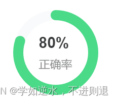
2.组件的使用
	<view class="progressBox">
					<progress-circle :percent="80" :size="168" progressColor="#4ADA88" id='a'>
						<view class="centerTxt">
							<view class="num">
								80%
							</view>
							<view class="txt">
								正确率
							</view>
						</view>
					</progress-circle>
				</view>
	.progressBox {
		position: relative;
		width: 168rpx;
		height: 168rpx;
		margin: 0 auto;
		margin-top: 33rpx;
	}

	.centerTxt {
		position: absolute;
		top: 50%;
		left: 50%;
		transform: translate(-50%, -50%);

		.num {
			font-size: 30rpx;
			font-family: Arial;
			font-weight: bold;
			color: #38393A;
		}

		.txt {
			font-size: 22rpx;
			font-family: PingFang SC;
			font-weight: 400;
			color: #8A8B8B;
			margin-top: 10rpx;
		}

	}
3.效果图


为开发者提供学习成长、分享交流、生态实践、资源工具等服务,帮助开发者快速成长。
更多推荐


 6
6 0
0- 0


 已为社区贡献4条内容

所有评论(0)