uniapp 实现可滑动顶部选项卡(菜单)
uniapp 实现可滑动顶部选项卡(菜单)
·
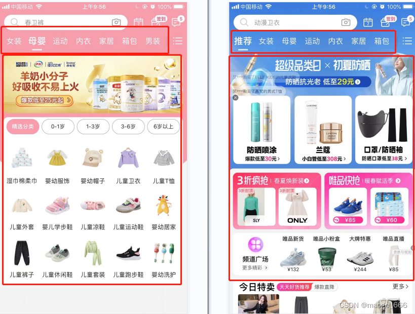
利用和实现可滑动顶部选项卡,实现的切换效果类似下图这种(顶部tab下方swiper):(代码具体效果只是实现可滑动顶部选项卡的功能,具体样式可自定义修改)
一、分步骤展示
构建顶部tab选项按钮步骤
1、使用组件布局,横向滑动需要使scroll-x=“true”
2、设置选项按钮的初始数据barNameList及当前默认第一个tab所在位置tabIndex
3、点击选项按钮获取当前下标值@click=“ontabtap”,切换状态
<scroll-view id="tab" scroll-x="true">
		<view v-for="(item,index) in barNameList" :key="item.id" class="tabName" :data-current="index" @click="ontabtap">
			<text class="tabName_text" :class="tabIndex == index?'active_text':''">{{item.name}}</text>
		</view>
</scroll-view>
<script>
	export default{
		data(){
			return{
				tabIndex:0,
				barNameList:[{
				    name: '待审核',
				    id: '0'
				}, {
				    name: '审核中',
				    id: '1'
				}, {
				    name: '已审核',
				    id: '2'
				},{
				    name: '全部',
				    id: '3'
				}]
			}
		},
		methods:{
			// scroll-view 点击 tab 时 改变下标
			ontabtap(e){
				let index = e.target.dataset.current || e.currentTarget.dataset.current;
				this.switchTab(index);
			},
			switchTab(index){
				if(this.tabIndex == index){
					return
				}
				this.tabIndex = index;
			}
		}
	}
</script>
构建下方swiper内容数据步骤
1、使用和组件布局
2、设置初始数据barContentList(假数据,项目中应该从接口中获取,此处只是为了方便看效果)
3、滑动swiper获取当前下标值@change=“tabChange”,切换状态
<swiper id="tabContent" :current="tabIndex" @change="tabChange">
	<swiper-item v-for="(item,index) in barContentList" :key="item.id">
		<view>
			<text>{{item.title}}</text>
			<text>{{item.statusLabal}}</text>
			<text>{{item.content}}</text>
		</view>
	</swiper-item>
</swiper>
<script>
	export default{
		data(){
			return{
				barContentList:[{
						id:"01",
						title:"标题1",
						status:"0",
						statusLabal:"待审核",
						content:"的声音如同风格与噶人菲亚特古"
					},
					{
						id:"02",
						title:"标题2",
						status:"1",
						statusLabal:"审核中",
						content:"大唐贵妃打瑞文u哦i"
					},
					{
						id:"03",
						title:"标题3",
						status:"2",
						statusLabal:"已审核",
						content:"大唐贵妃打瑞文u哦i"
					},{
						id:"04",
						title:"标题4",
						status:"3",
						statusLabal:"全部",
						content:"大唐贵妃打瑞文u哦i"
					}]
			}
		},
		methods:{
			// swiper滑动时改变下标
			tabChange(e){
				let index = e.target.current || e.detail.current;  // 获取到当前移动到第几个
				this.switchTab(index);
			},
			switchTab(index){
				if(this.tabIndex == index){
					return
				}
				this.tabIndex = index;
			}
		}
	}
</script>
style样式
<style>
	#tab{
		width: 100%;
		display: flex;
	}
	.tabName{
		text-align: center;
		width: 25%;
		display: inline-block;
		height: 80rpx;
		line-height: 80rpx;
		white-space: nowrap;
	}
	.tabName_text{
		display: inline-block;
		width: 100%;
		height: 100%;
	}
	.active_text{
		background-color: #FDDD9B;
		color: #FFFFFF;
	}
	#tabContent{
		width: 100%;
	}
</style>
两部分建立起效果连接的主要方法是通过点击tab或滑动swiper更改了下标值,将tabIndex值进行更新,因为二者都需要tabIndex值,所以一个改变了另一个也会随之改变,这样就实现了点击顶部tab下面内容会切换,滑动swiper顶部tab会切换二者同步的效果。
二、整体展示
下面是请求接口形式的完整代码:
<template>
	<view>
		<scroll-view id="tab" scroll-x="true">
			<view v-for="(item,index) in barNameList" :key="item.id" class="tabName" :data-current="index" @click="ontabtap">
				<text class="tabName_text" :class="tabIndex == index?'active_text':''">{{item.name}}</text>
			</view>
		</scroll-view>
		<swiper id="tabContent" :current="tabIndex" @change="tabChange">
			<swiper-item v-for="(item,index) in barContentList" :key="item.id">
				<view v-for="(listItem,listIndex) in item.data">
					<text>{{listItem.title}}</text>
					<text>{{listItem.statusLabal}}</text>
					<text>{{listItem.content}}</text>
				</view>
			</swiper-item>
		</swiper>
	</view>
</template>

<script>
	export default{
		data(){
			return{
				tabIndex:0,
				barNameList:[{
				    name: '待审核',
				    id: '0'
				}, {
				    name: '审核中',
				    id: '1'
				}, {
				    name: '已审核',
				    id: '2'
				},{
				    name: '全部',
				    id: '3'
				}],
				barContentList:[]
			}
		},
		methods:{
			onLoad() {
			    setTimeout(()=>{
			      this.barNameList.forEach((tabBar) => {
			          this.barContentList.push({
			              data: [],
			              isLoading: false,
			              refreshText: "",
			              loadingText: '加载更多...'
			          });
			      });
				  this.getList(0); // 默认初始获取第一个选项对应的数据
			    },350)
			},
			// 获取列表数据
			getList(index){
				let activeTab = this.barContentList[index];
				let list = [];
				// ......
				// 这里请求接口--> 获取数据返回值data--> list.push(data);
				// ......
				activeTab.data = activeTab.data.concat(list);
			},
			// swiper滑动时改变下标
			tabChange(e){
				let index = e.target.current || e.detail.current;  // 获取到当前移动到第几个
				this.switchTab(index);
			},
			// scroll-view 点击 tab 时 改变下标
			ontabtap(e){
				let index = e.target.dataset.current || e.currentTarget.dataset.current;
				this.switchTab(index);
			},
			switchTab(index){
				if(this.tabIndex == index){
					return
				}
				// 先清空前面访问的swiper的缓存,要不再次切换到之前访问过的tab的时候内容会显示多次
				this.barContentList[this.tabIndex].data = [];
				// 后赋值
				this.getList(index);
				this.tabIndex = index;
			}
		}
	}
</script>

<style>
	#tab{
		width: 100%;
		display: flex;
	}
	.tabName{
		text-align: center;
		width: 25%;
		display: inline-block;
		height: 80rpx;
		line-height: 80rpx;
		white-space: nowrap;
	}
	.tabName_text{
		display: inline-block;
		width: 100%;
		height: 100%;
	}
	.active_text{
		background-color: #FDDD9B;
		color: #FFFFFF;
	}
	#tabContent{
		width: 100%;
	}
</style>
可参考官网hello uniapp项目:https://hellouniapp.dcloud.net.cn/pages/template/tabbar/tabbar

为开发者提供学习成长、分享交流、生态实践、资源工具等服务,帮助开发者快速成长。
更多推荐


 1
1 0
0- 0


 已为社区贡献41条内容

所有评论(0)