【uniapp】多端(H5和微信小程序)
多端适配,H5页面和微信小程序:去除H5页面的顶部导航栏;H5样式;H5页面下载视频和PDF;H5页面手机端和pc端适配
·
目录
一、运行H5页面

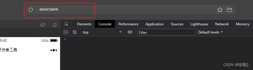
打开网页后复制网页地址
然后打开微信开发者工具,点击公众号网页版,输入地址即可看到H5页面

二、去除H5顶部导航栏
"globalStyle": {
		"navigationBarTextStyle": "black",
		"navigationBarTitleText": "uni-app",
		"navigationBarBackgroundColor": "#F8F8F8",
		"backgroundColor": "#F8F8F8",
		"app-plus": {
			"bounce": "none" //可选: 是否禁止iOS回弹和Android触顶触底的弧形阴影, 默认允许 (可配在 'globalStyle')
		},
		"mp-alipay": {
			"allowsBounceVertical": "NO"
		}, //可选: 取消支付宝和钉钉小程序的iOS回弹 (可配在 'globalStyle')
		"h5": {
			"titleNView": false // H5的顶部导航
		}
	}
三、区分H5页面和微信小程序的样式
无论是页面还是js还是css,都是一样的使用,样式如下:
APP:APP端

            /*#ifdef APP-PLUS*/
            top:0;
            /*#endif*/


            /*#ifdef APP-PLUS*/
            console.log('APP端')
            /*#endif*/


            <!-- #ifdef APP-PLUS -->
            <view> APP端 </view>
            <!-- #endif -->

H5:H5端
            /*#ifdef H5*/
            top:88rpx;
            /*#endif*/


            /*#ifdef H5*/
            console.log('H5端')
            /*#endif*/


            <!-- #ifdef H5 -->
            <view> H5端 </view>
            <!-- #endif -->

MP:小程序
            /*#ifdef MP*/
            top:0;
            /*#endif*/

            /*#ifdef MP*/
            console.log('微信小程序端')
            /*#endif*/

            <!-- #ifdef MP -->
            <view> 小程序端 </view>
            <!-- #endif -->
四、H5页面下载视频、PDF
视频:
methods:{
   //下载方法
   saveFile(url, success) {
				const dA = document.createElement("a");
				dA.download = ''; // 设置下载的文件名,默认是'下载'
				dA.href = url;
				document.body.appendChild(dA);
				dA.click();
				dA.remove(); // 下载之后把创建的元素删除
				success(); //运行回调
    },
    //点击下载按钮
    downloadMP4() {
				let that = this
				this.saveFile(that.word.fileurl_EN, () => {
					// 保存下载记录
					that.api.DownloadFile({
						FileId: that.word.Id
					}).then(res => {
						console.log(res)
					})
				});
   },
}
PDF:
methods:{
           // 下载
			async download() {
				let that = this
				// 文件
				await uni.showLoading({
					title: '加载中'
				})
				uni.openDocument({
					filePath: that.word.fileurl_EN,
					showMenu: true, //预览文件的时候右上角有三点
					success: function(res) {
						uni.hideLoading()
					},
					fail(error) {
						uni.hideLoading()
						uni.showToast({
							title: '打开失败,请刷新后稍后重新下载',
							icon: 'none'
						})
					}
				})
			},
}
五、H5页面适配
手机端、iPad、pc端
第一步:pages.json
"globalStyle": {
		"navigationBarTextStyle": "black",
		"navigationBarTitleText": "uni-app",
		"navigationBarBackgroundColor": "#F8F8F8",
		"backgroundColor": "#F8F8F8",
		"app-plus": {
			"bounce": "none" //可选: 是否禁止iOS回弹和Android触顶触底的弧形阴影, 默认允许 (可配在 'globalStyle')
		},
		"mp-alipay": {
			"allowsBounceVertical": "NO"
		}, //可选: 取消支付宝和钉钉小程序的iOS回弹 (可配在 'globalStyle')
		"h5": {
			"titleNView": false, // 去掉APP、H5的顶部导航
			"devServer": {
				"disableHostCheck": true
			// "navigationStyle": "custom"
		},
		"rpxCalcMaxDeviceWidth": 1024 // rpx 计算所支持的最大设备宽度,单位 px,默认值为 960
		// "rpxCalcBaseDeviceWidth": 750, // rpx 计算使用的基准设备宽度,设备实际宽度超出 rpx 计算所支持的最大设备宽度时将按基准宽度计算,单位 px,默认值为 375
		// "rpxCalcIncludeWidth": 1280 // rpx 计算特殊处理的值,始终按实际的设备宽度计算,单位 rpx,默认值为 750
	}
第二步:页面使用媒体查询
<style lang="scss">
    // 设置了rpxCalcMaxDeviceWidth:1024px,所以1024px以内都可以使用rpx,超出则使用px
	@media screen and (min-width:1024px) {}
</style>
如果手机端和pc端的顶部不一样,切换的时候可以使用display: none;
<template>
	<view class="TopContainer">
		<!-- 没有超过屏幕宽度768,则显示 -->
        <view class="screen1"></view>

		<!-- 超过屏幕宽度768,则显示 -->
		<view class="screen"></view>
	</view>
</template>

<style lang="scss">
	.screen1 {
		display: block;
	}

	.screen {
		display: none;
	}

	@media screen and (min-width:1024px) {

		.screen1 {
			display: none;
		}

		.screen {
			display: block;
		}
	}
</style>

为开发者提供学习成长、分享交流、生态实践、资源工具等服务,帮助开发者快速成长。
更多推荐


 2
2 0
0- 0


 已为社区贡献13条内容

所有评论(0)