
【uniapp】自定义多级折叠面板
自定义侧边栏、折叠面板的基础实现
·
原先我是在uni-collapse基础上进行修改,实现多级折叠面板。但是会出现高度不适应的问题以及若使用默认展开,因为展开的高度小程序不能动态更改,只支持手动更改。所以我就自定义了一个基础的组件
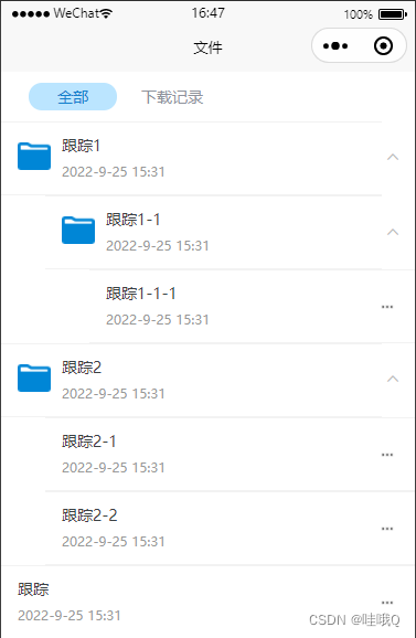
下面这张图有两个组件,上面一个是类似侧边栏的组件,下面就是类似折叠面板的组件,都是只实现了展开和关闭的功能,其他功能还没做
两个组件只不过就是内容不一样,其他都是一致的,一个嵌套自身,一个就是存放内容

components/collapse/sidebar-item.vue
<template>
	<view class="Sidebar">
		<scroll-view style="white-space: nowrap;width: 100%;height: 100%;" scroll-y="true">
			<view v-for="(item,index) in arr" :key='index'>
				<view class="allbox" @click="lock(item,index)">
					<view class="title_box">
						<slot name="title">
							<image v-if="thumb" :src="thumb" class="img"></image>
							<image v-else :src="item.img" class="img"></image>
							<view>
								<view :class="{'box':true,'title':item.show&&active===item.Id}">
									{{item.title?item.title:'标题'}}
								</view>
								<view class="Subtitle" v-if="Subtitle">
									{{item.Subtitle?item.Subtitle:'副标题'}}
								</view>
							</view>
						</slot>
					</view>
					<view v-if="item.children&&item.children.length>0" class="right right-arrow"
						:class="{ 'right-arrow-active': item.show&&active===item.Id,'Sidebar--animation': true }">
						<uni-icons :color="item.show&&active===item.Id?'#0086d6':'#bbb'" size="14" type="bottom" />
					</view>
				</view>
				<view style="padding-left: 20px;background-color: #fff;">
					<SidebarItem :arr='item.children' v-if="item.children&&active===item.Id" :thumb='thumb'
						:Subtitle='Subtitle'>
					</SidebarItem>
				</view>
			</view>
		</scroll-view>
	</view>
</template>

<script>
	/**
	 * 侧边栏
	 * @property {String} thumb 标题左侧缩略图
	 * @property {Boolean} Subtitle = [true|false] 是否显示副标题=====默认不显示
	 */
	import SidebarItem from './sidebar-item.vue'
	export default {
		name: 'Word',
		components: {
			SidebarItem
		},
		props: {
			arr: {
				type: Array,
				default: []
			},
			thumb: { //图片
				type: String,
				default: ''
			},
			Subtitle: { //副标题
				type: Boolean,
				default: false
			},
		},
		data() {
			return {
				active: null, //当前id
			};
		},
		methods: {
			// 点击
			lock(item, index) {
				item.show = true
				this.active = item.Id
			},
		}
	}
</script>

<style lang="scss">
	.Sidebar {
		.box {
			height: 40px;
			line-height: 40px;
			padding: 0px 5px 5px 10px;
			font-size: 16px;
			overflow: hidden;
			text-overflow: ellipsis; // text-overflow css3的属性,当文本溢出时,显示省略号
			display: -webkit-box;
			-webkit-line-clamp: 1; // 设置两行文字溢出
			-webkit-box-orient: vertical;
			word-break: break-all;
			word-wrap: break-word;
			white-space: pre-wrap;
		}

		.title {
			color: #0086d6;
		}

		.allbox {
			display: flex;
			justify-content: space-between;
			background-color: #fff;
			border-bottom: 1px solid #ebedec;
		}

		// 主标题
		.title_box {
			display: flex;
			padding-left: 10px;

			.img {
				width: 25px;
				height: 25px;
				margin: auto;
			}
		}

		.right {
			line-height: 40px;
			margin: auto 0;
			display: flex;
			flex-direction: row;
			align-items: center;

			&-arrow {
				/* #ifndef APP-NVUE */
				display: flex;
				box-sizing: border-box;
				/* #endif */
				align-items: center;
				justify-content: center;
				width: 20px;
				height: 20px;
				margin-right: 10px;
				transform: rotate(-90deg);

				&-active {
					transform: rotate(0deg);
				}
			}
		}

		// 副标题
		.Subtitle {
			color: #a7b1ae;
			padding: 0px 5px 5px 10px;
			font-size: 14px;
		}

		&--animation {
			transition-property: transform;
			transition-duration: 0.3s;
			transition-timing-function: ease;
		}
	}
</style>
components/collapse/collapse-item.vue
<template>
	<view class="collapse">
		<view class="allbox" @click="lock(!isOpen)">
			<view class="title_box">
				<slot name="title">
					<image v-if="thumb" :src="thumb" class="img"></image>
					<view>
						<view :class="{'box':true,'title':isOpen,'is-disabled':disabled}">
							{{title}}
						</view>
						<view class="Subtitle" v-if="Subtitle">
							{{Subtitle}}
						</view>
					</view>
				</slot>
			</view>
			<view class="right right-arrow" v-if="showArrow"
				:class="{ 'right-arrow-active': isOpen,'collapse--animation': showAnimation === true }">
				<uni-icons :color="disabled?'#ddd':'#bbb'" size="14" type="bottom" />
			</view>
		</view>
		<view class="content" v-if="isOpen">
			<slot name="content">
				内容
			</slot>
		</view>
	</view>
</template>

<script>
	/**
	 * 折叠面板
	 * @property {String} thumb 标题左侧缩略图
	 * @property {Boolean} Subtitle = [true|false] 是否显示副标题=====默认不显示
	 * @property {Boolean} showAnimation = [true|false] 开启动画
	 * @property {Boolean} showArrow = [true|false] 是否显示右侧箭头
	 * @property {Boolean} disabled = [true|false] 是否展开面板
	 *
	 */
	import SidebarItem from './sidebar-item.vue'
	export default {
		name: 'Word',
		components: {
			SidebarItem
		},
		props: {
			thumb: { //图片
				type: String,
				default: ''
			},
			title: { //标题
				type: String,
				default: ''
			},
			Subtitle: { //副标题
				type: String,
				default: ''
			},
			showArrow: { //右侧箭头
				type: Boolean,
				default: false
			},
			showAnimation: { //动画
				type: Boolean,
				default: true
			},
			// 是否禁用
			disabled: {
				type: Boolean,
				default: false
			},
		},
		data() {
			return {
				isOpen: false,
			};
		},
		methods: {
			// 点击
			lock(isOpen, type) {
				if (this.disabled) return
				this.isOpen = isOpen
			},
		}
	}
</script>

<style lang="scss">
	.collapse {
		.box {
			height: 40px;
			line-height: 40px;
			padding: 0px 5px 5px 10px;
			font-size: 16px;
			overflow: hidden;
			text-overflow: ellipsis; // text-overflow css3的属性,当文本溢出时,显示省略号
			display: -webkit-box;
			-webkit-line-clamp: 1; // 设置两行文字溢出
			-webkit-box-orient: vertical;
			word-break: break-all;
			word-wrap: break-word;
			white-space: pre-wrap;

			&.is-disabled {
				color: #999;
			}
		}

		.title {
			color: #0086d6;
		}

		.allbox {
			display: flex;
			justify-content: space-between;
			background-color: #fff;
			border-bottom: 1px solid #ebedec;
		}

		// 主标题
		.title_box {
			display: flex;
			padding-left: 10px;

			.img {
				width: 25px;
				height: 25px;
				margin: auto;
			}
		}

		.right {
			// padding: 5px 5px 5px 0;
			line-height: 40px;
			margin: auto 0;
			display: flex;
			flex-direction: row;
			align-items: center;

			&-arrow {
				/* #ifndef APP-NVUE */
				display: flex;
				box-sizing: border-box;
				/* #endif */
				align-items: center;
				justify-content: center;
				width: 20px;
				height: 20px;
				margin-right: 10px;
				transform: rotate(0deg);

				&-active {
					transform: rotate(-180deg);
				}
			}
		}

		// 副标题
		.Subtitle {
			color: #a7b1ae;
			padding: 0px 5px 5px 10px;
			font-size: 14px;
		}

		.content {
			padding: 10px 20px;
			background-color: #fff;
			border-bottom: 1px solid #ebedec;
		}

		&--animation {
			transition-property: transform;
			transition-duration: 0.3s;
			transition-timing-function: ease;
		}
	}
</style>
页面中使用
<template>
	<view class="container">
		<SidebarItem :arr="list" :Subtitle='true'>
		</SidebarItem>
		<view>--------------------------------------</view>
		<CollapseItem :thumb='thumb' title='标题' Subtitle='副标题' :showArrow='true' :showAnimation='true'>
		</CollapseItem>
	</view>
</template>

<script>
	import SidebarItem from '../../components/Sidebar/sidebar-item.vue'
	import CollapseItem from '../../components/Sidebar/collapse-item.vue'
	export default {
		components: {
			SidebarItem,
			CollapseItem
		},
		data() {
			return {
				// 折叠面板
				thumb: '../../static/logo.png',

				// 侧边栏
				list: [{
					title: '跟踪1',
					Id: 1,
					ParentId: 0,
					note: '2022-9-25 15:31',
					show: false,
					img: '../../static/a-wenjianjiawenjian.png',
					children: [{
						title: '跟踪1-1',
						Id: 3,
						ParentId: 1,
						note: '2022-9-25 15:31',
						show: false,
						img: '../../static/a-wenjianjiawenjian.png',
						children: [{
							title: '跟踪1-1-1',
							Id: 7,
							ParentId: 3,
							note: '2022-9-25 15:31',
							show: false,
						}]
					}, {
						title: '跟踪1-2',
						Id: 4,
						ParentId: 1,
						note: '2022-9-25 15:31',
						show: false,
					}]
				}, {
					title: '跟踪2',
					Id: 2,
					ParentId: 0,
					note: '2022-9-25 15:31',
					show: false,
					img: '../../static/a-wenjianjiawenjian.png',
					children: [{
						title: '跟踪2-1',
						Id: 5,
						ParentId: 2,
						note: '2022-9-25 15:31',
						show: false,
					}, {
						title: '跟踪2-2',
						Id: 6,
						ParentId: 2,
						note: '2022-9-25 15:31',
						show: false,
					}]
				}, ],
			};
		},
	}
</script>

<style>

</style>
基于 Vue 的企业级 UI 组件库和中后台系统解决方案,为数万开发者服务。
更多推荐

 4
4 0
0- 0


 已为社区贡献3条内容

所有评论(0)