关于如何在 uniapp 中自定义微信小程序的 tabBar
在 uniapp 中,自定义微信小程序底部 tabBar
·
使用 uniapp 开发小程序,和原生小程序开发是有亿点点的区别。微信开发文档中自定义tabbar 使用 uniapp 开发微信小程序,则要在此基础上进行一些改造。
微信原生如何自定义tabbar
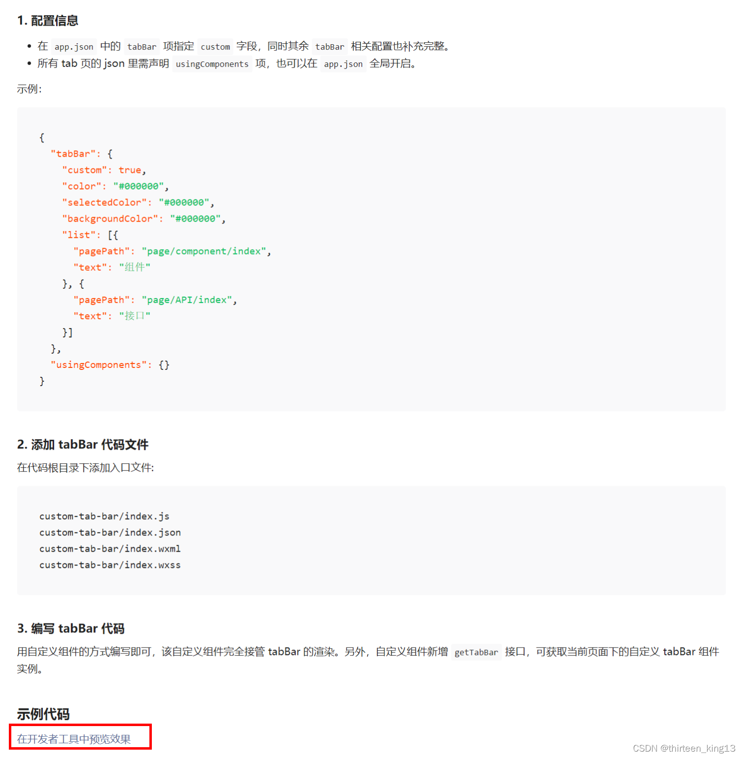
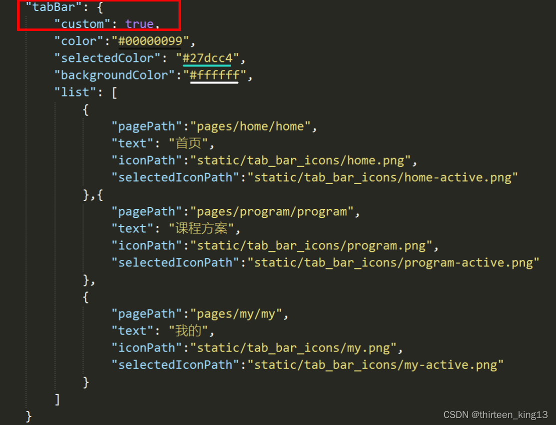
- 配置信息
在app.json中的tabBar项指定custom字段,同时其余tabBar相关配置也补充完整。
所有tab页的json里需声明usingComponents项,也可以在app.json全局开启。
示例:
{
  "tabBar": {
    "custom": true,
    "color": "#000000",
    "selectedColor": "#000000",
    "backgroundColor": "#000000",
    "list": [{
      "pagePath": "page/component/index",
      "text": "组件"
    }, {
      "pagePath": "page/API/index",
      "text": "接口"
    }]
  },
  "usingComponents": {}
}
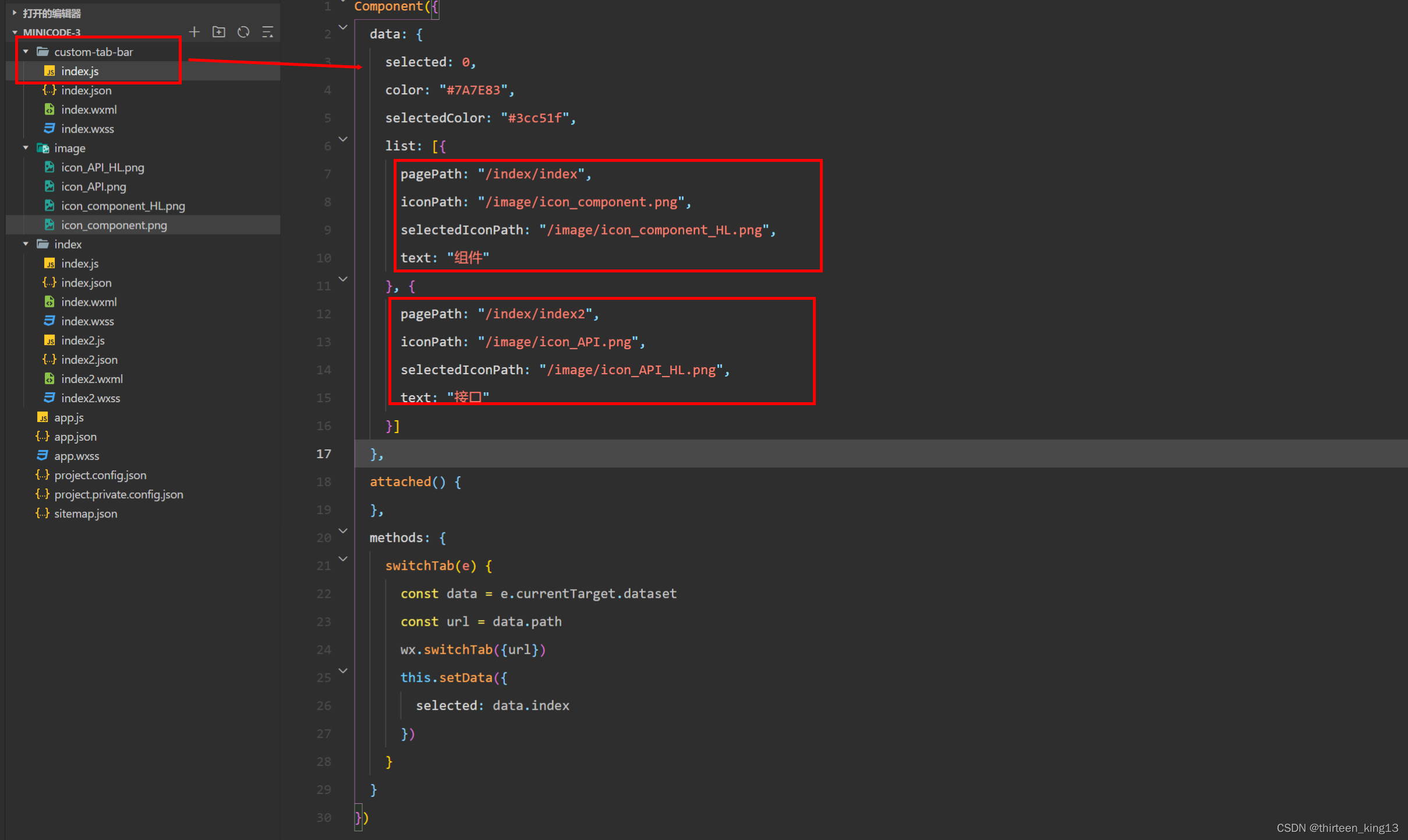
- 添加
tabBar代码文件
在代码根目录下添加入口文件,在根目录下新建 custom-tab-bar 文件,其下有
custom-tab-bar/index.js
custom-tab-bar/index.json
custom-tab-bar/index.wxml
custom-tab-bar/index.wxss

index.js
Component({
  data: {
    selected: 0,
    color: "#7A7E83",
    selectedColor: "#3cc51f",
    // 定义 tabbar list
    list: [{
      pagePath: "/home/home",
      iconPath: "/image/icon_home.png",
      selectedIconPath: "/image/icon_home_active.png",
      text: "首页"
    }, {
      pagePath: "/program/program",
      iconPath: "/image/icon_program.png",
      selectedIconPath: "/image/icon_program_active.png",
      text: "方案"
    }, {
      pagePath: "/my/my",
      iconPath: "/image/icon_my.png",
      selectedIconPath: "/image/icon_my_active.png",
      text: "我的"
    }]
  },
  attached() {
  },
  methods: {
	// 切换tabbar
    switchTab(e) {
      const data = e.currentTarget.dataset
      const url = data.path
      wx.switchTab({url})
      this.setData({
        selected: data.index
      })
    }
  }
})
index.json
{
  "component": true
}
index.wxml
<!--miniprogram/custom-tab-bar/index.wxml-->
<cover-view class="tab-bar">
  <cover-view class="tab-bar-border"></cover-view>
  <cover-view wx:for="{{list}}" wx:key="index" class="tab-bar-item" data-path="{{item.pagePath}}" data-index="{{index}}" bindtap="switchTab">
    <cover-image src="{{selected === index ? item.selectedIconPath : item.iconPath}}"></cover-image>
    <cover-view style="color: {{selected === index ? selectedColor : color}}">{{item.text}}</cover-view>
  </cover-view>
</cover-view>
index.wxss
.tab-bar {
  position: fixed;
  bottom: 0;
  left: 0;
  right: 0;
  height: 48px;
  background: white;
  display: flex;
  padding-bottom: env(safe-area-inset-bottom);
}

.tab-bar-border {
  background-color: rgba(0, 0, 0, 0.33);
  position: absolute;
  left: 0;
  top: 0;
  width: 100%;
  height: 1px;
  transform: scaleY(0.5);
}

.tab-bar-item {
  flex: 1;
  text-align: center;
  display: flex;
  justify-content: center;
  align-items: center;
  flex-direction: column;
}

.tab-bar-item cover-image {
  width: 27px;
  height: 27px;
}

.tab-bar-item cover-view {
  font-size: 10px;
}
- 编写 tabBar 代码
用自定义组件的方式编写即可,该自定义组件完全接管 tabBar 的渲染。另外,自定义组件新增 getTabBar 接口,可获取当前页面下的自定义 tabBar 组件实例。
需要在每一个tabBar的js页面添加
Component({
  pageLifetimes: {
    show() {
      if (typeof this.getTabBar === 'function' &&
        this.getTabBar()) {
        this.getTabBar().setData({
          selected: 0 // 第一个tabBar 则传索引 0 第二个tabBar 则传索引 1 以此类推
        })
      }
    }
  }
})
在 uniapp 中自定义tabbar
前两步和微信小程序中的操作一样,可以打开链接 并在开发者工具中打开。
将 custom-tab-bar 文件夹复制进自己的项目根目录中

修改 custom-tab-bar 中 index.js 文件中 list 下的内容,修改为自己项目的 tabBar 内容(如果需要修改tabBar的样式,在custom-tab-bar 中 index.wxss中修改 )。
在自己项目的 pages.json 修改 tabBar 下的 custom 为 true
在项目的 main.js 中添加
Vue.mixin({
    methods:{
        setTabBarIndex(index) {
            if (typeof this.$mp.page.getTabBar === 'function' &&
            this.$mp.page.getTabBar()) {
                this.$mp.page.getTabBar().setData({
                    selected: index
                })
            }
        }
    }
})
在各个 tabBar 页面调用
onShow() {
	this.setTabBarIndex(0); // 第一个tabBar 传入索引 0 以此类推
}
这样就实现了自定义微信小程序的 tabBar
如有错误,欢迎指正,谢谢!
以上内容仅供参考,欢迎大家讨论。

为开发者提供学习成长、分享交流、生态实践、资源工具等服务,帮助开发者快速成长。
更多推荐


 2
2 0
0- 0


 已为社区贡献9条内容

所有评论(0)