android 快速布局技巧,Android 日常开发中,两个非常实用的布局技巧
Android 布局容器、常用控件和属性,相信每个开发者都能倒背如流,开发排版 layout 时也能适当取舍。但是,本文中介绍的这两个常见的设计场景,其特殊的实现技巧可能你真的不曾用过。RelativeLayout 水平居中等分设计场景:看到这样的效果,可能你会不假思索地选择 LinearLayout 容器,同时分配 children 的 weight 属性。不错,这样实现确实很简单。但是,通常界
Android 布局容器、常用控件和属性,相信每个开发者都能倒背如流,开发排版 layout 时也能适当取舍。但是,本文中介绍的这两个常见的设计场景,其特殊的实现技巧可能你真的不曾用过。
RelativeLayout 水平居中等分
设计场景:
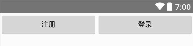
看到这样的效果,可能你会不假思索地选择 LinearLayout 容器,同时分配 children 的 weight 属性。不错,这样实现确实很简单。但是,通常界面上还有其他元素,父容器一般使用的是 RelativeLayout ,如果再选择使用一层 LinearLayout 包裹这两个 Button 的话,无疑会额外增加视图层次(View Hierarchy),加大性能渲染压力。其实,大可不必这样做,RelativeLayout 也能让两个 children 水平居中等分宽度。
实现方式如下:
android:layout_width="fill_parent"
android:layout_height="fill_parent" >
android:id="@+id/world"
android:layout_width="wrap_content"
android:layout_height="wrap_content"
android:layout_alignParentRight="true"
android:layout_alignTop="@+id/hello"
android:layout_toRightOf="@+id/view"
android:text="First" />
android:id="@+id/view"
android:layout_width="0dp"
android:layout_height="1dp"
android:layout_centerHorizontal="true" />
android:id="@+id/hello"
android:layout_width="wrap_content"
android:layout_height="wrap_content"
android:layout_alignParentLeft="true"
android:layout_toLeftOf="@+id/view"
android:text="Second" />
复制代码ScrollView 内容适配技巧
设计场景:

简单说明一下,这种界面,或者说类似的界面很常见,中间内容长度不固定,或者说相同内容在不同设备上屏幕占比不一致,导致底部操作按钮位置也不尽相同。比如,这个界面的产品重点是希望用户能够读完协议内容,然后再做出下一步操作。也就是说,你不能做成这个样子:
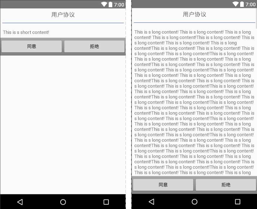
可以对比着前面那张图看一下,产品希望的实现效果是:当屏幕空间足够大(或者说中间内容较少)时,操作按钮显示在屏幕底部;当屏幕空间不足(或者说中间内容较多)时,以内容显示为主,操作按钮位于屏幕之外,向上滚动方可进入屏幕可见范围,然后进行下一步操作。
理解需求之后,我们再来看一下实现方式:
android:layout_width="match_parent"
android:layout_height="match_parent"
android:fillViewport="true">
android:layout_width="match_parent"
android:layout_height="wrap_content"
android:orientation="vertical">
android:layout_width="match_parent"
android:layout_height="wrap_content"
android:gravity="center"
android:padding="8dp"
android:text="用户协议"
android:textAppearance="?android:attr/textAppearanceMedium" />
android:layout_width="match_parent"
android:layout_height="1dp"
android:layout_marginLeft="16dp"
android:layout_marginRight="16dp"
android:layout_marginTop="8dp"
android:background="@color/colorPrimary" />
android:layout_width="match_parent"
android:layout_height="wrap_content"
android:layout_weight="1"
android:padding="16dp"
android:text="@string/content" />
android:layout_width="match_parent"
android:layout_height="wrap_content"
android:background="@android:drawable/bottom_bar"
android:gravity="center_vertical">
android:layout_width="0dp"
android:layout_height="wrap_content"
android:layout_weight="1"
android:text="同意" />
android:layout_width="0dp"
android:layout_height="wrap_content"
android:layout_weight="1"
android:text="拒绝" />
复制代码注意两个地方,第一个是设置 ScrollView 的 android:fillViewport="true" 属性,保证内容占据整个屏幕空间;第二个地方是,中间部分,也就是例子中的 TextView 巧妙运用 android:layout_weight 属性,实现高度上的自适应,保证后面的操作按钮部分能够按照我们期望的要求正确展示。
好好领会一下,相信我们一定能够有所收获。并且你会发现,实际开发过程中能够运用上述两个布局技巧的地方会有很多。当然,读完此文,如果你还用过其他比较特别的技巧的话,不妨留言交流一下。
欢迎关注我的微信公众号
安卓笔记侠:专注于 Android 开发中的原创笔记记录。

为开发者提供学习成长、分享交流、生态实践、资源工具等服务,帮助开发者快速成长。
更多推荐


 0
0 0
0- 0


 已为社区贡献1条内容

所有评论(0)