2. (css3布局)使用流式布局移动端JD首页案例
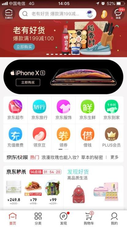
文章目录1. 案例:京东移动端首页2. 技术选型3. 搭建相关文件夹结构4. 设置视口标签以及引入初始化样式5. 常用初始化样式6. 导航布局6.1首行7. 二倍精灵图做法8. 图片格式8.1 DPG图片压缩技术8.2 webp 图片格式9. 下半部布局10. 移动端布局之流式布局总结1. 案例:京东移动端首页访问地址: m.jd.com2. 技术选型方案:采取单独制作移动页面方案技术:布局采取流
文章目录
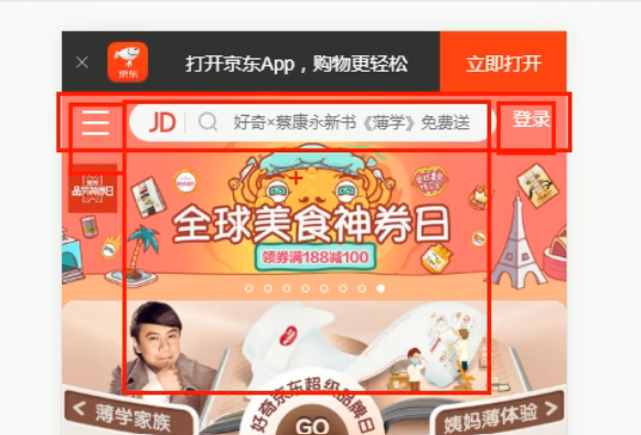
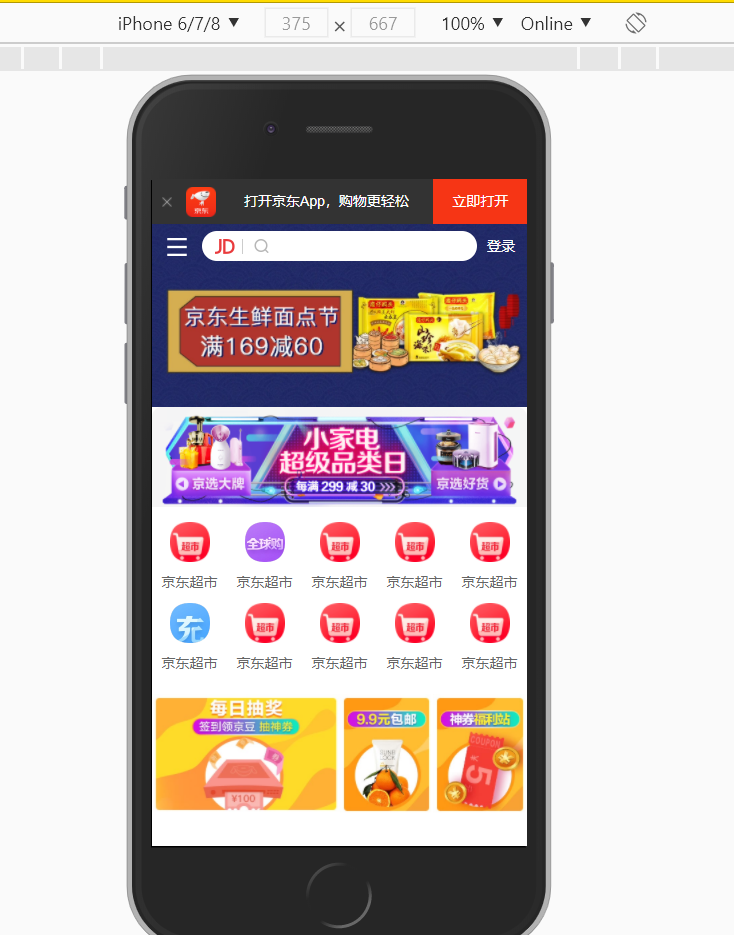
1. 案例:京东移动端首页
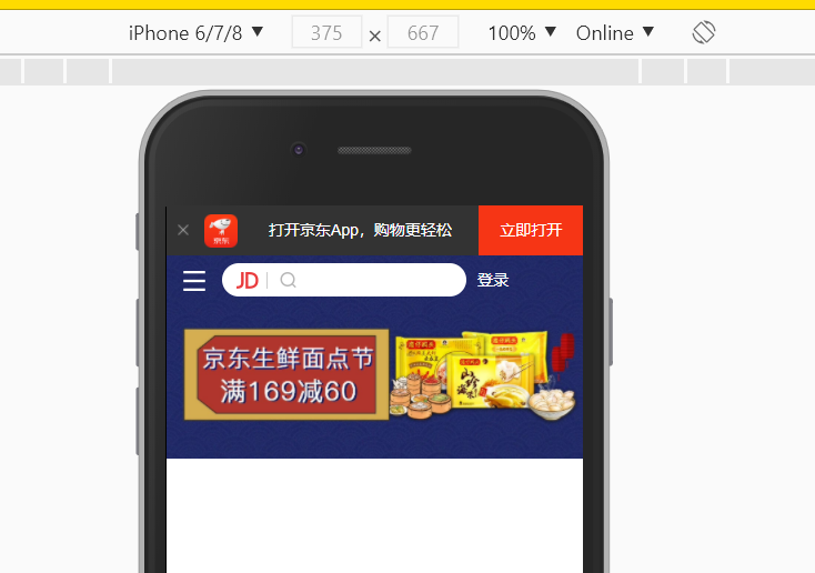
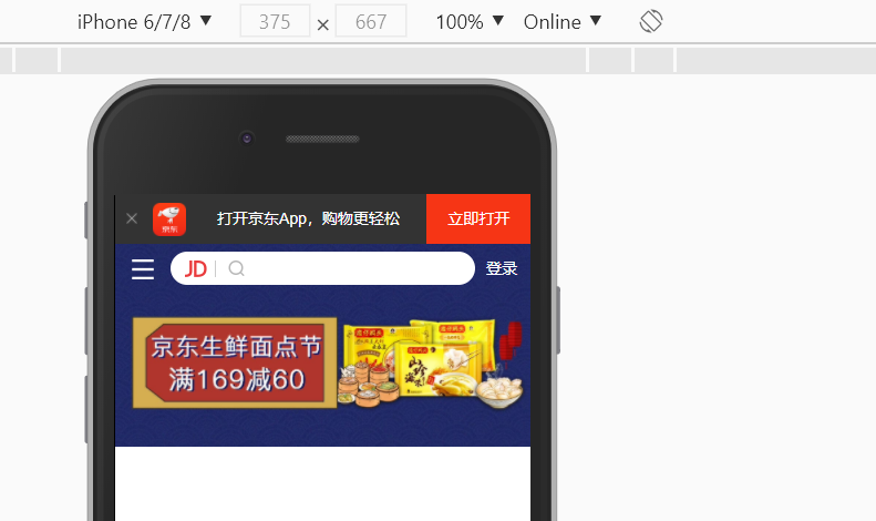
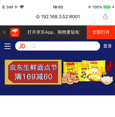
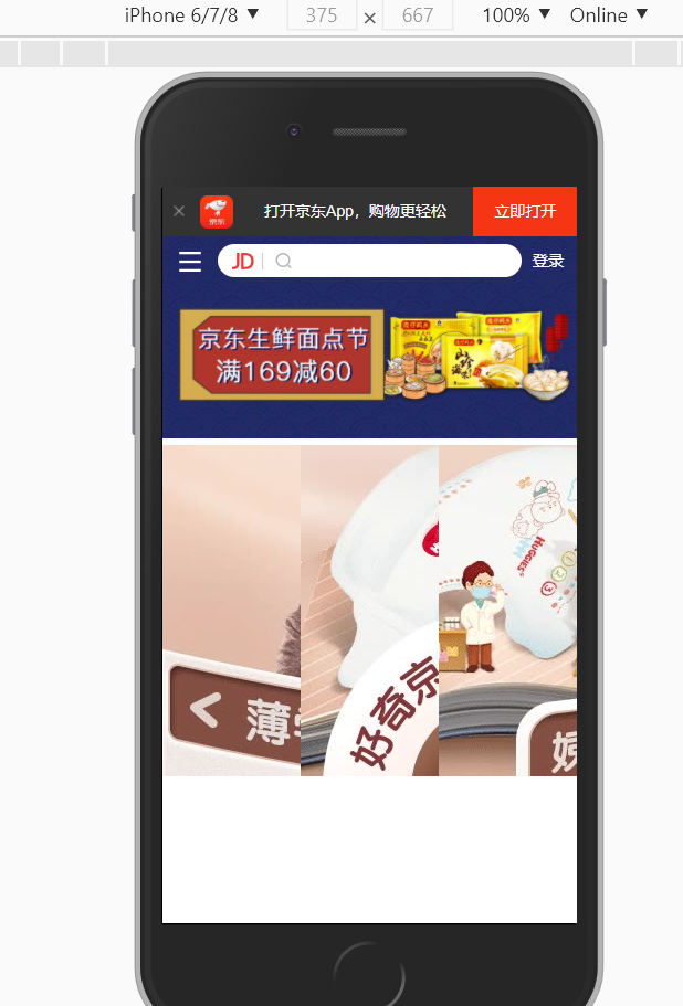
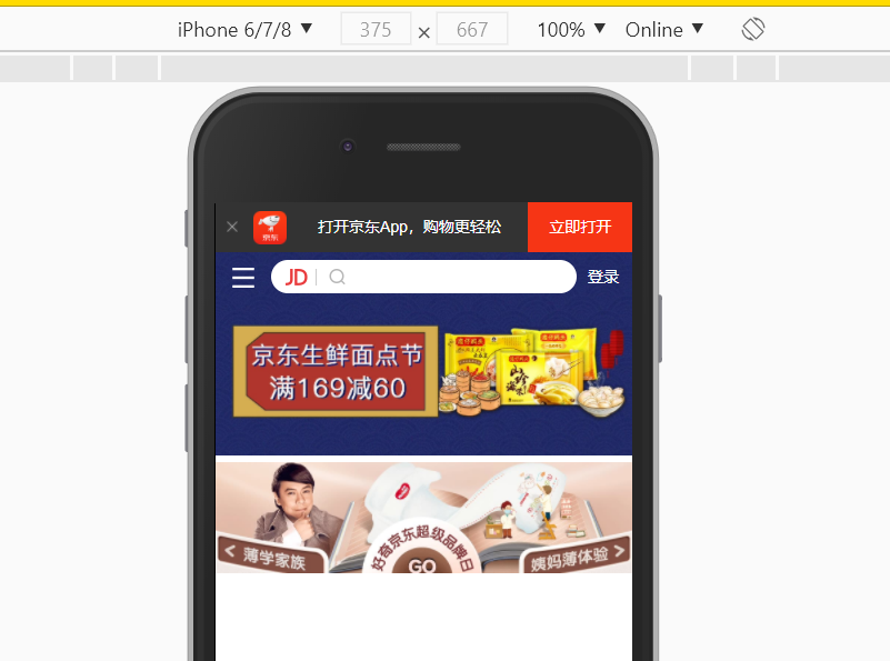
访问地址: m.jd.com
2. 技术选型
方案:采取单独制作移动页面方案
技术:布局采取流式布局
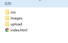
3. 搭建相关文件夹结构
images 背景图
upload 产品图
4. 设置视口标签以及引入初始化样式
<meta name="viewport" content="width=device-width, user-scalable=no,
initial-scale=1.0, maximum-scale=1.0, minimum-scale=1.0">
<link rel="stylesheet" href="css/normalize.css">
<link rel="stylesheet" href="css/index.css">
参考:https://github.com/6xiaoDi/blog–Mobile-layout/tree/a0.10
Branch: branch01commit description:a0.10(jd首页案例—设置视口标签以及引入初始化样式 及框子)
tag:a0.10
5. 常用初始化样式
通常给body设置固定尺寸,后面按照百分比设置就行了,在页面当中不能无限放大和缩小(不能让页面变形),因此需要设置最大和最小宽度尺寸。
为了适应平板及4k高清、1080p手机,把最大限制1080px,这里我们让其小一点。

min-width: 320px; 市场上大部分手机网页定的最小宽度。

body {
    width: 100%;
    min-width: 320px;
    max-width: 640px;
    /*居中对齐*/
    margin: 0 auto;
    /*字体按照jd设置*/
    font-size: 14px;
    font-family: -apple-system, Helvetica, sans-serif;
    color: #666;
    line-height: 1.5;
}

参考:https://github.com/6xiaoDi/blog–Mobile-layout/tree/a0.11
Branch: branch01commit description:a0.11(jd首页案例—设置body样式)
tag:a0.11
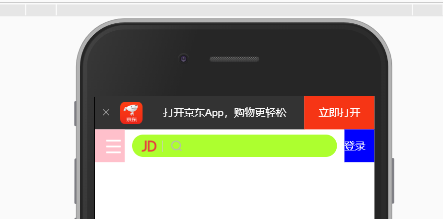
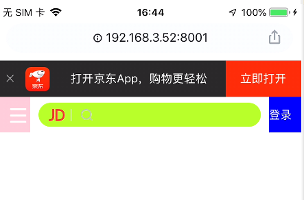
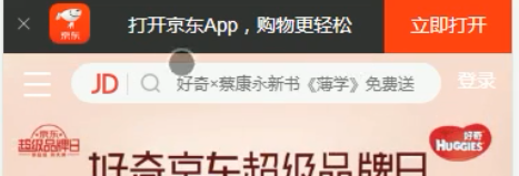
6. 导航布局
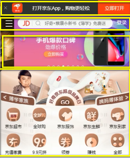
6.1 首行
注意:宽度设置百分比,高度暂时我们先写死。
.app {
    height: 45px;
}
拾色
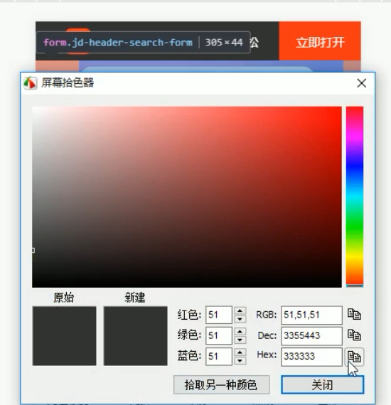
.app ul li {
    height: 45px;
    background-color: #333333;
}
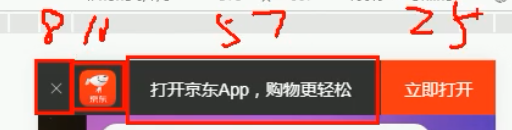
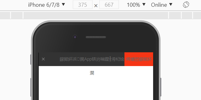
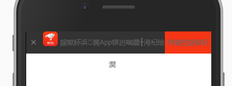
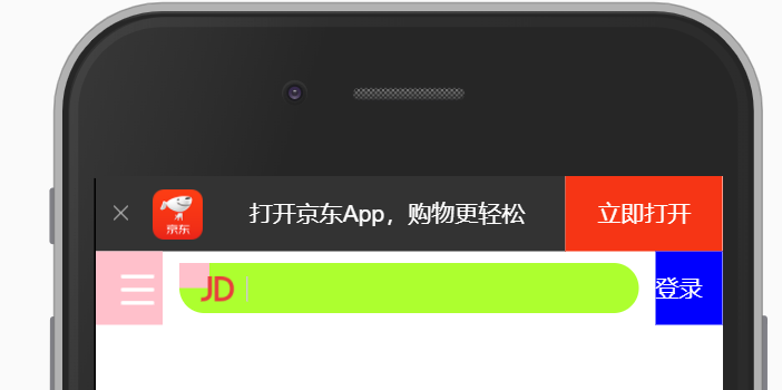
<body>
<!-- 顶部 -->
<header class="app">
<!-- ul>li*4 -->
<ul>
<li>
</li>
<li>
</li>
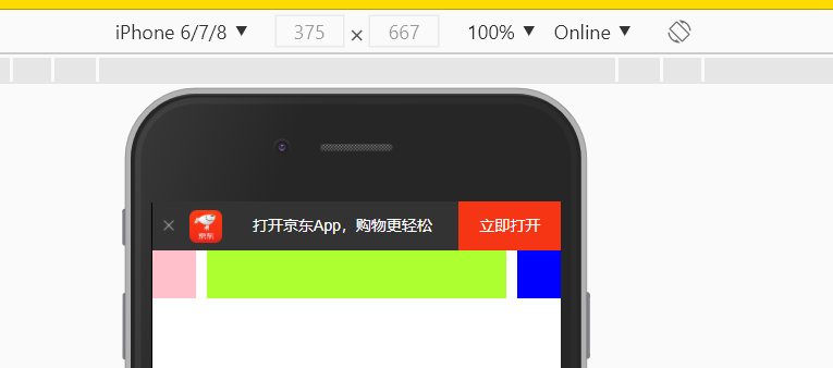
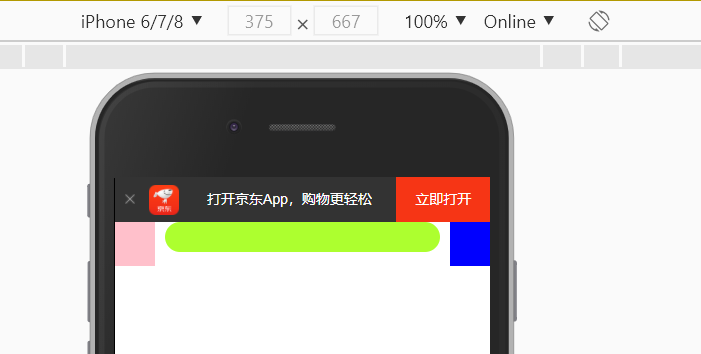
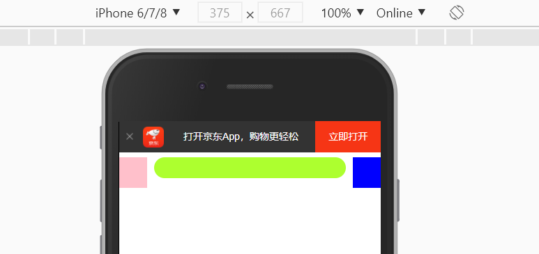
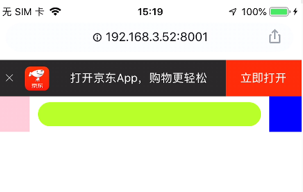
<li>打开京东App,购物更轻松</li>
<li>立即打开</li>
</ul>
</header>
</body>
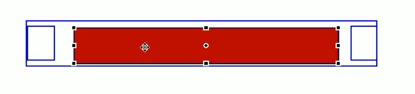
li应该有宽度,是浮动起来的,再分别设置百分比宽度,注意设置最后一个背景色是红色。
清除ul内外边距及清除ul的默认样式
<!DOCTYPE html>
<html lang="en">
<head>
    <meta name="viewport" content="width=device-width, user-scalable=no,initial-scale=1.0, maximum-scale=1.0, minimum-scale=1.0">
    <link rel="stylesheet" href="css/normalize.css">
    <link rel="stylesheet" href="css/index.css">
    <title>Title</title>
</head>
<body>
<!-- 顶部 -->
<header class="app">
<!-- ul>li*4   -->
    <ul>
        <li>
            111
        </li>
        <li>
            222
        </li>
        <li>333</li>
        <li>444</li>
    </ul>
</header>
</body>
</html>
body {
    width: 100%;
    min-width: 320px;
    max-width: 640px;
    /*居中对齐*/
    margin: 0 auto;
    /*字体按照jd设置*/
    font-size: 14px;
    font-family: -apple-system, Helvetica, sans-serif;
    color: #666;
    line-height: 1.5;
}
ul {
    margin: 0;
    padding: 0;
    list-style: none;
}
.app {
    height: 45px;
}
.app ul li {
    float: left;
    height: 45px;
    background-color: #333333;
}
.app ul li:nth-child(1) {
    width: 8%;
}
.app ul li:nth-child(2) {
    width: 10%;
}
.app ul li:nth-child(3) {
    width: 57%;
}
.app ul li:nth-child(4) {
    width: 25%;
    background-color: #F63515;
}
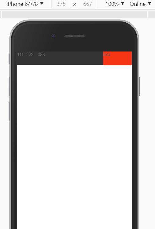
百分比布局可以拉伸了。

参考:https://github.com/6xiaoDi/blog–Mobile-layout/tree/a0.12
Branch: branch01commit description:a0.12(jd首页案例—第一层布局)
tag:a0.12
准备填充内容及格式
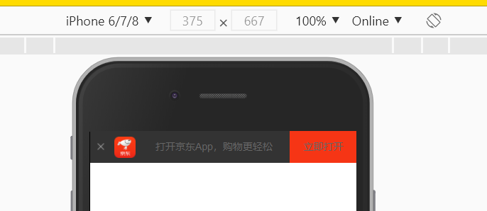
<header class="app">
<!-- ul>li*4   -->
    <ul>
        <li>
            <img src="images/close.png" alt="">
        </li>
        <li>
        </li>
        <li>打开京东App,购物更轻松</li>
        <li>立即打开</li>
    </ul>
</header>
图太大了。
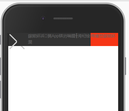
必须进行缩放(官网缩放10*10),图片再水平垂直居中
.app ul li {
    float: left;
    height: 45px;
    /*垂直居中*/
    line-height: 45px;
    background-color: #333333;
    /*水平居中*/
    text-align: center;
}
.app ul li:nth-child(1) img {
    width: 10px;
}
加第二个块的图片
        <li>
            <img src="images/close.png" alt="">
        </li>
        <li>
            <img src="images/logo.png" alt="">
        </li>
.app ul li:nth-child(2) img {
    width: 30px;
}
为啥前面图片垂直居中,第二个就不行了?
因为图片默认与文字的基线对齐,第一张图是因为图很小,和文字差不多。
=> 令图片与文字居中对齐。(字体乱码,是小迪的webstorm有点问题别在意)
.app ul li:nth-child(2) img {
    width: 30px;
    vertical-align: middle;
}
完整版
body {
    width: 100%;
    min-width: 320px;
    max-width: 640px;
    /*居中对齐*/
    margin: 0 auto;
    /*字体按照jd设置*/
    font-size: 14px;
    font-family: -apple-system, Helvetica, sans-serif;
    color: #666;
    line-height: 1.5;
}
ul {
    margin: 0;
    padding: 0;
    list-style: none;
}
.app {
    height: 45px;
}
.app ul li {
    float: left;
    height: 45px;
    /*垂直居中*/
    line-height: 45px;
    background-color: #333333;
    /*水平居中*/
    text-align: center;
    color: #fff;
}
.app ul li:nth-child(1) {
    width: 8%;
}
.app ul li:nth-child(1) img {
    width: 10px;
}
.app ul li:nth-child(2) {
    width: 10%;
}
.app ul li:nth-child(2) img {
    width: 30px;
    vertical-align: middle;
}
.app ul li:nth-child(3) {
    width: 57%;
}
.app ul li:nth-child(4) {
    width: 25%;
    background-color: #F63515;
}
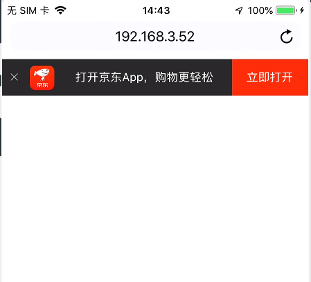
<!DOCTYPE html>
<html lang="en">
<head>
    <meta name="viewport" content="width=device-width, user-scalable=no,initial-scale=1.0, maximum-scale=1.0, minimum-scale=1.0">
    <link rel="stylesheet" href="css/normalize.css">
    <link rel="stylesheet" href="css/index.css">
    <title>Title</title>
</head>
<body>
<!-- 顶部 -->
<header class="app">
<!-- ul>li*4   -->
    <ul>
        <li>
            <img src="images/close.png" alt="">
        </li>
        <li>
            <img src="images/logo.png" alt="">
        </li>
        <li>打开京东App,购物更轻松</li>
        <li>立即打开</li>
    </ul>
</header>
</body>
</html>
参考:https://github.com/6xiaoDi/blog–Mobile-layout/tree/a0.13
Branch: branch01commit description:a0.13(jd首页案例—第一层实现)
tag:a0.13
第二层布局分类
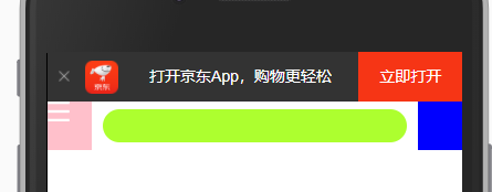
注意,当我们拉伸页面的时候,两侧按钮尺寸不变,但是input框的尺寸会跟随变化。

首先准备一个父盒子,左右两侧定死,用定位即可,不占位置。
剩下中间盒子,自由伸缩,我们再准备一个标准流的盒子,不设置宽度,默认与父级一样宽(随着界面自由伸缩了并自适应),只需要设置margin把两侧盒子空出来就行了。
<!-- 顶部 -->
<header class="app">
<!-- ul>li*4 -->
<ul>
<li>
<img src="images/close.png" alt="">
</li>
<li>
<img src="images/logo.png" alt="">
</li>
<li>打开京东App,购物更轻松</li>
<li>立即打开</li>
</ul>
</header>
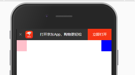
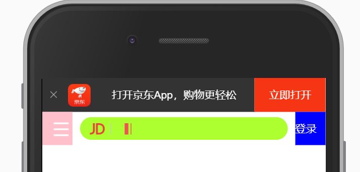
<div class="search-wrap">
<!-- .search-btn+.search-login-->
<div class="search-btn"></div>
<div class="search-login"></div>
</div>
/* 搜索 */

.search-wrap {
    position: relative;
    height: 44px;
}
.search-btn {
    position: absolute;
    top: 0;
    left: 0;
    background-color: pink;
    width: 40px;
    height: 44px;
}
.search-login {
    position: absolute;
    right: 0;
    top: 0;
    width: 40px;
    height: 44px;
    background-color: blue;
}
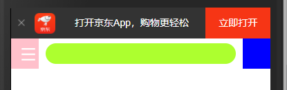
继续加中间的标准流
    <div class="search-wrap">
<!--        .search-btn+.search-login-->
        <div class="search-btn"></div>
        <div class="search">
        </div>
        <div class="search-login"></div>
    </div>
.search {
    height: 44px;
    background-color: greenyellow;
}
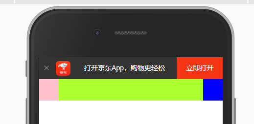
实际输入框是有margin的,而不是贴死。
=> margin: 0 50px;
实际输入框不是等高的,并且是圆角形状
.search {
    height: 30px;
    background-color: greenyellow;
    margin: 0 50px;
    border-radius: 15px;
}
顶部距离不是贴着的
=> margin-top: 7px;
然而父级也下来了,出现了外边距合并(塌陷)的问题 =>
父级 => overflow: hidden;

参考:https://github.com/6xiaoDi/blog–Mobile-layout/tree/a0.14
Branch: branch01commit description:a0.14(jd首页案例—第二层布局)
tag:a0.14
完成左侧按钮,是一个图片 => 使用before伪元素
.search-btn::before {
    content: "";
    display: block;
    width: 20px;
    height: 18px;
    background: url(../images/s-btn.png) no-repeat;
}
有点跑偏了,图很大,盒子有点小,就装不下了 => 图片缩放

background-size: 20px 18px;
加一点边距,并且有点偏右
margin: 14px 0 0 15px; (上右下左)
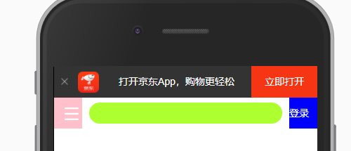
右侧是文字,文字内容改为白色,并垂直居中
<div class="search-login">登录</div>
.search-login {
    position: absolute;
    right: 0;
    top: 0;
    width: 40px;
    height: 44px;
    background-color: blue;
    color: #fff;
    line-height: 44px;
}
实现中间部分,两者图片,最右侧是input => 排列用定位
左侧按钮,绝对定位 => 子绝父相
        <div class="search">
            <div class="jd-icon"></div>
        </div>
.search {
    position: relative;
    height: 30px;
    background-color: greenyellow;
    margin: 0 50px;
    border-radius: 15px;
    margin-top: 7px;
}
.jd-icon {
    width: 20px;
    height: 15px;
    position: absolute;
    top: 8px;
    left: 13px;
    background: url(../images/jd.png) no-repeat;
}
图片看不全,肯定需要缩放了。
background-size: 20px 15px;
后面还有一根竖线 => after
.jd-icon::after {
    content: "";
    display: block;
    width: 1px;
    height: 15px;
    background-color: #ccc;
}
跑到最前面去了 => 定位到后头
.jd-icon::after {
    content: "";
    position: absolute;
    right: -8px;
    top: 0;
    display: block;
    width: 1px;
    height: 15px;
    background-color: #ccc;
}

参考:https://github.com/6xiaoDi/blog–Mobile-layout/tree/a0.15
Branch: branch01commit description:a0.15(jd首页案例—实现第二层两侧,中间暂未实现完成)
tag:a0.15
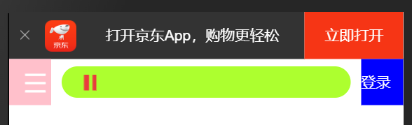
实现搜索框里的放大镜
发现京东中做成了精灵图,在移动端如何处理呢?
单独图片可以随意缩放,而对于精灵图,一缩放它的位置就会受到影响了,就需要重新计算和测量位置了。
    <div class="search-wrap">
<!--        .search-btn+.search-login-->
        <div class="search-btn"></div>
        <div class="search">
            <div class="jd-icon"></div>
<!--     放大镜       -->
            <div class="sou"></div>
        </div>
        <div class="search-login">登录</div>
    </div>
.sou {
    width: 18px;
    height: 15px;
    background-color: pink;
}
绝对定位调整位置
.sou {
    position: absolute;
    top: 8px;
    left: 50px;
    width: 18px;
    height: 15px;
    background-color: pink;
}

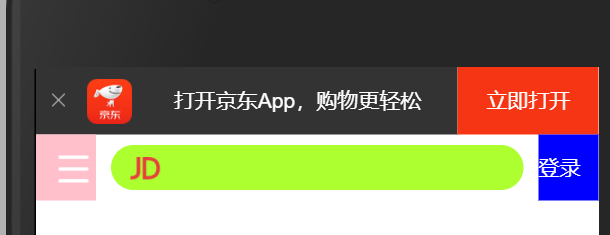
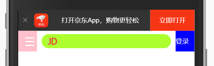
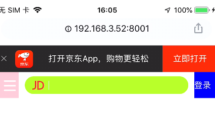
=> background: url(…/images/jd-sprites.png) no-repeat;
此时显示的是精灵图,最上方的jd logo
计算位置先
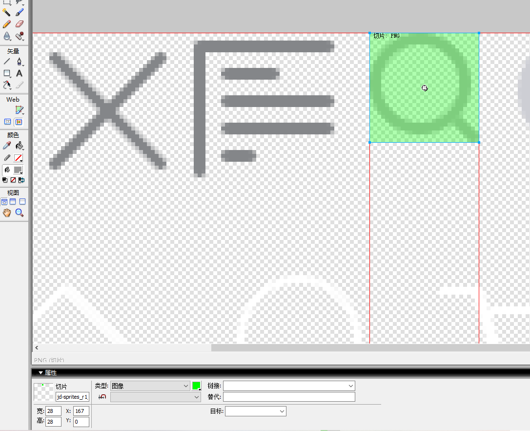
这里不能直接缩放精灵图,这样整个图都缩放了,我们量取的距离也不对了。
7. 二倍精灵图做法
- 在firework里面把精灵图等比例缩放为原来的一半
- 之后根据大小 测量坐标
- 注意代码里面background-size也要写: 精灵图原来宽度的一半
先选中图,然后勾选等比例缩放,再输入我们要缩放的宽度,高度会同步等比例缩放。
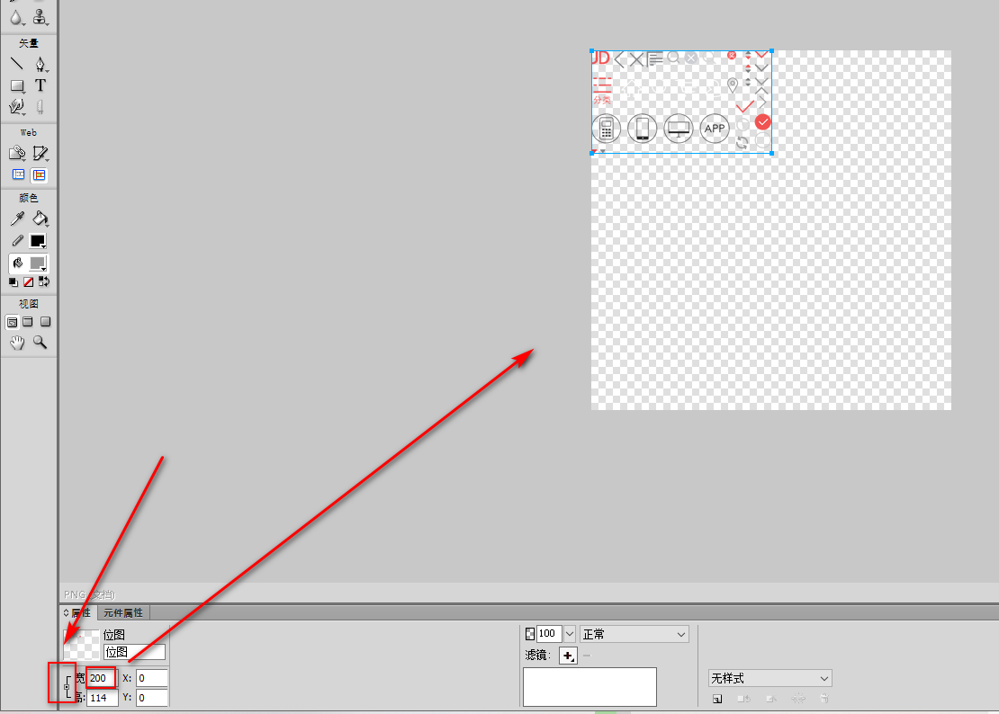
勾勒出20 x 18的尺寸即可
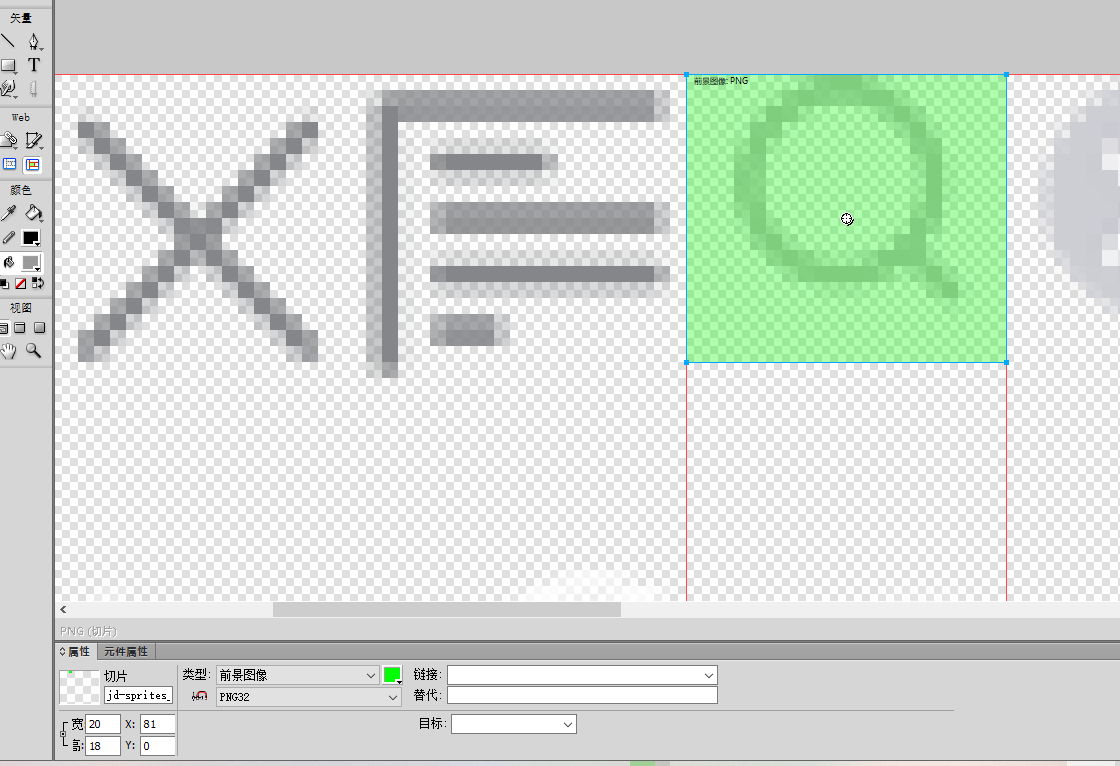
.sou {
    position: absolute;
    top: 8px;
    left: 50px;
    width: 18px;
    height: 15px;
    background-color: pink;
    background: url(../images/jd-sprites.png) no-repeat -81px 0;
    background-size: 200px auto;
}
参考:https://github.com/6xiaoDi/blog–Mobile-layout/tree/a0.16
Branch: branch01commit description:a0.16(jd首页案例—实现第二层两侧,实现中间层的放大镜,利用精灵图技术)
tag:a0.16
8. 图片格式
实际我们可以看到jd的某些大图是dgp格式,这是什么呢?

8.1 DPG图片压缩技术
京东自主研发推出DPG图片压缩技术,经测试该技术,可直接节省用户近50%的浏览流量,极大的提升了用户的网页打开速度。能够兼容jpeg,实现全平台、全部浏览器的兼容支持,经过内部和外部上万张图片的人眼浏览测试后发现,压缩后的图片和webp的清晰度对比没有差距。
8.2 webp 图片格式
谷歌开发的一种旨在加快图片加载速度的图片格式。图片压缩体积大约只有JPEG的2/3,并能节省大量的服务器宽带资源和数据空间。
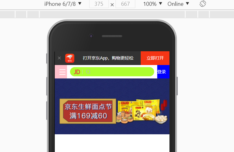
9. 下半部布局
下半部都是主体内容,因此选中一个大盒子,把它都包起来。
<!-- 主体内容部分 -->
<div class="main-content">
<!-- 滑动图 -->
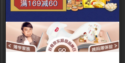
<div class="slider">
<img src="upload/banner.dpg" alt="">
</div>
</div>
图实在太大了。 => 缩放
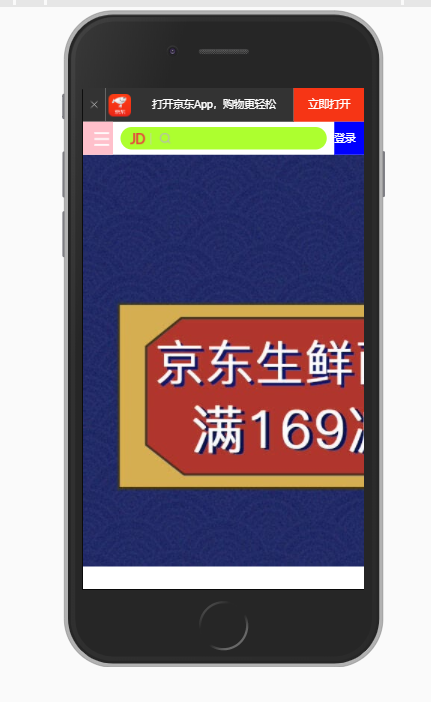
父盒子多宽,就缩成多宽
.slider img {
    width: 100%;
}
按道理滚动幻灯片应该在第一层下方,并且是固定住的,所以用固定定位最为合适。
同时把我们方便调试代码,设置的特殊背景去掉。
.search-wrap {
    position: fixed;
    overflow: hidden;
    height: 44px;
}
出问题了,都挤到一块了,因为没设置搜索框宽度。

应该限制宽度。
.search-wrap {
    position: fixed;
    overflow: hidden;
    height: 44px;
    min-width: 320px;
    max-width: 640px;
}
宽度比例还是不对,应该占满 => width: 100%;
参考:https://github.com/6xiaoDi/blog–Mobile-layout/tree/a0.17
Branch: branch01commit description:a0.17(jd首页案例—实现顶部导航及幻灯片部分)
tag:a0.17
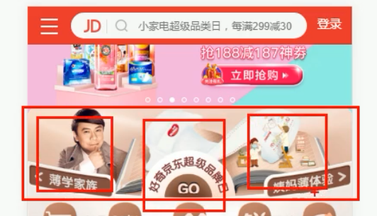
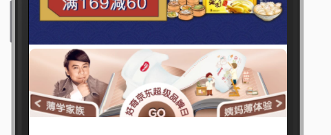
实现如下部分 => 设置一个盒子,丢一张图片,但是点击图片可以跳转页面,并且里面可以点击跳转几个页面,因此是多个图组成。
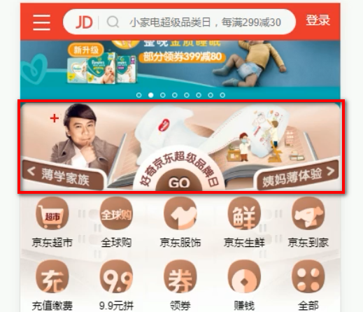
实际是一个大盒子,里装三张图片,可实现不同的跳转,同时是小圆角。
    <!-- 主体内容部分 -->
    <div class="main-content">
        <!-- 滑动图 -->
        <div class="slider">
            <img src="upload/banner.dpg" alt="">
        </div>
        <!-- 蔡康永品牌日 -->
        <div class="brand">
            <div>
                <a href="#">
                    <img src="upload/pic1.dpg" alt="">
                </a>
            </div>
            <div>
                <a href="#">
                    <img src="upload/pic2.dpg" alt="">
                </a>

            </div>
            <div>
                <a href="#">
                    <img src="upload/pic3.dpg" alt="">
                </a>
            </div>
        </div>

排成一列了,而京东是放在一行上,大小基本相同。我们可以让每个盒子各占一份即可,同时浮动。
.brand div {
    float: left;
    width: 33.33%;
}
图片大小不对,应该盒子多宽,图片就多宽。
.brand div img {
    width: 100%;
}
还需设置圆角。
.brand {
    border-radius: 10px 10px 0 0;
}
依旧没变,因为光给盒子设置了,照片肯定没效果 =>
overflow: hidden;
但是还是有问题,上方会有小缝隙,因为图片底色默认有空白缝隙(他的底线会和父级盒子的基线对齐),
img {
    vertical-align: middle;
}
并且忘记设置使用css3盒模型了,我们也设置上
div {
    /* css3 盒子模型 */
    box-sizing: border-box;
}
参考:https://github.com/6xiaoDi/blog–Mobile-layout/tree/a0.18
Branch: branch01commit description:a0.18(jd首页案例—实现幻灯片下层部分)
tag:a0.18
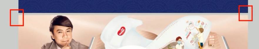
实际布局布好了,剩下就是换图片的事情了。
我们尝试再修改一下刚刚的功能。

        <!-- 小家电品牌日 -->
        <div class="brand">
            <div>
                <a href="#">
                    <img src="upload/pic11.dpg" alt="">
                </a>
            </div>
            <div>
                <a href="#">
                    <img src="upload/pic22.dpg" alt="">
                </a>

            </div>
            <div>
                <a href="#">
                    <img src="upload/pic33.dpg" alt="">
                </a>
            </div>
        </div>

实现后面导航栏的内容
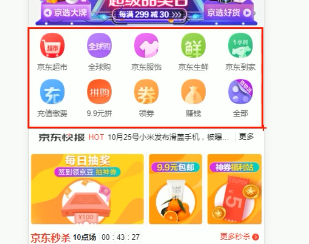
只需要一个大盒子包起来,宽度和父级一样宽,高度不用设置,随着内容撑开即可。
一行5个盒子,各占20%就行。每个盒子里一张图,一个span。
移动端导航不会太复杂,就不用ul和li,直接用a即可。
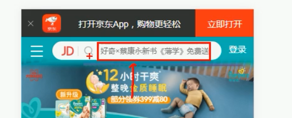
        <nav class="clearfix">
            <a href="">
                <img src="upload/nav1.webp" alt="">
                <span>京东超市</span>
            </a>

            <a href="">
                <img src="upload/nav2.webp" alt="">
                <span>京东超市</span>
            </a>

            <a href="">
                <img src="upload/nav1.webp" alt="">
                <span>京东超市</span>
            </a>

            <a href="">
                <img src="upload/nav1.webp" alt="">
                <span>京东超市</span>
            </a>

            <a href="">
                <img src="upload/nav1.webp" alt="">
                <span>京东超市</span>
            </a>

            <a href="">
                <img src="upload/nav3.webp" alt="">
                <span>京东超市</span>
            </a>

            <a href="">
                <img src="upload/nav1.webp" alt="">
                <span>京东超市</span>
            </a>

            <a href="">
                <img src="upload/nav1.webp" alt="">
                <span>京东超市</span>
            </a>

            <a href="">
                <img src="upload/nav1.webp" alt="">
                <span>京东超市</span>
            </a>

            <a href="">
                <img src="upload/nav1.webp" alt="">
                <span>京东超市</span>
            </a>

        </nav>
nav a {
    float: left;
    width: 20%;
}

nav a img {
    width: 40px;
}

加边距及对齐
nav a {
    float: left;
    width: 20%;
    text-align: center;
}

nav a img {
    width: 40px;
    margin: 10px 0;
}
span和img是行内元素,得将span转成块级元素才能下来
nav a span {
    display: block;
}
所有的a标签风格一致。
a {
    color: #666;
    text-decoration: none;
}

顶部距离稍微大一些
nav {
    padding-top: 5px;
}

参考:https://github.com/6xiaoDi/blog–Mobile-layout/tree/a0.19
Branch: branch01commit description:a0.19(jd首页案例—实现主导航部分)
tag:a0.19
实现新闻快报部分

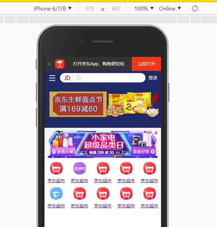
图片得空白间隙实际在图片中就做好了,
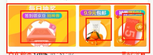
        <!-- 新闻模块 -->
        <div class="news">
            <a href="#">
                <img src="upload/new1.dpg" alt="">
            </a>
            <a href="#">
                <img src="upload/new2.dpg" alt="">

            </a>
            <a href="#">
                <img src="upload/new3.dpg" alt="">

            </a>
        </div>

加浮动,图片撑满父级,第一个占满50%、剩下两个各占25%
.news img {
    width: 100%;
}

.news a {
    float: left;
}

.news a:nth-child(1){
    width: 50%;
}

.news a:nth-child(2),
.news a:nth-child(3){
    width: 25%;
}

.news a:nth-child(2),
.news a:nth-child(3){
    width: 25%;
}
还有另外一种简写 =>
/* n+2 就是从从2个往后面选 */

.news a:nth-child(n+2) {
    width: 25%;
}
顶部再加一些边距
.news {
    margin-top: 20px;
}
结果加在上面了
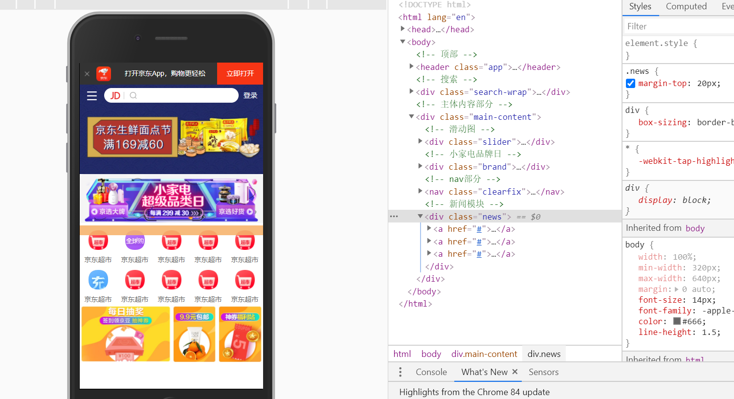
由于浮动导致,解决这个问题 => 我在网上找了个兼容性更好的清除浮动的方法( 自动清除其子元素 )。https://stackoverflow.com/questions/8554043/what-is-a-clearfix
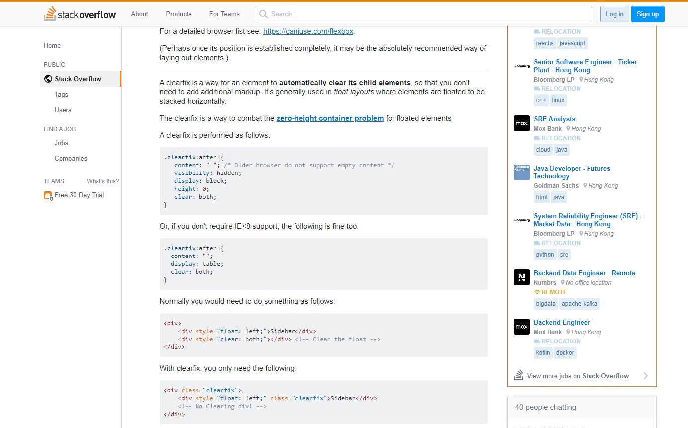

/* 利用生成内容清理浮动 for IE8(标准模式) 和 非IE浏览器 */
.clearfix:after {
    content: ".";
    clear: both;
    height: 0;
    visibility: hidden;
    display: block;
}
加上移动端需要全局加的样式
/*点击高亮我们需要清除清除  设置为transparent 完成透明*/

* {
    -webkit-tap-highlight-color: transparent;
}


/*在移动端浏览器默认的外观在iOS上加上这个属性才能给按钮和输入框自定义样式*/

input {
    -webkit-appearance: none;
}


/*禁用长按页面时的弹出菜单*/

img,
a {
    -webkit-touch-callout: none;
}
图片之间有竖线
.news a:nth-child(n+2) {
    width: 25%;
    border-left: 1px solid #ccc;
}

a采用css3样式
.news a {
    float: left;
    box-sizing: border-box;
}


参考:https://github.com/6xiaoDi/blog–Mobile-layout/tree/a0.20
Branch: branch01commit description:a0.20(jd首页案例—实现主导航部分)
tag:a0.20
ios端主导航的图片显示不出来,暂时不知道咋回事。
10. 移动端布局之流式布局总结
- 标准viewport规范以及写法
- 模拟移动端调试方法
- 移动端常见的布局方案
- 流式布局原理
- 京东移动端首页布局技巧
(后续待补充)

为开发者提供学习成长、分享交流、生态实践、资源工具等服务,帮助开发者快速成长。
更多推荐


 2
2 0
0- 0


 已为社区贡献1条内容

所有评论(0)