uniapp——顶部导航栏(分段器)、带吸附效果顶部导航(下拉刷新,上拉加载更多,返回顶部)
顶部导航栏(分段器)效果图:segmented-control代码<template><view><!-- style-type="'button'"中有 text和button两种风格 --><view class="uni-padding-wrap "><uni-segmented-control :current="currentItem
·
1、顶部导航(支持左右滑,下拉刷新,上拉加载更多,返回顶部,加载动画)

需要用到的代码比较多,这里只提供下载地址:https://download.csdn.net/download/wy313622821/20106026
2、带吸附效果顶部导航(支持左右滑,下拉刷新,上拉加载更多,返回顶部,加载动画)

需要用到的代码比较多,这里只提供下载地址:https://download.csdn.net/download/wy313622821/20107287
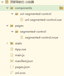
3、顶部导航栏(分段器)
效果图:

segmented-control代码
<template>
	<view>
		<!-- style-type="'button'"中有 text和button两种风格 -->
		<view class="uni-padding-wrap ">
			<uni-segmented-control :current="currentItem" :values="items" :style-type="'text'" :active-color="'#007aff'"
			 @clickItem="onClickItem" />
		</view>

		<view class="content">
			<!-- 选项卡1的内容 -->
			<view v-if="currentItem === 0">
				<text class="content-text"> 选项卡1的内容</text>
			</view>
			<!-- 选项卡2的内容 -->
			<view v-if="currentItem === 1">
				<text class="content-text">选项卡2的内容</text>
			</view>
			<!-- 选项卡3的内容 -->
			<view v-if="currentItem === 2">
				<text class="content-text">选项卡3的内容</text>
			</view>
		</view>

	</view>
</template>

<script>
	export default {
		data() {
			return {
				items: ['选项卡1', '选项卡2', '选项卡3'],
				currentItem: 0,
			}
		},
		methods: {
			onClickItem(e) {
				if (this.currentItem !== e.currentIndex) {
					this.currentItem = e.currentIndex
				}
			},
		}
	}
</script>

<style>
	/* 头条小程序组件内不能引入字体 */
	/* #ifdef MP-TOUTIAO */
	@font-face {
		font-family: uniicons;
		font-weight: normal;
		font-style: normal;
		src: url('~@/static/uni.ttf') format('truetype');
	}

	/* #endif */

	/* #ifndef APP-NVUE */
	page {
		display: flex;
		flex-direction: column;
		box-sizing: border-box;
		background-color: #efeff4;
		min-height: 100%;
		height: auto;
	}

	.uni-padding-wrap {
		width: 750rpx;
		padding: 0px 30px;
	}

	.content {
		/* #ifndef APP-NVUE */
		display: flex;
		/* #endif */
		justify-content: center;
		align-items: center;
		height: 150px;
		text-align: center;
	}

	.content-text {
		font-size: 18px;
		color: #333;
	}
	/* #endif */
</style>
uni-segmented-control代码
<template>
	<view :class="[styleType === 'text'?'segmented-control--text' : 'segmented-control--button' ]" :style="{ borderColor: styleType === 'text' ? '' : activeColor }"
	 class="segmented-control">
		<view v-for="(item, index) in values" :class="[ styleType === 'text'?'segmented-control__item--text': 'segmented-control__item--button' , index === currentIndex&&styleType === 'button'?'segmented-control__item--button--active': '' , index === 0&&styleType === 'button'?'segmented-control__item--button--first': '',index === values.length - 1&&styleType === 'button'?'segmented-control__item--button--last': '' ]"
		 :key="index" :style="{
        backgroundColor: index === currentIndex && styleType === 'button' ? activeColor : '',borderColor: index === currentIndex&&styleType === 'text'||styleType === 'button'?activeColor:'transparent'
      }"
		 class="segmented-control__item" @click="_onClick(index)">
			<text :style="{color:
          index === currentIndex
            ? styleType === 'text'
              ? activeColor
              : '#fff'
            : styleType === 'text'
              ? '#000'
              : activeColor}"
			 class="segmented-control__text">{{ item }}</text>
		</view>
	</view>
</template>

<script>
	export default {
		name: 'UniSegmentedControl',
		props: {
			current: {
				type: Number,
				default: 0
			},
			values: {
				type: Array,
				default () {
					return []
				}
			},
			activeColor: {
				type: String,
				default: '#007aff'
			},
			styleType: {
				type: String,
				default: 'button'
			}
		},
		data() {
			return {
				currentIndex: 0
			}
		},
		watch: {
			current(val) {
				if (val !== this.currentIndex) {
					this.currentIndex = val
				}
			}
		},
		created() {
			this.currentIndex = this.current
		},
		methods: {
			_onClick(index) {
				if (this.currentIndex !== index) {
					this.currentIndex = index
					this.$emit('clickItem', {currentIndex:index})
				}
			}
		}
	}
</script>

<style lang="scss" scoped>
	@import '@/uni.scss';

	.segmented-control {
		/* #ifndef APP-NVUE */
		display: flex;
		box-sizing: border-box;
		/* #endif */
		flex-direction: row;
		height: 36px;
		overflow: hidden;
	}

	.segmented-control__item {
		/* #ifndef APP-NVUE */
		display: inline-flex;
		box-sizing: border-box;
		/* #endif */
		position: relative;
		flex: 1;
		justify-content: center;
		align-items: center;
	}

	.segmented-control__item--button {
		border-style: solid;
		border-top-width: 1px;
		border-bottom-width: 1px;
		border-right-width: 1px;
		border-left-width: 0;
	}

	.segmented-control__item--button--first {
		border-left-width: 1px;
		border-top-left-radius: 5px;
		border-bottom-left-radius: 5px;
	}

	.segmented-control__item--button--last {
		border-top-right-radius: 5px;
		border-bottom-right-radius: 5px;
	}

	.segmented-control__item--text {
		border-bottom-style: solid;
		border-bottom-width: 3px;
	}

	.segmented-control__text {
		font-size: 16px;
		line-height: 20px;
		text-align: center;
	}
</style>

为开发者提供学习成长、分享交流、生态实践、资源工具等服务,帮助开发者快速成长。
更多推荐


 6
6 0
0- 0


 已为社区贡献27条内容

所有评论(0)