flutter - AppBar 参数设置布局效果
class MyHomePage extends StatelessWidget {@overrideWidget build(BuildContext context) {return Scaffold(appBar: AppBar(// backgroundColor: Colors.red,// backgroundColor: Color(0xff45ff41),leading: Cont
·

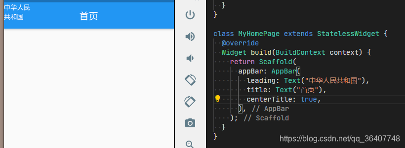
class MyHomePage extends StatelessWidget {
  @override
  Widget build(BuildContext context) {
    return Scaffold(
      appBar: AppBar(
        // backgroundColor: Colors.red,
        // backgroundColor: Color(0xff45ff41),
        leading: Container(
          padding: EdgeInsets.all(8),
          child: ClipOval(
            child: Image.network(
              "https://p3-juejin.byteimg.com/tos-cn-i-k3u1fbpfcp/ab5870542e8d4479bfb899ea7a195e4d~tplv-k3u1fbpfcp-watermark.image",
              fit: BoxFit.cover,
            ),
          ),
        ),
        title: Text("首页"),
        centerTitle: true,
        actions: [
          Row(
            children: [
              Text("右1"),
              SizedBox(width: 10),
              Text("右2"),
              SizedBox(width: 10),
              Text("右3"),
              SizedBox(width: 10),
            ],
          )
        ],
        elevation: 0.0
      ),
    );
  }
}
| 常用属性 | 说明 |
|---|---|
| leading | 左侧 元素自定义,是一个widget部件 |
| leadingWidth | AppBar 的leading的宽度,假如leading 里是文字的话,如果不设置这个属性,当你的文字很多时,会换行的 |
| title | AppBar 的标题 ,也是一个widget |
| titleSpacing | 设置AppBar 的标题 撑开左右 两边的 距离 |
| centerTitle | 控制AppBar 的标题是否居中,布尔值, 默认false, |
| actins | AppBar 右侧附加的部分 ,比如一个按钮,一个文字等,需要传入一个List(数组) |
| backgroundColor | AppBar 的背景色,传入一个Color类型的颜色, 如 Colors.red, Color(0xff45ff41) |
| elevation | AppBar 的底部的 阴影区大小, 默认是4.0, 设置为0.0 会和 body 里的元素连在一起 |
| shadowColor | AppBar 的底部的 阴影颜色, 同 backgroundColor 参数用法 |
| toolbarHeight | 设置AppBar 部件的 高度 ,传入 double 类型的 值,如 25, 40.2 |
leading里放置一段文本,默认宽度下,文字过多时, 可能文字换行
设置 leadingWidth 后

设置titleSpacing


为开发者提供学习成长、分享交流、生态实践、资源工具等服务,帮助开发者快速成长。
更多推荐


 3
3 0
0- 0


 已为社区贡献8条内容

所有评论(0)