
Echarts数据动态可视化的实现
Echarts简介Echarts缩写来自 Enterprise Charts,商业级数据图表,是百度的一个开源的数据可视化工具,一个纯 Javascript 的图表库,能够在 PC 端和移动设备上流畅运行。与此相同的数据可视化插件还有Highcharts。不过我还是比较喜欢Echarts(支持国货),这篇文章讲解从Echarts的基础入门到通过Echarts制作动态图表。...
Echarts简介
Echarts缩写来自 Enterprise Charts,商业级数据图表,是百度的一个开源的数据可视化工具,一个纯 Javascript 的图表库,能够在 PC 端和移动设备上流畅运行。与此相同的数据可视化插件还有Highcharts。不过我还是比较喜欢还是Echarts(支持国货),这篇文章讲解从Echarts的基础入门到通过Echarts制作动态图表。
使用步骤
1.下载Echarts插件
可以去Echarts官网下载Echarts插件

可以进行在线定制,可能有人会在选择定制的模块上很纠结,一句话:你觉得你可能用的上的模块都勾上就行了。
下载成功后是这个样子:
2.通过插件开始编写图表
先将插件导入自己的工程
我用的webStrom,我的工程目录大概是这样子的(内容比较简单):
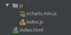
工程中也就两个js文件,以及一个页面
学过html都知道html文件就是将页面的大体框架部署出来就OK了,不需要在里面进行复杂的修饰,所以我将要写的js文件一并放到了index.js文件中
<!DOCTYPE html>
<html lang="en">
<head>
    <meta charset="UTF-8">
<!--    引入Echarts插件-->
    <script src="js/echarts.min.js"></script>
<!--    引入自己编写的js文件-->
    <script src="js/index.js"></script>
    <title>Title</title>
</head>
<style>
    *{
        margin: 0;
        padding: 0;
    }
    .login-content{
        width: 1518px;
        height: 750px;
        margin: 0 auto;
        background-image: url("image/night_background.png");
        background-repeat: no-repeat;
        background-size: 100%;
    }
    .title{
        font-size: 20px;
        width: 200px;
        height: 40px;
        margin: 0 auto;
        color: deepskyblue;
        text-align: center;

    }
    #echarts{
        width: 90%;
        height: 300px;
        margin: 0 auto;
    }
    #echarts3{
        width: 90%;
        height: 300px;
        margin: 0 auto;
    }
    #echarts2{
        width: 90%;
        height: 300px;
        margin: 0 auto;
    }
    .panel{
        margin-top: 100px;
        width: 500px;
        float: left;
    }
</style>
<body>
<div class="login-content">
    <div class="panel">
<!--柱形图标-->
        <div class="title">图表一</div>
        <div id="echarts" ></div>
    </div>

    <div class="panel">
<!--饼状图标-->
        <div class="title">图表二</div>
        <div id="echarts2"></div>
    </div>
<!--折线图表-->
    <div class="panel">
        <div class="title">图表三</div>
        <div id="echarts3"></div>
    </div>
</div>
</body>
</html>
html页面一目了然,也就是构建了一个大体的框架,由于小编为了展示出来的漂亮些,所以就给整个页面加了一个背景图片,如果嫌麻烦这完全可以去掉。
之后就可以开始编写index.js文件了,也就是正式编写可视化图表
我直接源码展示出来:
window.onload = function(){
    //柱状图
    //配置
    var option = {
        // backgroundColor:'#d48265', //背景颜色
        color:['#546570'],//系列颜色
        xAxis: {//x轴
            type: 'category',
            data: ['Mon', 'Tue', 'Wed', 'Thu', 'Fri', 'Sat', 'Sun'],
            axisLine:{ //线条设置
                lineStyle:{//线条颜色
                    color: '#fff'
                }
            }
        },
        grid:{  //图表在指定div中的位置,相当于html中的margin
            left:'2%',
            right:'2%',
            top:'2%',
            bottom:'2%',
            containLabel: true //是否显示刻度信息
        },
        yAxis: {//y轴
            type: 'value'
        },
        series: [{//展示数据
            data: [820, 932, 901, 934, 1290, 1330, 1320],
            type: 'bar'  //line为折线图,bar为柱状图
        }]
    };
    //初始化
    var mychart1 = echarts.init(document.getElementById("echarts"));
    //设置数据
    //mychart1.setOption(option);
    //实时数据展示,这里为了制造动态图表,直接进行模拟数据
    var data = [[123, 342, 533, 23, 42, 57, 112],
                [29, 642, 567 ,98, 45, 567, 172],
                [13, 342, 508 ,6, 65, 567, 192],
                [41, 65, 65 ,6, 45, 500, 120],
                [123, 234, 533 ,6, 45, 67, 162]];
    //定时器
    setInterval(getItem, 1000);  //每间隔两秒钟请求一次函数
    function getItem(){
        var random = data[parseInt(Math.random()*data.length)];
        option.series[0].data = random;  //获取series的第一行数据,并将模拟的数据赋值给他
        mychart1.setOption(option);//重新加载表
    }
    //先直接调用该函数,可以让页面刚出现时图表就可以展现出来,也可以不写
    getItem();

    //数据请求
    // function getData(){
    //     $.ajax({
    //         type:'get',
    //         url:'',
    //         success:function(){
    //              option.series[0].data;
    //              mychart1.setOption(option);
    //         }
    //     })
    // }

    //折线图
    var mychart3 = echarts.init(document.getElementById("echarts3"));
    mychart3.setOption({
        // backgroundColor:'#d48265', //背景颜色
        color:['#ff0000'],//系列颜色
        xAxis: {//x轴
            type: 'category',
            data: ['一月', '二月', '三月', '四月', '五月', '六', '七'],
            axisLine:{ //线条设置
                lineStyle:{//线条颜色
                    color: '#fff'
                }
            }
        },
        grid:{  //图表在指定div中的位置,相当于html中的margin
            left:'2%',
            right:'2%',
            top:'2%',
            bottom:'2%',
            containLabel: true //是否显示图表刻度信息
        },
        yAxis: {//y轴
            type: 'value'
        },
        series: [{//展示数据
            data: [820, 932, 901, 934, 1290, 1330, 1320],
            type: 'line'  //line为折线图,bar为柱状图
        }]
    });

	//饼状图
    var mycharts2 = echarts.init(document.getElementById("echarts2"));

    mycharts2.setOption({
        //backgroundColor: '#2c343c',
        title: {
            text: 'Customized Pie',
            left: 'center',
            top: 20,
            textStyle: {
                color: '#ccc'
            }
        },

        tooltip : {
            trigger: 'item',
            formatter: "{a} <br/>{b} : {c} ({d}%)"
        },

        visualMap: {
            show: false,
            min: 80,
            max: 600,
            inRange: {
                colorLightness: [0, 1]
            }
        },
        series : [
            {
                name:'访问来源',
                type:'pie',
                radius : '55%',
                center: ['50%', '50%'],
                data:[
                    {value:335, name:'直接访问'},
                    {value:310, name:'邮件营销'},
                    {value:274, name:'联盟广告'},
                    {value:235, name:'视频广告'},
                    {value:400, name:'搜索引擎'}
                ].sort(function (a, b) { return a.value - b.value; }),
                roseType: 'radius',
                label: {
                    normal: {
                        textStyle: {
                            color: 'rgba(255, 255, 255, 0.3)'
                        }
                    }
                },
                labelLine: {
                    normal: {
                        lineStyle: {
                            color: 'rgba(255, 255, 255, 0.3)'
                        },
                        smooth: 0.2,
                        length: 10,
                        length2: 20
                    }
                },
                itemStyle: {
                    normal: {
                        color: '#c23531',
                        shadowBlur: 200,
                        shadowColor: 'rgba(0, 0, 0, 0.5)'
                    }
                },

                animationType: 'scale',
                animationEasing: 'elasticOut',
                animationDelay: function (idx) {
                    return Math.random() * 200;
                }
            }
        ]
    });
    window.onresize = function(){ //窗口自适应
        mycharts.resize();
        mycharts2.resize();
        mycharts3.resize();
    }
}
这个js文件主要编写了三种图表:柱状图,饼状图,折线图
上面代码备注了比较多的注释,更多关于其具体配置的详解可以在Echarts官网上查看:

最终展现的的可视化界面也跟大家分享下吧:

上面的代码只将图表一进行了动态化,剩下两个图表都是静态的,其原理与图表一的原理相似。
有问题可以或者需要前端资源可以留言或私聊噢!

旨在为数千万中国开发者提供一个无缝且高效的云端环境,以支持学习、使用和贡献开源项目。
更多推荐


 4
4 0
0- 0


 已为社区贡献1条内容

所有评论(0)