多态组件:创作灵活且可重用的组件。
在构建大型 React 项目时,构建组件以适应不同的变体和元素可能非常困难,尤其是当您试图找到一种方法来构建可重用和灵活的组件时。
在本文中,我将演示如何使用多态组件。这是一种模式,它为组件消费者提供了通过 props 配置组件行为的灵活性。
免责声明:此示例是使用 Next.js 和 tailwind 完成的。尽管如此,这个演示可以在任何其他 React 框架(如 CRA)上使用。
如果您正在使用 Next.js:
npx create-next-app@latest --typescript polymorphic-components with-tailwindcss
进入全屏模式 退出全屏模式
如果您使用 CRA 关注
npx create-react-app polymorphic-components --template tailwindcss-typescript
进入全屏模式 退出全屏模式
配置和依赖
- clsx- 这是一个我们必须安装的包,一个用于有条件地构造类名字符串的实用程序。
$ npm install --save clsx
进入全屏模式 退出全屏模式
有关 clsx的更多信息 https://www.npmjs.com/package/clsx
- Tailwind 嵌套 - 我们将在 postcss.config.ts 文件中启用嵌套样式。按照这些指示https://tailwindcss.com/docs/using-with-preprocessors#nesting
我们将构建一个卡片组件,我们将重复使用三次以显示三张卡片。我们将通过父组件中的 props 配置每张卡片的内容/行为,在本例中是Index组件。
文件结构
源代码
|--组件
|--图标
|--ReactIcon.tsx
|--SvelteIcon.tsx
|--VueIcon.tsx
|--多态
|--card.type.ts
|--卡片.ts
|--卡片模块.css
|--索引.tsx
src/components/polymorphic/card.type.ts
Card组件将支持三种变体——react、vue 和 svelte,所以让我们创建一个CardVariant类型的文件。
export type CardVariant = 'react' | 'vue' | 'svelte'
进入全屏模式 退出全屏模式
src/components/Card.module.css
在这里,我们为每个变体赋予样式
.card {
  @apply text-left flex relative border-l-4;

  &.react {
    @apply flex flex-col bg-[#61dafb] bg-opacity-30 p-4 w-[300px] h-[390px] border-2;
  }
  &.vue {
    @apply flex flex-col bg-[#4dba87] bg-opacity-30 p-4 w-[300px] h-[390px] border-2;
  }
  &.svelte {
    @apply flex flex-col bg-[#ff3e00] bg-opacity-30 p-4 w-[300px] h-[390px] border-2;
  }

}
进入全屏模式 退出全屏模式
让我们创建图标!
src/components/icons/ReactIcon
type ReactIconProps = {}

const ReactIcon = (props: ReactIconProps) => {
  return (
    <>
    <svg height="150" viewBox="175.7 78 490.6 436.9" width="150" xmlns="http://www.w3.org/2000/svg">
      <g fill="#61dafb"><path d="m666.3 296.5c0-32.5-40.7-63.3-103.1-82.4 14.4-63.6 8-114.2-20.2-130.4-6.5-3.8-14.1-5.6-22.4-5.6v22.3c4.6 0 8.3.9 11.4 2.6 13.6 7.8 19.5 37.5 14.9 75.7-1.1 9.4-2.9 19.3-5.1 29.4-19.6-4.8-41-8.5-63.5-10.9-13.5-18.5-27.5-35.3-41.6-50 32.6-30.3 63.2-46.9 84-46.9v-22.3c-27.5 0-63.5 19.6-99.9 53.6-36.4-33.8-72.4-53.2-99.9-53.2v22.3c20.7 0 51.4 16.5 84 46.6-14 14.7-28 31.4-41.3 49.9-22.6 2.4-44 6.1-63.6 11-2.3-10-4-19.7-5.2-29-4.7-38.2 1.1-67.9 14.6-75.8 3-1.8 6.9-2.6 11.5-2.6v-22.3c-8.4 0-16 1.8-22.6 5.6-28.1 16.2-34.4 66.7-19.9 130.1-62.2 19.2-102.7 49.9-102.7 82.3 0 32.5 40.7 63.3 103.1 82.4-14.4 63.6-8 114.2 20.2 130.4 6.5 3.8 14.1 5.6 22.5 5.6 27.5 0 63.5-19.6 99.9-53.6 36.4 33.8 72.4 53.2 99.9 53.2 8.4 0 16-1.8 22.6-5.6 28.1-16.2 34.4-66.7 19.9-130.1 62-19.1 102.5-49.9 102.5-82.3zm-130.2-66.7c-3.7 12.9-8.3 26.2-13.5 39.5-4.1-8-8.4-16-13.1-24-4.6-8-9.5-15.8-14.4-23.4 14.2 2.1 27.9 4.7 41 7.9zm-45.8 106.5c-7.8 13.5-15.8 26.3-24.1 38.2-14.9 1.3-30 2-45.2 2-15.1 0-30.2-.7-45-1.9-8.3-11.9-16.4-24.6-24.2-38-7.6-13.1-14.5-26.4-20.8-39.8 6.2-13.4 13.2-26.8 20.7-39.9 7.8-13.5 15.8-26.3 24.1-38.2 14.9-1.3 30-2 45.2-2 15.1 0 30.2.7 45 1.9 8.3 11.9 16.4 24.6 24.2 38 7.6 13.1 14.5 26.4 20.8 39.8-6.3 13.4-13.2 26.8-20.7 39.9zm32.3-13c5.4 13.4 10 26.8 13.8 39.8-13.1 3.2-26.9 5.9-41.2 8 4.9-7.7 9.8-15.6 14.4-23.7 4.6-8 8.9-16.1 13-24.1zm-101.4 106.7c-9.3-9.6-18.6-20.3-27.8-32 9 .4 18.2.7 27.5.7 9.4 0 18.7-.2 27.8-.7-9 11.7-18.3 22.4-27.5 32zm-74.4-58.9c-14.2-2.1-27.9-4.7-41-7.9 3.7-12.9 8.3-26.2 13.5-39.5 4.1 8 8.4 16 13.1 24s9.5 15.8 14.4 23.4zm73.9-208.1c9.3 9.6 18.6 20.3 27.8 32-9-.4-18.2-.7-27.5-.7-9.4 0-18.7.2-27.8.7 9-11.7 18.3-22.4 27.5-32zm-74 58.9c-4.9 7.7-9.8 15.6-14.4 23.7-4.6 8-8.9 16-13 24-5.4-13.4-10-26.8-13.8-39.8 13.1-3.1 26.9-5.8 41.2-7.9zm-90.5 125.2c-35.4-15.1-58.3-34.9-58.3-50.6s22.9-35.6 58.3-50.6c8.6-3.7 18-7 27.7-10.1 5.7 19.6 13.2 40 22.5 60.9-9.2 20.8-16.6 41.1-22.2 60.6-9.9-3.1-19.3-6.5-28-10.2zm53.8 142.9c-13.6-7.8-19.5-37.5-14.9-75.7 1.1-9.4 2.9-19.3 5.1-29.4 19.6 4.8 41 8.5 63.5 10.9 13.5 18.5 27.5 35.3 41.6 50-32.6 30.3-63.2 46.9-84 46.9-4.5-.1-8.3-1-11.3-2.7zm237.2-76.2c4.7 38.2-1.1 67.9-14.6 75.8-3 1.8-6.9 2.6-11.5 2.6-20.7 0-51.4-16.5-84-46.6 14-14.7 28-31.4 41.3-49.9 22.6-2.4 44-6.1 63.6-11 2.3 10.1 4.1 19.8 5.2 29.1zm38.5-66.7c-8.6 3.7-18 7-27.7 10.1-5.7-19.6-13.2-40-22.5-60.9 9.2-20.8 16.6-41.1 22.2-60.6 9.9 3.1 19.3 6.5 28.1 10.2 35.4 15.1 58.3 34.9 58.3 50.6-.1 15.7-23 35.6-58.4 50.6z"/><circle cx="420.9" cy="296.5" r="45.7"/></g>
    </svg>
    </>
  )
}

export default ReactIcon
进入全屏模式 退出全屏模式
src/components/icons/VueIcon
type VueIconProps = {}

const VueIcon = (props: VueIconProps) => {
  return (
    <>
    <svg className="w-[150px]" enable-background="new 0 0 2500 2165.1" viewBox="0 0 2500 2165.1" xmlns="http://www.w3.org/2000/svg"><path d="m1538.7 0-288.7 500-288.7-500h-961.3l1250 2165.1 1250-2165.1z" fill="#4dba87"/>
      <path d="m1538.7 0-288.7 500-288.7-500h-461.3l750 1299 750-1299z" fill="#435466"/>
    </svg>
    </>
  )
}

export default VueIcon
进入全屏模式 退出全屏模式
src/components/icons/SvelteIcon
type SvelteIconProps = {}

const SvelteIcon = (props: SvelteIconProps) => {
  return (
    <>
    <svg height="150" viewBox="-23.04085003 -23.7 545.4320132 647" width="150" xmlns="http://www.w3.org/2000/svg">
      <path d="m466.95 79.52c-55.66-79.62-165.6-103.22-245.08-52.6l-139.58 88.93c-9.39 5.9-18.15 12.76-26.12 20.47-7.98 7.71-15.13 16.23-21.34 25.42s-11.45 19-15.64 29.27a160.478 160.478 0 0 0 -9.26 31.87c-1.65 9.15-2.55 18.43-2.67 27.73-.13 9.31.52 18.61 1.93 27.8 1.41 9.2 3.58 18.27 6.48 27.11s6.53 17.42 10.85 25.66a161.68 161.68 0 0 0 -8.22 13.97c-2.51 4.79-4.77 9.71-6.78 14.73s-3.76 10.14-5.25 15.34-2.71 10.47-3.67 15.79a170.365 170.365 0 0 0 1.55 67.48c2.5 11.05 6.09 21.83 10.73 32.17s10.29 20.2 16.89 29.42c55.66 79.62 165.59 103.22 245.07 52.6l139.58-88.56c9.39-5.91 18.13-12.78 26.1-20.5a160.58 160.58 0 0 0 21.33-25.42c6.21-9.18 11.45-18.99 15.64-29.26 4.19-10.26 7.3-20.94 9.29-31.85 1.65-9.15 2.54-18.42 2.66-27.72s-.53-18.6-1.95-27.79c-1.41-9.19-3.58-18.25-6.49-27.09-2.91-8.83-6.54-17.41-10.86-25.65 2.97-4.51 5.72-9.18 8.23-13.97 2.5-4.79 4.77-9.71 6.78-14.73s3.77-10.14 5.27-15.34c1.49-5.19 2.73-10.46 3.7-15.78 1.98-11.16 2.84-22.49 2.58-33.82s-1.65-22.6-4.15-33.66c-2.5-11.05-6.09-21.83-10.73-32.17a170.906 170.906 0 0 0 -16.87-29.42" fill="#ff3e00"/><path d="m208.23 527.78a110.876 110.876 0 0 1 -33.49 3.42c-11.27-.58-22.39-2.86-32.97-6.79a111.06 111.06 0 0 1 -29.42-16.35 111.108 111.108 0 0 1 -23.15-24.42c-3.97-5.55-7.37-11.47-10.15-17.69a102.38 102.38 0 0 1 -6.45-19.34c-1.49-6.65-2.33-13.43-2.48-20.24s.38-13.62 1.58-20.33c.19-1.09.41-2.18.65-3.26.23-1.09.49-2.17.77-3.24.27-1.08.57-2.15.89-3.22.31-1.06.65-2.12 1-3.17l2.63-8.03 7.17 5.35c4.11 3 8.35 5.83 12.7 8.47 4.35 2.65 8.81 5.11 13.37 7.37 4.55 2.27 9.21 4.35 13.94 6.22 4.73 1.88 9.54 3.55 14.42 5.02l5.35 1.55-.48 5.35a31.395 31.395 0 0 0 1.12 10.81c.49 1.76 1.14 3.46 1.93 5.1s1.72 3.21 2.78 4.69a33.4 33.4 0 0 0 6.99 7.35c2.68 2.08 5.67 3.74 8.86 4.92s6.53 1.86 9.93 2.03c3.39.18 6.79-.17 10.08-1.03.76-.2 1.5-.43 2.24-.69s1.47-.54 2.18-.86c.72-.31 1.42-.65 2.12-1.02.69-.36 1.36-.75 2.02-1.17l139.37-88.94a28.96 28.96 0 0 0 4.75-3.72c1.45-1.41 2.74-2.96 3.87-4.63s2.07-3.46 2.83-5.33c.75-1.87 1.31-3.81 1.67-5.79.35-2.03.5-4.08.45-6.14-.05-2.05-.31-4.09-.77-6.1-.45-2-1.11-3.95-1.96-5.83-.84-1.87-1.88-3.65-3.08-5.32-1.94-2.79-4.29-5.26-6.98-7.34s-5.68-3.74-8.86-4.92a33.464 33.464 0 0 0 -9.93-2.04c-3.4-.17-6.8.18-10.09 1.03-.75.2-1.5.43-2.24.69s-1.46.54-2.18.85c-.72.32-1.42.66-2.11 1.03-.69.36-1.37.76-2.03 1.18l-53.52 33.98c-2.18 1.38-4.42 2.68-6.7 3.9-2.29 1.21-4.61 2.34-6.98 3.38s-4.78 1.99-7.22 2.84c-2.44.86-4.91 1.62-7.41 2.29-10.91 2.82-22.18 3.96-33.43 3.38s-22.34-2.87-32.9-6.78c-10.56-3.92-20.46-9.43-29.36-16.33s-16.7-15.11-23.13-24.36c-3.95-5.55-7.34-11.48-10.11-17.7-2.78-6.22-4.93-12.7-6.42-19.34-1.49-6.65-2.31-13.43-2.45-20.24-.15-6.8.38-13.61 1.59-20.31a96.419 96.419 0 0 1 14.94-36.86 96.283 96.283 0 0 1 28.57-27.68l139.8-88.93c2.17-1.38 4.39-2.68 6.66-3.9 2.27-1.21 4.59-2.34 6.94-3.38a98.21 98.21 0 0 1 7.18-2.84c2.42-.86 4.88-1.63 7.37-2.3 10.92-2.83 22.21-3.99 33.47-3.42 11.27.58 22.38 2.86 32.96 6.79 10.58 3.92 20.49 9.44 29.41 16.35a111.11 111.11 0 0 1 23.14 24.43c3.96 5.54 7.37 11.46 10.16 17.68s4.95 12.69 6.46 19.34c1.5 6.65 2.34 13.43 2.49 20.24.16 6.81-.36 13.62-1.56 20.33-.21 1.1-.43 2.2-.68 3.29-.24 1.09-.5 2.18-.78 3.26-.27 1.09-.57 2.17-.88 3.24-.31 1.08-.63 2.15-.98 3.21l-2.67 8.03-7.12-5.35c-4.12-3.03-8.37-5.87-12.73-8.54-4.36-2.66-8.84-5.14-13.41-7.43a182.39 182.39 0 0 0 -28.45-11.32l-5.36-1.55.49-5.35c.15-1.83.14-3.67-.03-5.49-.16-1.82-.49-3.63-.97-5.4-.49-1.76-1.12-3.49-1.91-5.14-.78-1.66-1.71-3.24-2.77-4.74a33.153 33.153 0 0 0 -6.99-7.2 32.991 32.991 0 0 0 -8.82-4.8 33.244 33.244 0 0 0 -19.83-.89c-.76.2-1.51.43-2.24.68-.74.26-1.47.55-2.19.86-.71.31-1.42.66-2.11 1.02-.69.37-1.37.76-2.03 1.18l-139.63 88.78c-1.7 1.07-3.29 2.32-4.73 3.72s-2.74 2.95-3.87 4.61a29.724 29.724 0 0 0 -2.83 5.31c-.76 1.87-1.32 3.8-1.68 5.78-.35 2.03-.5 4.09-.45 6.15a31.547 31.547 0 0 0 2.73 11.95 31.84 31.84 0 0 0 3.07 5.34c1.93 2.76 4.27 5.22 6.94 7.28a33.26 33.26 0 0 0 8.79 4.9 33.533 33.533 0 0 0 19.86 1.09c.75-.21 1.5-.44 2.24-.7.73-.26 1.46-.55 2.18-.86a29.2 29.2 0 0 0 2.11-1.02c.69-.36 1.37-.75 2.03-1.17l53.52-33.92c2.19-1.4 4.42-2.72 6.71-3.94 2.28-1.23 4.61-2.36 6.99-3.41a99.39 99.39 0 0 1 7.23-2.84c2.45-.86 4.93-1.62 7.44-2.28 10.92-2.84 22.2-4 33.47-3.44 11.27.57 22.38 2.85 32.96 6.77 10.57 3.92 20.49 9.43 29.4 16.35 8.92 6.91 16.72 15.14 23.15 24.41 3.96 5.55 7.36 11.47 10.15 17.69a102.65 102.65 0 0 1 6.46 19.34c1.5 6.64 2.34 13.42 2.5 20.23.16 6.82-.37 13.63-1.56 20.33a96.419 96.419 0 0 1 -5.55 19.21 95.753 95.753 0 0 1 -9.4 17.65c-3.73 5.54-8.03 10.68-12.83 15.33s-10.07 8.79-15.73 12.35l-139.64 88.93c-2.19 1.39-4.43 2.7-6.71 3.92-2.29 1.22-4.62 2.35-7 3.39-2.37 1.05-4.78 2-7.23 2.86-2.44.86-4.92 1.63-7.42 2.3" fill="#fff"/>
    </svg>
    </>
  )
}

export default SvelteIcon
进入全屏模式 退出全屏模式
现在是时候创建
Card组件了
src/components/polymorphic/Card.tsx
import clsx from 'clsx'
import styles from '../../components/Card.module.css'
import { VueIcon, ReactIcon, SvelteIcon } from '../icons'
import { CardVariant } from "./card.types";

type CardProps = {
  show: boolean;
  showIcon?: boolean;
  variant: CardVariant;
  headerText: string;
  text?: string;
  children?: React.ReactNode;
};

const ICONS = {
  react: ReactIcon,
  svelte: SvelteIcon,
  vue: VueIcon,
};

const Card = (props: CardProps) => {
  const { children, show, text, headerText, variant, showIcon = true } =
    props;

  const Icon = ICONS[variant];

  return show ? (
    <div
      className={clsx(styles.card, styles[variant])}
    >

      {/* Logo Icon */}
      {showIcon ? (
        <div className="h-1/2 flex justify-center items-center w-[100%]">
          <Icon />
        </div>
      ) : null}

      {/* Header text */}
      <div className="py-3 h-1/2 w-[100%]">
        {headerText ? (
          <div>
            <h1 className="text-2xl mb-1">{headerText}</h1>
          </div>
        ) : null}

        {/* Body text */}
        <div>
          <p className="text-sm">
            {text ? text : children}
          </p>
        </div>
      </div>
    </div>
  ) : null;
};

export default Card;
进入全屏模式 退出全屏模式
让我们来看看Card组件中发生了什么
我们让 Card 组件接受道具,让我们能够配置 Card 应该呈现的内容
• show - 指示是否应呈现卡片
• 变体- 指定样式变体。
• showIcon - 指示是否应显示警报图标。默认情况下,它设置为 true 。
• headerText - 卡片标题的文本。
• text - 卡片的主体文本。
• children - 任何 HTML/React 元素、组件等。
type CardProps = {
  show: boolean;
  showIcon?: boolean;
  variant: CardVariant;
  headerText: string;
  text?: string;
  children?: React.ReactNode;
};
进入全屏模式 退出全屏模式
接下来,我们有ICONS变量,它将变体映射到适当的图标组件。
const ICONS = {
  react: ReactIcon,
  svelte: SvelteIcon,
  vue: VueIcon,
};
进入全屏模式 退出全屏模式
这里我们解构道具。我们还将showIcon默认设置为 true。
const { children, show, text, headerText, variant, showIcon = true } = props;
进入全屏模式 退出全屏模式
接下来,我们创建Icon组件来根据 variant 属性渲染图标。
const Icon = ICONS[variant];
进入全屏模式 退出全屏模式
Card 组件呈现
-
一个图标
-
一个标题文字
-
本体
return show ? (
    <div
      className={clsx(styles.card, styles[variant])}
    >

      {/* Logo Icon */}
      {showIcon ? (
        <div className="h-1/2 flex justify-center items-center w-[100%]">
          <Icon />
        </div>
      ) : null}

      {/* Header text */}
      <div className="py-3 h-1/2 w-[100%]">
        {headerText ? (
          <div>
            <h1 className="text-2xl mb-1">{headerText}</h1>
          </div>
        ) : null}

        {/* Body text */}
        <div>
          <p className="text-sm">
            {text ? text : children}
          </p>
        </div>
      </div>
    </div>
  ) : null;
进入全屏模式 退出全屏模式
提示:根据道具有条件地渲染元素(尤其是当道具是用户输入时)有利于错误处理。在上面的代码中,我渲染元素,否则返回 null ,它不会渲染任何东西。
让我们使用
Card组件
src/Index.tsx
如前所述,我们将拥有三张卡片,每个变体一张。最后但同样重要的是,我们需要更新Index组件。
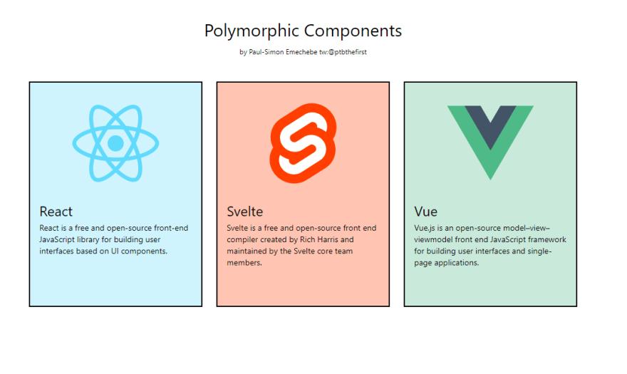
import Card from './components/polymorphic/Card'

const Home = () => {
  return (
    <div className='flex flex-col justify-center items-center min-w-[900px] mx-auto p-11'>
      <div><h1 className='text-3xl'>Polymorphic Components</h1></div>
      <div><h1 className='text-xs mb-5 mt-3'>by Paul-Simon Emechebe   tw:@ptbthefirst</h1></div>
      <div className='p-6 flex flex-row space-x-6'>
        <Card
          show
          variant='react'
          headerText='React'
          text='React is a free and open-source front-end JavaScript library for building user interfaces based on UI components.'
        />
        <Card
          show
          variant='svelte'
          headerText='Svelte'
          text='Svelte is a free and open-source front end compiler created by Rich Harris and maintained by the Svelte core team members.'
        />
        <Card
          show
          variant='vue'
          headerText='Vue'
          text='Vue.js is an open-source model–view–viewmodel front end JavaScript framework for building user interfaces and single-page applications.'
        />
      </div>
    </div>
  )
}

export default Home
进入全屏模式 退出全屏模式
💥💥💥 我们只是构建了一个可以支持不同变体/元素的工作Card组件。你觉得呢?你有没有什么想法?这种模式可以应用于大型应用程序吗?你有没有尝试过这样的事情?我很想收到你的来信。

React社区为您提供最前沿的新闻资讯和知识内容
更多推荐
 0
0 0
0- 0


 已为社区贡献29247条内容

所有评论(0)