React-Bootstrap ONLY Close Button Styling Not Working
Answer a question
For ALL the components I'm using with React-Bootstrap, all the styling is working EXCEPT for close buttons that are built into Modals, Alerts, etc. Examples below.
Alert Component - Expected

Alert Component that I see

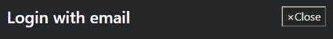
Modal Component - Expected

Modal Component that I see
The same thing is happening for npm packages that I'm using that are built on top of React-Bootstrap, like React-Bootstrap-Typeahead.
These are the dependencies I'm using:
"bootstrap": "^5.0.0-beta1",
"popper.js": "^1.16.1",
"react-bootstrap": "^1.4.0",
"react-bootstrap-typeahead": "^5.1.4"
I import Bootstrap CSS in my index.js file:
import 'bootstrap/dist/css/bootstrap.min.css';

ReactDOM.render(
  <React.StrictMode>
    <App />
  </React.StrictMode>,
  document.getElementById('root')
);
I import React-Bootstrap in my files like this and everything works without a problem EXCEPT the close buttons.
import { Modal, Button, Alert } from 'react-bootstrap';
I'm not importing Popper.js or Bootstrap.js anywhere though. Does anyone know what could be going wrong?
Edits
Underneath is the button being rendered in the HTML DOM and the styles being applied. Strangely, there are no styles being applied for the .close class on the button (and no styles for this in bootstrap.min.css). Also, the majority of the styles related to the button visuals are from the user agent stylesheet
/* From user agent stylesheet */
button {
    appearance: button;
    -webkit-writing-mode: horizontal-tb !important;
    text-rendering: auto;
    color: -internal-light-dark(black, white);
    letter-spacing: normal;
    word-spacing: normal;
    text-transform: none;
    text-indent: 0px;
    text-shadow: none;
    display: inline-block;
    text-align: center;
    align-items: flex-start;
    cursor: default;
    background-color: -internal-light-dark(rgb(239, 239, 239), rgb(59, 59, 59));
    box-sizing: border-box;
    margin: 0em;
    font: 400 13.3333px Arial;
    padding: 1px 6px;
    border-width: 2px;
    border-style: outset;
    border-color: -internal-light-dark(rgb(118, 118, 118), rgb(133, 133, 133));
    border-image: initial;
}
/* The appearance, text-transform, cursor, and margin properties
are being over-riden by _reboot.scss below */

/* From bootstrap/scss/_reboot.scss */
[type=button]:not(:disabled), button:not(:disabled) {
    cursor: pointer;
}

/* This style is being over-riden*/
[type=button], button {
    -webkit-appearance: button;
}

button {
    margin: 0;
    font-family: inherit;
    font-size: inherit;
    line-height: inherit;
    text-transform: none
    border-radius: 0;
}
<button type="button" class="close">
  <span aria-hidden="true">×</span>
  <span class="sr-only">Close alert</span>
</button>
Answers
It has been answered before but I am posting a version independent solution.
THE PROBLEM
react-bootstrap starts acting strangely when it is not matched with it's corresponding bootstrap version. In OP's case, the close button on an Alert component was not styled properly.
THE SOLUTION
We need to make sure that the versions of the two libraries match. Look inside your package.json file and see what versions of bootstrap and react-bootstrap are installed.
package.json:
{
  "name": "react-frontend",
  "version": "0.1.0",
  "private": true,
  "proxy": "http://localhost:5000",
  "dependencies": {

    "bootstrap": "5.0.2",
    "react-bootstrap": "1.4.3"

    // these versions might not match!

  }
}
To find if your versions match, visit the https://react-bootstrap.github.io website and check the versions drop down on the right:
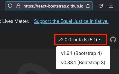
-
react-bootstrap@2and above -bootstrap@5 -
react-bootstrap@1.6.1and above -bootstrap@4 -
react-bootstrap@0.33.1and above -bootstrap@3
To solve the problem in the given example, either downgrade to bootstrap version 4:
npm install --save bootstrap@4 or yarn add bootstrap@4
or upgrade to react-bootstrap 2
npm install --save react-bootstrap@2 or yarn add react-bootstrap@2
In my case upgrading to react-bootstrap didn't work as it introduced other issues, but I successfully downgraded to bootstrap 4.

React社区为您提供最前沿的新闻资讯和知识内容
更多推荐
 0
0 0
0- 0


 已为社区贡献29247条内容

所有评论(0)