Headless React Table 对比 AG Grid React Data Grid
[ ](https://res.cloudinary.com/practicaldev/image/fetch/s--CfvDfXie--/c_limit%2Cf_auto%2Cfl_progressive%2Cq_auto%2Cw_880/ https://blog.ag-grid.com/content/images/2022/06/react-table-vs-ag-grid-data-grid-compared.png)
_这篇文章由Cameron Pavey贡献给 AG Grid 博客 _
在构建复杂的 Web 应用程序时,您经常会发现自己需要比简单表格更高级的东西。这就是数据网格发挥作用的地方。在这种情况下,数据网格本质上是一个交互式表格。这种交互性可能涉及过滤器、排序、编辑、分页和其他交互。有很多库试图提供满足各种用例的数据网格,这个比较将着眼于两个这样的库。
正在考虑的第一个库是AG Grid React。这是一个功能齐全的数据网格,开箱即用。
另一个库是 React Table。与 AG Grid React 不同,React Table不是表格组件;相反,它将自己描述为“表格实用程序”或“用于构建强大的表格和数据网格体验的钩子集合”。这意味着 React Table 不包含任何 UI,但为您提供了在 UI 组件中实现数据网格逻辑所需的部分。
本文以各种方式比较这两个库,通常是通过演示使用每个库实现可比较的特性并比较每种情况下所需的工作量。本文中的所有代码示例都可以在公共 GitHub 存储库以及每个示例的Storybook故事中找到,如果您希望看到它们的实际效果。您还应该注意,本文中的示例大量借鉴了各个库文档中的官方示例。它们可能不是实现特定结果的最有效方式,但它们通常代表了每个图书馆认可的最佳实践。
创建基本网格
作为此比较其余部分的参考框架,很高兴看到这两个库在一个简单的用例中有何不同。每个库文档中的“入门”部分描述了您可以使用每个库制作的最简单的网格。以下代码片段来自所述文档,对于 AG Grid](https://www.ag-grid.com/react-data-grid/getting-started/)和[在这里可以找到用于 React Table。
AG Grid的基本用法如下:
import * as React from 'react';

import { AgGridReact } from 'ag-grid-react';

import 'ag-grid-community/dist/styles/ag-grid.css';
import 'ag-grid-community/dist/styles/ag-theme-alpine.css';

export const AgGrid = () => {

    const [rowData] = React.useState([
        { make: "Toyota", model: "Celica", price: 35000 },
        { make: "Ford", model: "Mondeo", price: 32000 },
        { make: "Porsche", model: "Boxster", price: 72000 }
    ]);

    const [columnDefs] = React.useState([
        { field: 'make' },
        { field: 'model' },
        { field: 'price' }
    ])

    return <div className="ag-theme-alpine" style={{ height: 400, width: 600 }}>
        <AgGridReact
            rowData={rowData}
            columnDefs={columnDefs}>
        </AgGridReact>
    </div>
}
进入全屏模式 退出全屏模式
这将产生一个如下所示的网格:
[ ](https://res.cloudinary.com/practicaldev/image/fetch/s--J8MpiWzB--/c_limit%2Cf_auto%2Cfl_progressive%2Cq_auto%2Cw_880/ https://blog.ag-grid.com/content/images/2022/06/bas-ag-grid.png)
同时,React Table 的基本用法有些冗长:
import * as React from 'react';

import { useTable } from 'react-table';

export const ReactTable = () => {
    const data = React.useMemo<Record<string, string>[]>(
        () => [
            { col1: 'Hello', col2: 'World' },
            { col1: 'react-table', col2: 'rocks' },
            { col1: 'whatever', col2: 'you want' },
        ], []
    )

    const columns = React.useMemo(
        () => [
            { Header: 'Column 1', accessor: 'col1' },
            { Header: 'Column 2', accessor: 'col2' },
        ], []
    )

    const tableInstance = useTable({ columns, data })

    const { getTableProps, getTableBodyProps, headerGroups, rows, prepareRow, } = tableInstance

    return (
        <table {...getTableProps()}>
            <thead>
                {headerGroups.map(headerGroup => (
                    <tr {...headerGroup.getHeaderGroupProps()}>
                        {headerGroup.headers.map(column => (
                            <th {...column.getHeaderProps()}>
                                {column.render('Header')}
                            </th>
                        ))}
                    </tr>
                ))}
            </thead>
            <tbody {...getTableBodyProps()}>
                {
                    rows.map(row => {
                        prepareRow(row)
                        return (
                            <tr {...row.getRowProps()}>
                                {row.cells.map(cell => {
                                    return (<td {...cell.getCellProps()}>
                                        {cell.render('Cell')}
                                    </td>
                                    )
                                })}
                            </tr>
                        )
                    })}
            </tbody>
        </table>
    )
}
进入全屏模式 退出全屏模式
生成的网格也有些乏味且没有样式:
[![Headless React Table 与 AG Grid React Data Grid]相比(https://res.cloudinary.com/practicaldev/image/fetch/s--Sj7tXWjd--/c_limit%2Cf_auto%2Cfl_progressive%2Cq_auto%2Cw_880/https://blog.ag-grid.com/content/images/2022/06/basic-react-table.png)](https://res.cloudinary.com/practicaldev/image/fetch/s--Sj7tXWjd--/c_limit%2Cf_auto%2Cfl_progressive%2Cq_auto%2Cw_880/ https://blog.ag-grid.com/content/images/2022/06/basic-react-table.png)
仅仅从这个比较中,一个主要的区别就很明显了。 AG Grid 采用更具声明性的方法,其中输出在很大程度上受到控制,能够将选项指定为道具。另一方面,React Table 没有任何开箱即用的 UI。相反,您必须在使用提供的钩子注入必要的数据时手动确定表的显示方式。
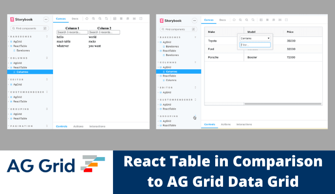
使用列
由于数据网格可能需要满足各种各样的用例,因此实施起来可能很棘手。例如,网格可以是最简单形式的表格。但是,企业通常需要能够与网格动态交互。这可能采取诸如列_sorting_、filtering、rearranging、_pinning_和_resizing_之类的操作的形式。以下示例说明了与每个相关库的交互可能是什么样的。首先,考虑这个 AG Grid 示例:
import * as React from 'react';

import { AgGridReact } from 'ag-grid-react';
import { ColDef } from 'ag-grid-community';

import 'ag-grid-community/dist/styles/ag-grid.css';
import 'ag-grid-community/dist/styles/ag-theme-alpine.css';

export const AgGrid = () => {

    const [rowData] = React.useState([
        { make: "Toyota", model: "Celica", price: 35000 },
        { make: "Ford", model: "Mondeo", price: 32000 },
        { make: "Porsche", model: "Boxster", price: 72000 }
    ]);

    const [columnDefs] = React.useState([
        { field: 'make', pinned: true }, // Only this row is pinned, meaning it cannot be re-ordered
        { field: 'model' }, // Non-pinned rows can be re-ordered by default
        { field: 'price' }
    ])

    // These properties apply to all of the above columns
    const [defaultColDef] = React.useState<ColDef>({
        sortable: true, // Allows the columns to be sorted
        filter: true, // Allows the columns to be filtered
        resizable: true, // Allows the columns to be resized
    })

    return <div className="ag-theme-alpine" style={{ height: 400, width: 600 }}>
        <AgGridReact
            rowData={rowData}
            columnDefs={columnDefs}
            defaultColDef={defaultColDef}
        />
    </div>
}
进入全屏模式 退出全屏模式
此示例使用列定义或columnDefs实现上述所有功能。此属性允许您规定要为每个列启用的功能。defaultColDef属性允许您指定适用于所有列的默认值,除非被更具体的定义覆盖。
[ 相比](https://res.cloudinary.com/practicaldev/image/fetch/s--PnXHBD3X--/c_limit%2Cf_auto%2Cfl_progressive%2Cq_auto%2Cw_880/ https://blog.ag-grid.com/content/images/2022/06/ag-grid-columns.png)
接下来,考虑这个使用 React Grid 实现类似功能的示例:
import * as React from 'react';
import { useSortBy, useTable, useFilters } from 'react-table';
import { matchSorter } from 'match-sorter'

// Define a default UI for filtering
function DefaultColumnFilter({
    column: { filterValue, preFilteredRows, setFilter },
}) {
    const count = preFilteredRows.length

    return (
        <input
            value={filterValue || ''}
            onChange={e => {
                setFilter(e.target.value || undefined) // Set undefined to remove the filter entirely
            }}
            placeholder={`Search ${count} records...`}
        />
    )
}

function fuzzyTextFilterFn(rows, id, filterValue) {
    return matchSorter(rows, filterValue, { keys: [row => row.values[id]] })
}

// Let the table remove the filter if the string is empty
fuzzyTextFilterFn.autoRemove = val => !val

export const ReactTable = () => {

    const filterTypes = React.useMemo(
        () => ({
            // Add a new fuzzyTextFilterFn filter type.
            fuzzyText: fuzzyTextFilterFn,
            // Or, override the default text filter to use
            // "startWith"
            text: (rows, id, filterValue) => {
                return rows.filter(row => {
                    const rowValue = row.values[id]
                    return rowValue !== undefined
                        ? String(rowValue)
                            .toLowerCase()
                            .startsWith(String(filterValue).toLowerCase())
                        : true
                })
            },
        }),
        []
    )

    const data = React.useMemo<Record<string, string>[]>(
        () => [
            { col1: 'hello', col2: 'world' },
            { col1: 'react-table', col2: 'rocks' },
            { col1: 'whatever', col2: 'you want' },
        ], []
    )

    const columns = React.useMemo(
        () => [
            { Header: 'Column 1', accessor: 'col1', filter: 'fuzzytext' },
            { Header: 'Column 2', accessor: 'col2', filter: 'fuzzytext' },
        ], []
    )

    const defaultColumn = React.useMemo(
        () => ({
            // Let's set up our default Filter UI
            Filter: DefaultColumnFilter,
        }),
        []
    )

    const tableInstance = useTable({ columns, data, defaultColumn, filterTypes }, useFilters, useSortBy)

    const { getTableProps, getTableBodyProps, headerGroups, rows, prepareRow } = tableInstance

    return (
        <table {...getTableProps()}>
            <thead>
                {headerGroups.map(headerGroup => (
                    <tr {...headerGroup.getHeaderGroupProps()}>
                        {headerGroup.headers.map(column => (
                            // For sorting, you need to add this function call below
                            <th {...column.getHeaderProps(column.getSortByToggleProps())}>
                                <div>

                                    {column.render('Header')}
                                    {/* Add a sort direction indicator */}
                                    <span>
                                        {column.isSorted
                                            ? column.isSortedDesc
                                                ? ' 🔽'
                                                : ' 🔼'
                                            : ''}
                                    </span>
                                </div>
                                {/* Render the columns filter UI */}
                                <div>{column.canFilter ? column.render('Filter') : null}</div>
                            </th>
                        ))}
                    </tr>
                ))}

            </thead>
            <tbody {...getTableBodyProps()}>
                {
                    rows.map(row => {
                        prepareRow(row)
                        return (
                            <tr {...row.getRowProps()}>
                                {row.cells.map(cell => {
                                    return (<td {...cell.getCellProps()}>
                                        {cell.render('Cell')}
                                    </td>
                                    )
                                })}
                            </tr>
                        )
                    })}
            </tbody>
        </table>
    )
}
进入全屏模式 退出全屏模式
[ 相比](https://res.cloudinary.com/practicaldev/image/fetch/s--7XtPcPd8--/c_limit%2Cf_auto%2Cfl_progressive%2Cq_auto%2Cw_880/ https://blog.ag-grid.com/content/images/2022/06/react-table-columns.png)
这个冗长的示例使用 React Table 实现 sorting 和 filtering。为简洁起见,省略了 resizing 和 reordering 等其他功能,但它们同样需要冗长的命令式实现。如果您有兴趣,官方文档中有一个示例,用于调整和的大小,指定列排序。本机尚不支持交互式列重新排序;但是,它可以通过一些手动](https://github.com/TanStack/react-table/pull/3369)来实现[。
在整个比较过程中,两个库之间的冗长差异将是一个反复出现的主题,因为 AG Grid 倾向于提供大多数所需的功能。同时,React Table 提供了可用于构建表组件的实用程序。
分页
在处理大量数据时,分页是一项重要功能。有问题的两个库都支持分页。使用 AG Grid,添加分页只需指定至少两个道具——pagination和paginationPageSize。还有其他道具可以用于更高级的用例;您可以参考文档了解更多详细信息。考虑下面的例子,看看它在实践中的样子:
import * as React from 'react';

import { AgGridReact } from 'ag-grid-react';

import 'ag-grid-community/dist/styles/ag-grid.css';
import 'ag-grid-community/dist/styles/ag-theme-alpine.css';

// This function will generate lots of data, so that you can see how the table behaves when populated with many rows
function getData() {
    let data = [];
    for (let x = 0; x < 150; x++) {
        data.push(
            {
                make: ["Toyota", "Nissan", "Kia"][Math.floor(Math.random() * 3)],
                model: ["Celica", "KDH", "Sorento"][Math.floor(Math.random() * 3)],
                price: Math.floor(Math.random() * 100000) + 25000,
                type: ["sedan", "van", "jeep"][Math.floor(Math.random() * 3)]
            });
    }
    return data;
};

export const AgGrid = () => {

    const [rowData] = React.useState(getData);

    const [columnDefs] = React.useState([
        { field: 'make' },
        { field: 'model' },
        { field: 'price' }
    ])

    return <div className="ag-theme-alpine" style={{ height: 550, width: 600 }}>
        <AgGridReact
            pagination // This prop enables pagination for the table
            paginationPageSize={10} // This prop specifies how many items to show per page
            rowData={rowData}
            columnDefs={columnDefs}>
        </AgGridReact>
    </div>
}
进入全屏模式 退出全屏模式
[ 相比](https://res.cloudinary.com/practicaldev/image/fetch/s--KqSQlPYo--/c_limit%2Cf_auto%2Cfl_progressive%2Cq_auto%2Cw_880/ https://blog.ag-grid.com/content/images/2022/06/ag-grid-pagination.png)
相比之下,与前面的示例一样,在 React Table 中促进分页的涉及程度更高。考虑以下示例,灵感来自官方分页示例:
import * as React from 'react';
import { usePagination, useTable } from 'react-table';

// This function will generate lots of data, so that you can see how the table behaves when populated with many rows
function getData() {
    let data = [];
    for (let x = 0; x < 150; x++) {
        data.push(
            {
                col1: ["Hello", "react-table", "whatever"][Math.floor(Math.random() * 3)],
                col2: ["World", "rocks", "you want"][Math.floor(Math.random() * 3)],
            }
        );
    }
    return data;
};

export const ReactTable = () => {
    const data = React.useMemo<Record<string, string>[]>(
        getData, []
    )

    const columns = React.useMemo(
        () => [
            { Header: 'Column 1', accessor: 'col1' },
            { Header: 'Column 2', accessor: 'col2' },
        ], []
    )

    const tableInstance = useTable({ columns, data }, usePagination)

    const { getTableProps, getTableBodyProps, headerGroups, page, prepareRow, pageCount, gotoPage, previousPage, nextPage, pageOptions, canPreviousPage, canNextPage, state: { pageIndex, setPageSize } } = tableInstance

    return (
        <>
            <table {...getTableProps()}>
                <thead>
                    {headerGroups.map(headerGroup => (
                        <tr {...headerGroup.getHeaderGroupProps()}>
                            {headerGroup.headers.map(column => (
                                <th {...column.getHeaderProps()}>
                                    {column.render('Header')}
                                </th>
                            ))}
                        </tr>
                    ))}
                </thead>
                <tbody {...getTableBodyProps()}>
                    {page.map((row, i) => {
                        prepareRow(row)
                        return (
                            <tr {...row.getRowProps()}>
                                {row.cells.map(cell => {
                                    return (<td {...cell.getCellProps()}>
                                        {cell.render('Cell')}
                                    </td>
                                    )
                                })}
                            </tr>
                        )
                    })}
                </tbody>
            </table>
            {/*
        Pagination can be built however you'd like.
        This is just a very basic UI implementation:
      */}
            <div className="pagination">
                <button onClick={() => gotoPage(0)} disabled={!canPreviousPage}>
                    {'<<'}
                </button>{' '}
                <button onClick={() => previousPage()} disabled={!canPreviousPage}>
                    {'<'}
                </button>{' '}
                <button onClick={() => nextPage()} disabled={!canNextPage}>
                    {'>'}
                </button>{' '}
                <button onClick={() => gotoPage(pageCount - 1)} disabled={!canNextPage}>
                    {'>>'}
                </button>{' '}
                <span>
                    Page{' '}
                    <strong>
                        {pageIndex + 1} of {pageOptions.length}
                    </strong>{' '}
                </span>
            </div>
        </>
    )
}
进入全屏模式 退出全屏模式
[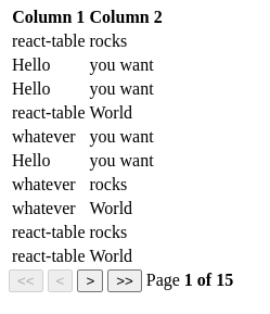 ](https://res.cloudinary.com/practicaldev/image/fetch/s--ByuMKWOb--/c_limit%2Cf_auto%2Cfl_progressive%2Cq_auto%2Cw_880/ https://blog.ag-grid.com/content/images/2022/06/react-table-pagination.png)
主题和样式
在大多数情况下,没有样式的表格是不够的。即使具有良好的默认样式(例如 AG Grid 中包含的样式),表格组件通常也需要专门重新设置样式以匹配应用程序的整体美感。为此,网格库必须包含应用自定义主题和样式的能力。
AG Grid 在文档中提供了说明,详细说明了使用 SCSS 自定义提供的主题的过程。还有a section详细说明了使用常规 CSS 应用更具体的样式覆盖的过程,以解决您无法通过简单地修改主题参数来实现所需设计效果的情况。
作为一个无头库,React Table 不附带 UI。相反,您必须指定您希望组件如何呈现。这意味着您可以完全、富有表现力地控制网格的样式。无论您是想使用 HTML 和 CSS 还是其他 UI 库中的组件,您都可以选择。官方文档包括如何使用来自@material-ui/core和React-Bootstrap的组件创建基本表的示例。在大多数情况下,这些示例看起来与上面看到的基本示例相同,主要区别在于 UI 是从外部库而不是默认 HTML 元素导入的。
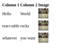
自定义单元格渲染器
通常,网格会将值呈现为原始数据的文本表示形式,有时您可能希望覆盖此呈现行为而无需更改基础数据。例如,如果您的数据包含图像资产的 URL,您可能希望显示实际图像而不仅仅是 URL。
在 AG Grid 中执行此操作涉及定义渲染单元格时要使用的附加组件。考虑以下 AG Grid 示例:
import * as React from 'react';

import { AgGridReact } from 'ag-grid-react';

import 'ag-grid-community/dist/styles/ag-grid.css';
import 'ag-grid-community/dist/styles/ag-theme-alpine.css';
import { ColDef } from 'ag-grid-community';

// This component will be used to render the image cells
const CustomImageRenderer = (props) => {
    return <img alt="" src={props.value} />
}

export const AgGrid = () => {

    const [rowData] = React.useState([
        { name: 'John Doe', image: 'https://picsum.photos/40' },
        { name: 'Jane Doe', image: 'https://picsum.photos/40' },
        { name: 'Bob Smith', image: 'https://picsum.photos/40' },
    ]);

    const [columnDefs] = React.useState<ColDef[]>([
        { field: 'name' },
        { field: 'image', cellRenderer: CustomImageRenderer }, // Here, you can specify your custom renderer
    ])

    return <div className="ag-theme-alpine" style={{ height: 400, width: 600 }}>
        <AgGridReact
            rowData={rowData}
            columnDefs={columnDefs}>
        </AgGridReact>
    </div>
}
进入全屏模式 退出全屏模式
[ 相比](https://res.cloudinary.com/practicaldev/image/fetch/s--fFLU2tbA--/c_limit%2Cf_auto%2Cfl_progressive%2Cq_auto%2Cw_880/ https://blog.ag-grid.com/content/images/2022/06/ag-grid-cell-renderer.png)
在这种情况下,React Table 的实现非常相似。与 AG Grid 一样,您可以定义一个自定义组件来处理某些单元格的渲染。然后在columns配置中指定该组件,如下所示:
import * as React from 'react';
import { useTable } from 'react-table';

// this component will handle rendering of the images
const ImageCellRenderer = (row) => {
    return <img alt="" src={row.value} />
}

export const ReactTable = () => {
    const data = React.useMemo<Record<string, string>[]>(
        () => [
            { col1: 'Hello', col2: 'World', col3: 'https://picsum.photos/40' },
            { col1: 'react-table', col2: 'rocks', col3: 'https://picsum.photos/40' },
            { col1: 'whatever', col2: 'you want', col3: 'https://picsum.photos/40' },
        ], []
    )

    const columns = React.useMemo(
        () => [
            { Header: 'Column 1', accessor: 'col1' },
            { Header: 'Column 2', accessor: 'col2' },
            { Header: 'Image', accessor: 'col3', Cell: ImageCellRenderer }, // Here, you can specify your custom cell renderer
        ], []
    )

    const tableInstance = useTable({ columns, data })

    const { getTableProps, getTableBodyProps, headerGroups, rows, prepareRow, } = tableInstance

    return (
        <table {...getTableProps()}>
            <thead>
                {headerGroups.map(headerGroup => (
                    <tr {...headerGroup.getHeaderGroupProps()}>
                        {headerGroup.headers.map(column => (
                            <th {...column.getHeaderProps()}>
                                {column.render('Header')}
                            </th>
                        ))}
                    </tr>
                ))}
            </thead>
            <tbody {...getTableBodyProps()}>
                {
                    rows.map(row => {
                        prepareRow(row)
                        return (
                            <tr {...row.getRowProps()}>
                                {row.cells.map(cell => {
                                    return (<td {...cell.getCellProps()}>
                                        {cell.render('Cell')}
                                    </td>
                                    )
                                })}
                            </tr>
                        )
                    })}
            </tbody>
        </table>
    )
}
进入全屏模式 退出全屏模式
[ 相比](https://res.cloudinary.com/practicaldev/image/fetch/s--jqIddPLP--/c_limit%2Cf_auto%2Cfl_progressive%2Cq_auto%2Cw_880/ https://blog.ag-grid.com/content/images/2022/06/react-table-cell-renderer.png)
自定义单元格编辑器
另一个类似于自定义渲染器的功能是自定义单元格编辑器。当您希望用户能够与网格交互以以类似 Excel 的方式更新数据时,自定义编辑器会很有用。这可能具有挑战性,因为不同的数据类型通常需要不同的编辑器才能提供良好的用户体验。当然,您可以简单地让用户将所有内容编辑为纯文本,但这对于日期和时间、数字和布尔值等值来说并不理想。考虑以下 AG Grid 示例,其中使用自定义编辑器通过 Select 组件限制用户的输入。
import * as React from 'react';

import { AgGridReact } from 'ag-grid-react';

import 'ag-grid-community/dist/styles/ag-grid.css';
import 'ag-grid-community/dist/styles/ag-theme-alpine.css';

const VehicleEditor = React.forwardRef((props, ref) => {
    const [value, setValue] = React.useState(props.value);
    const refInput = React.useRef(null);

    React.useEffect(() => {
        // focus on the input
        refInput?.current?.focus();
    }, []);

    React.useImperativeHandle(ref, () => {
        return {
            // the final value to send to the grid, on completion of editing
            getValue() {
                return value;
            },
            isCancelBeforeStart() {
                return false;
            },
            isCancelAfterEnd() {
                return false;
            }
        };
    });

    return <select name="cars" id="cars" onChange={(e) => setValue(e.target.value)} value={value}>
        <option value="Toyota">Toyota</option>
        <option value="Ford">Ford</option>
        <option value="Porsche">Porsche</option>
        <option value="Audi">Audi</option>
    </select>

});

export const AgGrid = () => {

    const [rowData] = React.useState([
        { make: "Toyota", model: "Celica", price: 35000 },
        { make: "Ford", model: "Mondeo", price: 32000 },
        { make: "Porsche", model: "Boxster", price: 72000 }
    ]);

    const [columnDefs] = React.useState([
        { field: 'make', cellEditor: VehicleEditor, editable: true },
        { field: 'model' },
        { field: 'price' }
    ])

    return <div className="ag-theme-alpine" style={{ height: 400, width: 600 }}>
        <AgGridReact
            rowData={rowData}
            columnDefs={columnDefs}>
        </AgGridReact>
    </div>
}
进入全屏模式 退出全屏模式
[ 比较](https://res.cloudinary.com/practicaldev/image/fetch/s--DHd6GnqJ--/c_limit%2Cf_auto%2Cfl_progressive%2Cq_auto%2Cw_880/ https://blog.ag-grid.com/content/images/2022/06/ag-grid-custom-editor.png)
React Table 对可编辑单元格没有一流的支持,但因为它本质上只是实用钩子的集合,所以没有什么能阻止你自己实现它。 React Table 的站点有一个示例,其中指定了自定义单元格编辑器,类似于上面的自定义渲染器示例。由于一些变通方法和外部状态提升,此编辑器能够工作。如果您在使用 React Table 时发现自己需要它,这可以作为一种解决方案,但它不如 AG Grid 的一流支持那么优雅。
命令式控制
在复杂的应用程序中,您通常需要将网格与其他组件更深入地集成。这可能采取对网格的内容或配置有影响的其他组件或执行逻辑的动作的形式。为了满足这些用例,开发人员经常需要以 API 的形式对网格进行命令式控制。 AG Grid 允许您通过将 ref 传递给组件来执行此操作,然后该组件将可以访问内部命令式 API。
React Table 有不同的做法,而是选择暴露一个useControlledState钩子,它可以用于细粒度,手动控制整个表状态。
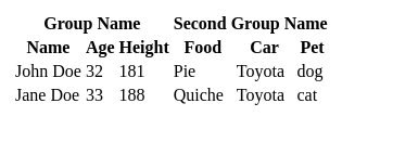
列分组
两个库都以类似的方式支持列分组。对于 AG Grid,这发生在columnDefs属性中,通过指定一个具有headerName和children的对象:
const columnDefs = [
    {
        headerName: 'Group Name',
        children: [
            { field: 'name'},
            { field: 'age'},
            { field: 'height'}
        ]
    },
    {
        headerName: 'Second Group Name',
        children: [
            { field: 'food' },
            { field: 'car' },
            { field: 'pet' },
        ]
    }
];
进入全屏模式 退出全屏模式
[![Headless React Table 与 AG Grid React Data Grid]相比(https://res.cloudinary.com/practicaldev/image/fetch/s--nR0lecw6--/c_limit%2Cf_auto%2Cfl_progressive%2Cq_auto%2Cw_880/https://blog.ag-grid.com/content/images/2022/06/ag-grid-grouping.png)](https://res.cloudinary.com/practicaldev/image/fetch/s--nR0lecw6--/c_limit%2Cf_auto%2Cfl_progressive%2Cq_auto%2Cw_880/ https://blog.ag-grid.com/content/images/2022/06/ag-grid-grouping.png)
这在React Table中的工作方式基本相同,组的指定与普通列相同,但添加了自己的column键:
const columns = React.useMemo(
    () => [
      {
        Header: 'Group Name',
        columns: [
          { Header: 'Name', accessor: 'name' },
          { Header: 'Age', accessor: 'age' },
          { Header: 'Height', accessor: 'height' },
        ],
      },
      {
        Header: 'Second Group Name',
        columns: [
          { Header: 'Food', accessor: 'food' },
          { Header: 'Car', accessor: 'car' },
          { Header: 'Pet', accessor: 'pet' },
        ],
      },
    ],
    []
  )
进入全屏模式 退出全屏模式
[ ](https://res.cloudinary.com/practicaldev/image/fetch/s---JLRaYA5---/c_limit%2Cf_auto%2Cfl_progressive%2Cq_auto%2Cw_880 /https://blog.ag-grid.com/content/images/2022/06/react-table-grouping.png)
企业特性
本文将讨论的最后一组功能通常面向企业用户。这些功能包括分组、透视、聚合、树数据、图表和服务器端数据。为简洁起见,不会为每一个提供完整的代码示例。
聚合
与列分组类似,两个库也通过将附加属性传递到列定义来支持聚合。对于 AG Grid,这是aggFunc属性,对于 React Table,它是一对属性,即aggregate和Aggregated。
树数据
这两个库还支持用于显示树状数据的可扩展子行。在 AG Grid 中,这通过实现getDataPath函数来工作,然后将其作为道具传递给网格。此函数负责返回将用于确定数据嵌套的字符串数组。
React Table 对此功能的实现涉及简单地嵌套数据本身,子行存储在其父行的subRows属性中。
行分组
Tree Data 要求您指定用于将数据分组到层次结构中的路径,而 Row Grouping 以更动态的方式实现了类似的结果,而是允许您对网格中的行执行“分组依据”操作。在 AG Grid 中,这是通过设置一些附加属性来完成的。具体来说,除了在AgGridReact组件上设置groupDisplayType={‘groupRows’}之外,您还需要在希望对数据进行分组的任何列定义上设置rowGroup: true。
React Table 也实现了这种行为。在这种情况下,它以的形式出现,两个附加挂钩、useGroupBy负责实际的分组操作和数据聚合,以及useExpanded允许您显示否则会被聚合隐藏的子行。与迄今为止的其他示例一样,React Table 实现需要更多的手动工作来换取对所有内容如何呈现的精细控制,而 AG Grid 实现只需要您选择加入一些额外的属性。
图表
AG Grid 提供集成图表解决方案,让您以更高级的方式可视化数据。这是一个非常强大的功能,利用它就像在 AgGrid 组件中添加两个道具一样简单,特别是enableCharts和enableRangeSelection。在本文中很难充分介绍集成图表,但如果这是您的用例将从中受益,您应该查看官方文档了解更多详细信息。
不幸的是,React Table 没有图表实现,因为它只关注表格实用程序。但是,有一个来自同一作者的类似库,React Charts,它将自己描述为“一个 React 组件,用于渲染 X/Y 图表的许多不同变体,包括但不限于线条、区域、条形图、柱形图和气泡图。”
结束
在本文中,您已经看到了如何使用 React Table 和 AG Grid 实现一些常用功能的示例。当您从高层次查看这些比较时,会出现一些典型的主题。通常,AG Grid 具有开箱即用的有用功能,您所要做的就是通过启用道具来选择加入。 React Table 还提供了许多实用程序,但通常仅用于这些功能的逻辑方面,需要您将各个部分拼接在一起并提供自己的 UI。这会导致更多的粒度和控制,但代价是付出更多的努力。
如果你有一个非常具体的用例,没有现成的组件可以充分解决,React Table 提供了一组健壮的构建块作为起点。但是,如果 AG Grid 支持您的用例,它可能是最佳选择,因为您可以利用主题、自定义编辑器和自定义渲染器等自定义功能,而无需从头开始构建。
如果您想了解更多关于 AG Grid 以及它是否适合您的信息,请务必参考官方文档和现场演示以查看它的实际效果。
您可以在公共 GitHub 存储库中找到本文中的所有代码示例。

React社区为您提供最前沿的新闻资讯和知识内容
更多推荐
 0
0 0
0- 0


 已为社区贡献7744条内容

所有评论(0)