如何在 React 中构建密码强度计
简介
在大多数 Web 应用程序中,密码通常用于用户身份验证。因此,以安全的方式存储密码非常重要。多年来,已采用诸如单向密码散列之类的技术来隐藏存储在数据库中的密码的真实表示。
尽管密码散列是朝着保护密码迈出的一大步,但用户仍然对密码安全提出了重大挑战:使用常用词作为密码的用户会使散列的努力徒劳无功,因为暴力攻击可以快速破解此类密码。
为了解决这个问题,当今的许多 Web 应用程序都坚持要求用户使用强密码,要么通过确保最小密码长度,要么在密码中使用字母数字字符和符号的某种组合。为了测量密码强度,Dropbox 开发了一种算法,用于真实密码强度估计器,其灵感来自密码破解者。该算法封装在一个名为zxcvbn的 JavaScript 库中。此外,该软件包还包含一本常用英语单词、名称和密码的字典。
在本教程中,我们将使用 React JavaScript 框架创建一个包含全名、电子邮件和密码字段的表单。我们将执行一些轻量级的表单验证,并使用zxcvbn库来估计表单中密码的强度,同时提供视觉反馈。
查看此CodeSandbox 演示,了解您将在本教程结束时创建的内容。
先决条件
在开始之前,请确保您的系统上安装了最新版本的节点。
要学习本教程,您将需要以下内容:
- 最新版本的节点安装在您的机器上。有关如何安装它的更多信息,请从如何安装 Node.js集合中选择您的发行版。
安装* yarn以运行所有NPM脚本并安装项目的依赖项。您可以按照此Yarn 安装指南在您的系统上安装yarn。
第 1 步 - 设置应用程序
本教程将使用create-react-app包来生成新的 React 应用程序。如果尚未安装,请运行以下命令在系统上安装create-react-app:
npm install -g create-react-app
安装完成后,使用以下命令启动一个新的 React 应用程序:
create-react-app react-password-strength
该命令将其命名为react-password-strength,但您可以随意命名。
注意: 如果您使用npm版本 5.2 或更高版本,它附带一个额外的npx二进制文件。使用npx二进制文件,您无需在系统上全局安装create-react-app。您可以使用以下命令启动一个新的 React 应用程序:npx create-react-app react-password-strength。
接下来,您将安装应用程序所需的依赖项。运行以下命令以安装所需的依赖项:
yarn add zxcvbn isemail prop-types node-sass bootstrap
此命令安装以下依赖项:
-
zxcvbn- 上述密码强度估计库。 -
isemail- 电子邮件验证库。 -
prop-types- 运行时检查传递给组件的预期属性类型。 -
node-sass- 用于将 Sass 文件编译为 CSS。
您可能已经注意到,您安装了bootstrap包作为应用程序的依赖项以获得一些默认样式。要在应用程序中包含 Bootstrap,请编辑src/index.js文件并在每个其他import语句之前添加以下行:
src/index.js
import 'bootstrap/dist/css/bootstrap.min.css';
最后,启动您的应用程序:
yarn start
应用程序现已启动,可以开始开发。请注意,已经为您打开了带有_live reloading_ 功能的浏览器选项卡。这将在您开发时与应用程序中的更改保持同步。
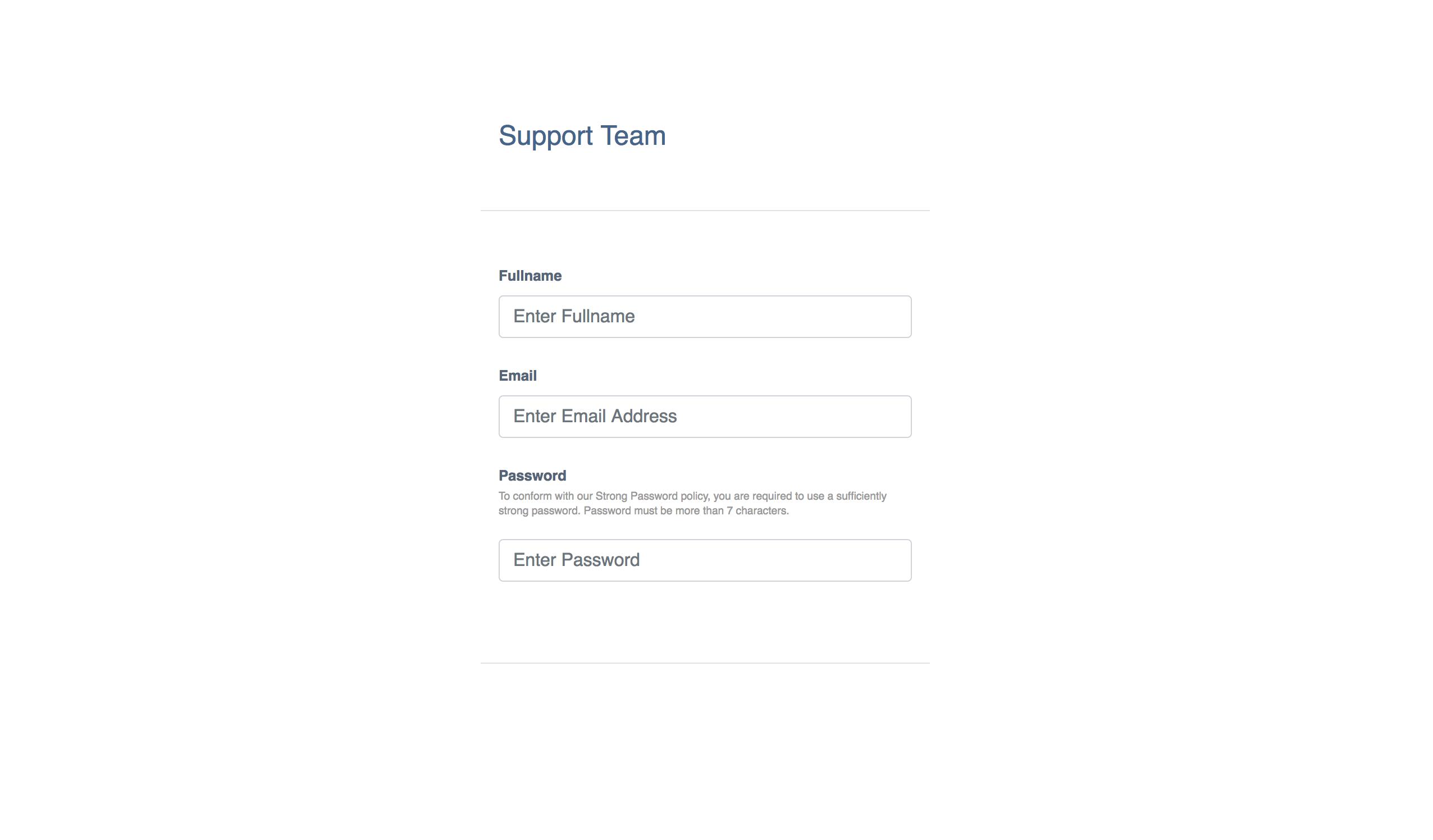
此时,您的应用程序视图将如下图所示:

第 2 步 - 构建组件
此应用程序将使用全名、电子邮件和密码的表格。它还将对字段执行一些轻量级的表单验证。在这一步中,您将创建以下 React 组件:
-
FormField- 使用其属性和更改事件处理程序包装表单输入字段。 -
EmailField- 包装电子邮件FormField并向其添加电子邮件验证逻辑。 -
PasswordField- 包装密码FormField并向其中添加密码验证逻辑。还将密码强度计和其他一些视觉提示附加到该字段。 -
JoinForm- 包含表单字段的虚构_加入支持团队_表单。
在应用程序的src目录内创建一个components目录来存放所有组件。
FormField组件
在src/components目录下新建文件FormField.js并添加如下代码片段:
src/components/FormField.js
import React, { Component, Fragment } from 'react';
import PropTypes from 'prop-types';

class FormField extends Component {

  // initialize state
  state = { value: '', dirty: false, errors: [] }

  hasChanged = e => {
    e.preventDefault();

    // destructure props - assign default dummy functions to validator and onStateChanged props
    const { label, required = false, validator = f => f, onStateChanged = f => f } = this.props;

    const value = e.target.value;
    const isEmpty = value.length === 0;
    const requiredMissing = this.state.dirty && required && isEmpty;

    let errors = [];

    if (requiredMissing) {
      // if required and is empty, add required error to state
      errors = [ ...errors, `${label} is required` ];
    } else if ('function' === typeof validator) {
      try {
        validator(value);
      } catch (e) {
        // if validator throws error, add validation error to state
        errors = [ ...errors, e.message ];
      }
    }

    // update state and call the onStateChanged callback fn after the update
    // dirty is only changed to true and remains true on and after the first state update
    this.setState(({ dirty = false }) => ({ value, errors, dirty: !dirty || dirty }), () => onStateChanged(this.state));
  }

  render() {
    const { value, dirty, errors } = this.state;
    const { type, label, fieldId, placeholder, children } = this.props;

    const hasErrors = errors.length > 0;
    const controlClass = ['form-control', dirty ? hasErrors ? 'is-invalid' : 'is-valid' : '' ].join(' ').trim();

    return (
      <Fragment>
        <div className="form-group px-3 pb-2">
          <div className="d-flex flex-row justify-content-between align-items-center">
            <label htmlFor={fieldId} className="control-label">{label}</label>
            {/** Render the first error if there are any errors **/}
            { hasErrors && <div className="error form-hint font-weight-bold text-right m-0 mb-2">{ errors[0] }</div> }
          </div>
          {/** Render the children nodes passed to component **/}
          {children}
          <input type={type} className={controlClass} id={fieldId} placeholder={placeholder} value={value} onChange={this.hasChanged} />
        </div>
      </Fragment>
    );
  }

}

FormField.propTypes = {
  type: PropTypes.oneOf(["text", "password"]).isRequired,
  label: PropTypes.string.isRequired,
  fieldId: PropTypes.string.isRequired,
  placeholder: PropTypes.string.isRequired,
  required: PropTypes.bool,
  children: PropTypes.node,
  validator: PropTypes.func,
  onStateChanged: PropTypes.func
};

export default FormField;
我们在这个组件中做了一些事情。让我们稍微分解一下:
输入状态:首先,您为表单字段组件初始化state以跟踪输入字段的当前value、字段的dirty状态以及任何现有的验证errors。字段在其值的那一刻变为_dirty_首先改变并保持肮脏。
处理输入更改:接下来,您添加了hasChanged(e)事件处理程序,以在每次输入更改时将状态value更新为当前输入值。在处理程序中,您还解析了字段的dirty状态。你根据 props 检查该字段是否为required字段,如果值为空,则向 stateerrors数组添加验证错误。
但是,如果该字段不是必填字段或必填但不为空,则您委托给传入可选validator属性的验证函数,使用当前输入值调用它,并将抛出的验证错误添加到状态errors数组(如果有任何错误)。
最后,您更新状态并传递要在更新后调用的回调函数。回调函数调用在可选的onStateChanged属性中传递的函数,将更新的状态作为其参数传递。这对于在组件外部传播状态更改将变得很方便。
渲染和道具:在这里您正在渲染输入字段及其标签。您还可以有条件地呈现状态errors数组中的第一个错误(如果有任何错误)。请注意如何使用 Bootstrap 的内置类动态设置输入字段的类以显示验证状态。您还可以渲染组件中包含的任何子节点。
从组件的propTypes中可以看出,该组件所需的 props 是type('text'或'password')、label、placeholder和fieldId。其余组件是可选的。
EmailField组件
在src/components目录下新建文件EmailField.js并在其中添加以下代码片段:
src/components/EmailField.js
import React from 'react';
import PropTypes from 'prop-types';
import { validate } from 'isemail';

import FormField from './FormField';

const EmailField = props => {

  // prevent passing type and validator props from this component to the rendered form field component
  const { type, validator, ...restProps } = props;

  // validateEmail function using the validate() method of the isemail package
  const validateEmail = value => {
    if (!validate(value)) throw new Error('Email is invalid');
  };

  // pass the validateEmail to the validator prop
  return <FormField type="text" validator={validateEmail} {...restProps} />
};

EmailField.propTypes = {
  label: PropTypes.string.isRequired,
  fieldId: PropTypes.string.isRequired,
  placeholder: PropTypes.string.isRequired,
  required: PropTypes.bool,
  children: PropTypes.node,
  onStateChanged: PropTypes.func
};

export default EmailField;
在EmailField组件中,您正在渲染FormField组件并将电子邮件验证函数传递给validator道具。您正在使用isemail包的validate()方法进行电子邮件验证。
您可能还会注意到,除了type和validator道具之外的所有其他道具都从EmailField组件转移到FormField组件。
PasswordField组件
在src/components目录下新建文件PasswordField.js,添加如下代码片段:
src/components/PasswordField.js
import React, { Component, Fragment } from 'react';
import PropTypes from 'prop-types';
import zxcvbn from 'zxcvbn';

import FormField from './FormField';

class PasswordField extends Component {

  constructor(props) {

    super(props);
    const { minStrength = 3, thresholdLength = 7 } = props;

    // set default minStrength to 3 if not a number or not specified
    // minStrength must be a a number between 0 - 4

    this.minStrength = typeof minStrength === 'number'
      ? Math.max( Math.min(minStrength, 4), 0 )
      : 3;

    // set default thresholdLength to 7 if not a number or not specified
    // thresholdLength must be a minimum value of 7

    this.thresholdLength = typeof thresholdLength === 'number'
      ? Math.max(thresholdLength, 7)
      : 7;

    // initialize internal component state
    this.state = { password: '', strength: 0 };
  };

  stateChanged = state => {

    // update the internal state using the updated state from the form field

    this.setState({
      password: state.value,
      strength: zxcvbn(state.value).score
    }, () => this.props.onStateChanged(state));

  };

  validatePasswordStrong = value => {
    // ensure password is long enough
    if (value.length <= this.thresholdLength) throw new Error("Password is short");

    // ensure password is strong enough using the zxcvbn library
    if (zxcvbn(value).score < this.minStrength) throw new Error("Password is weak");
  };

  render() {
    const { type, validator, onStateChanged, children, ...restProps } = this.props;
    const { password, strength } = this.state;

    const passwordLength = password.length;
    const passwordStrong = strength >= this.minStrength;
    const passwordLong = passwordLength > this.thresholdLength;

    // dynamically set the password length counter class
    const counterClass = ['badge badge-pill', passwordLong ? passwordStrong ? 'badge-success' : 'badge-warning' : 'badge-danger'].join(' ').trim();

    // password strength meter is only visible when password is not empty
    const strengthClass = ['strength-meter mt-2', passwordLength > 0 ? 'visible' : 'invisible'].join(' ').trim();

    return (
      <Fragment>
        <div className="position-relative">
          {/** Pass the validation and stateChanged functions as props to the form field **/}
          <FormField type="password" validator={this.validatePasswordStrong} onStateChanged={this.stateChanged} {...restProps}>
            <span className="d-block form-hint">To conform with our Strong Password policy, you are required to use a sufficiently strong password. Password must be more than 7 characters.</span>
            {children}
            {/** Render the password strength meter **/}
            <div className={strengthClass}>
              <div className="strength-meter-fill" data-strength={strength}></div>
            </div>
          </FormField>
          <div className="position-absolute password-count mx-3">
            {/** Render the password length counter indicator **/}
            <span className={counterClass}>{ passwordLength ? passwordLong ? `${this.thresholdLength}+` : passwordLength : '' }</span>
          </div>
        </div>
      </Fragment>
    );
  }

}

PasswordField.propTypes = {
  label: PropTypes.string.isRequired,
  fieldId: PropTypes.string.isRequired,
  placeholder: PropTypes.string.isRequired,
  required: PropTypes.bool,
  children: PropTypes.node,
  onStateChanged: PropTypes.func,
  minStrength: PropTypes.number,
  thresholdLength: PropTypes.number
};

export default PasswordField;
该组件使用zxcvbnJavaScript 密码强度估计器包。该包导出一个zxcvbn()函数,该函数将密码字符串作为其第一个参数,并返回一个具有多个属性的对象,用于密码强度估计。在本教程中,我们将只关注 score 属性,它是一个介于0-4之间的整数,这对于实现视觉强度条很有用。
以下是PasswordField组件中发生的情况的细分:
初始化:在constructor()中,您创建了两个实例属性,thresholdLangth和minStrength,从它们对应的 prop 传递给组件。thresholdLength是可以认为足够长的最小密码长度。它默认为7,不能更低。minStrength是密码被认为足够强之前的最低zxcvbn分数。其值范围为0-4。如果未指定,则默认为3。
您还初始化了密码字段的内部状态以存储当前的password和密码strength。
处理密码更改:您定义了一个密码验证函数,该函数将传递给底层FormField组件的validator属性。该函数确保密码长度大于thresholdLength并且还具有指定minStrength的最小zxcvbn()分数。
您还定义了一个stateChanged()函数,该函数将传递给FormField组件的onStateChanged属性。此函数检索FormField组件的更新状态,并使用它来计算和更新PasswordField组件的新内部状态。
内部状态更新后将调用回调函数。回调函数调用在PasswordField组件的可选onStateChanged属性中传递的函数,将更新的FormField状态作为其参数传递。
渲染和道具:在这里,您渲染了底层FormField组件以及 input hint、password strengthmeter 和 password length counter 的一些元素。
密码强度计根据状态指示当前password的strength,如果密码长度为0,则动态配置为invisible。强度等级不同,强度计会显示不同的颜色。
密码长度计数器指示密码何时足够长。如果密码不超过thresholdLength,则显示密码长度,否则显示thresholdLength后跟plus(+)。
PasswordField组件接受两个额外的可选字段,minStrength和thresholdLength,如组件的propTypes中所定义。
JoinForm组件
在src/components目录下新建文件JoinForm.js并添加以下代码片段:
src/components/JoinForm.js
import React, { Component } from 'react';

import FormField from './FormField';
import EmailField from './EmailField';
import PasswordField from './PasswordField';

class JoinForm extends Component {

  // initialize state to hold validity of form fields
  state = { fullname: false, email: false, password: false }

  // higher-order function that returns a state change watch function
  // sets the corresponding state property to true if the form field has no errors
  fieldStateChanged = field => state => this.setState({ [field]: state.errors.length === 0 });

  // state change watch functions for each field
  emailChanged = this.fieldStateChanged('email');
  fullnameChanged = this.fieldStateChanged('fullname');
  passwordChanged = this.fieldStateChanged('password');

  render() {
    const { fullname, email, password } = this.state;
    const formValidated = fullname && email && password;

    // validation function for the fullname
    // ensures that fullname contains at least two names separated with a space
    const validateFullname = value => {
      const regex = /^[a-z]{2,}(\s[a-z]{2,})+$/i;
      if (!regex.test(value)) throw new Error('Fullname is invalid');
    };

    return (
      <div className="form-container d-table-cell position-relative align-middle">
        <form action="/" method="POST" noValidate>

          <div className="d-flex flex-row justify-content-between align-items-center px-3 mb-5">
            <legend className="form-label mb-0">Support Team</legend>
            {/** Show the form button only if all fields are valid **/}
            { formValidated && <button type="button" className="btn btn-primary text-uppercase px-3 py-2">Join</button> }
          </div>

          <div className="py-5 border-gray border-top border-bottom">
            {/** Render the fullname form field passing the name validation fn **/}
            <FormField type="text" fieldId="fullname" label="Full Name" placeholder="Enter Full Name" validator={validateFullname} onStateChanged={this.fullnameChanged} required />

            {/** Render the email field component **/}
            <EmailField fieldId="email" label="Email" placeholder="Enter Email Address" onStateChanged={this.emailChanged} required />

            {/** Render the password field component using thresholdLength of 7 and minStrength of 3 **/}
            <PasswordField fieldId="password" label="Password" placeholder="Enter Password" onStateChanged={this.passwordChanged} thresholdLength={7} minStrength={3} required />
          </div>

        </form>
      </div>
    );
  }

}

export default JoinForm;
JoinForm组件包装了构成我们表单的表单字段组件。我们初始化状态以保持三个表单字段的有效性:fullname、email和password。它们最初都是false或invalid。
我们还为每个字段定义了状态更改监视函数,以相应地更新表单状态。 watch 函数检查字段中是否没有errors并将该字段的表单内部状态更新为true或valid。然后将这些 watch 函数分配给每个表单字段组件的onStateChanged属性以监视状态更改。
最后,表单被渲染。请注意,您向fullname字段添加了验证函数,以确保提供至少两个名称,由空格分隔且仅包含字母字符。
App组件
到目前为止,浏览器仍然呈现样板 React 应用程序。现在修改src目录下的App.js文件,将JoinForm渲染到AppComponent里面。
App.js文件将类似于以下代码段:
src/App.js
import React from 'react';
import JoinForm from './components/JoinForm';
import './App.css';

function App() {
  return (
    <div className="main-container d-table position-absolute m-auto">
      <JoinForm />
    </div>
  );
}

export default App;
第 3 步 — 使用 Sass 进行样式设置
您距离应用程序的最终外观仅一步之遥。目前,一切似乎都有些格格不入。在这一步中,您将继续定义一些样式规则来设置表单样式。
为了利用强大的 Sass 变量、嵌套和循环,我们之前安装了node-sass的依赖项。您正在使用 Sass 生成浏览器可以理解的 CSS 文件。
安装依赖项后,您需要更改两件事才能在应用程序中使用 Sass:
-
将文件
src/App.css重命名为src/App.scss。 -
编辑
src/App.js中的导入行以引用重命名的文件。
重命名src/App.css文件后,将src/App.js文件更新为以下内容:
src/App.js
import './App.scss';
保存并关闭文件。
接下来,将App.scss文件中的现有内容替换为以下代码以格式化应用程序:
src/App.scss
/** Declare some variables **/
$primary: #007bff;

// Password strength meter color for the different levels
$strength-colors: (darkred, orangered, orange, yellowgreen, green);

// Gap width between strength meter bars
$strength-gap: 6px;

body {
  font-size: 62.5%;
}

.main-container {
  width: 400px;
  top: 0;
  bottom: 0;
  left: 0;
  right: 0;
}

.form-container {
  bottom: 100px;
}

legend.form-label {
  font-size: 1.5rem;
  color: desaturate(darken($primary, 10%), 60%);
}

.control-label {
  font-size: 0.8rem;
  font-weight: bold;
  color: desaturate(darken($primary, 10%), 80%);
}

.form-control {
  font-size: 1rem;
}

.form-hint {
  font-size: 0.6rem;
  line-height: 1.4;
  margin: -5px auto 5px;
  color: #999;

  &.error {
    color: #C00;
    font-size: 0.8rem;
  }
}

button.btn {
  letter-spacing: 1px;
  font-size: 0.8rem;
  font-weight: 600;
}

.password-count {
  bottom: 16px;
  right: 10px;
  font-size: 1rem;
}

.strength-meter {
  position: relative;
  height: 3px;
  background: #DDD;
  margin: 7px 0;
  border-radius: 2px;

  // Dynamically create the gap effect
  &:before,
  &:after {
    content: '';
    height: inherit;
    background: transparent;
    display: block;
    border-color: #FFF;
    border-style: solid;
    border-width: 0 $strength-gap 0;
    position: absolute;
    width: calc(20% + #{$strength-gap});
    z-index: 10;
  }

  // Dynamically create the gap effect
  &:before {
    left: calc(20% - #{($strength-gap / 2)});
  }

  // Dynamically create the gap effect
  &:after {
    right: calc(20% - #{($strength-gap / 2)});
  }
}

.strength-meter-fill {
  background: transparent;
  height: inherit;
  position: absolute;
  width: 0;
  border-radius: inherit;
  transition: width 0.5s ease-in-out, background 0.25s;

  // Dynamically generate strength meter color styles
  @for $i from 1 through 5 {
    &[data-strength='#{$i - 1}'] {
      width: (20% * $i);
      background: nth($strength-colors, $i);
    }
  }
}
您已成功添加应用程序所需的样式。请注意在.strength-meter:before和.strength-meter:after伪元素中使用生成的 CSS 内容来为密码强度计添加间隙。
您还使用 Sass@for指令为不同密码强度级别的强度计动态生成填充颜色。
最终的应用程序屏幕将如下所示:
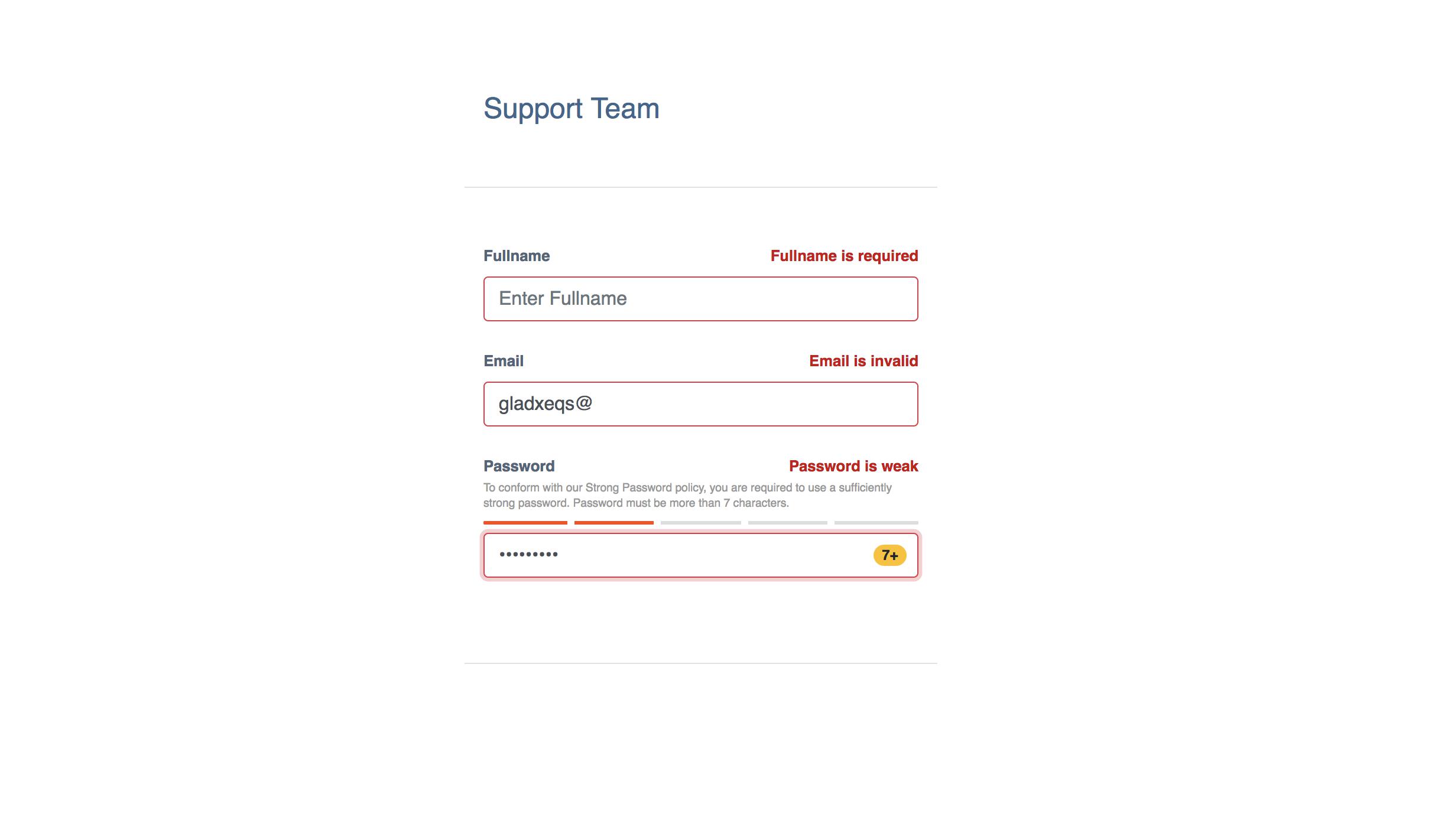
如果出现验证错误,屏幕将如下所示:
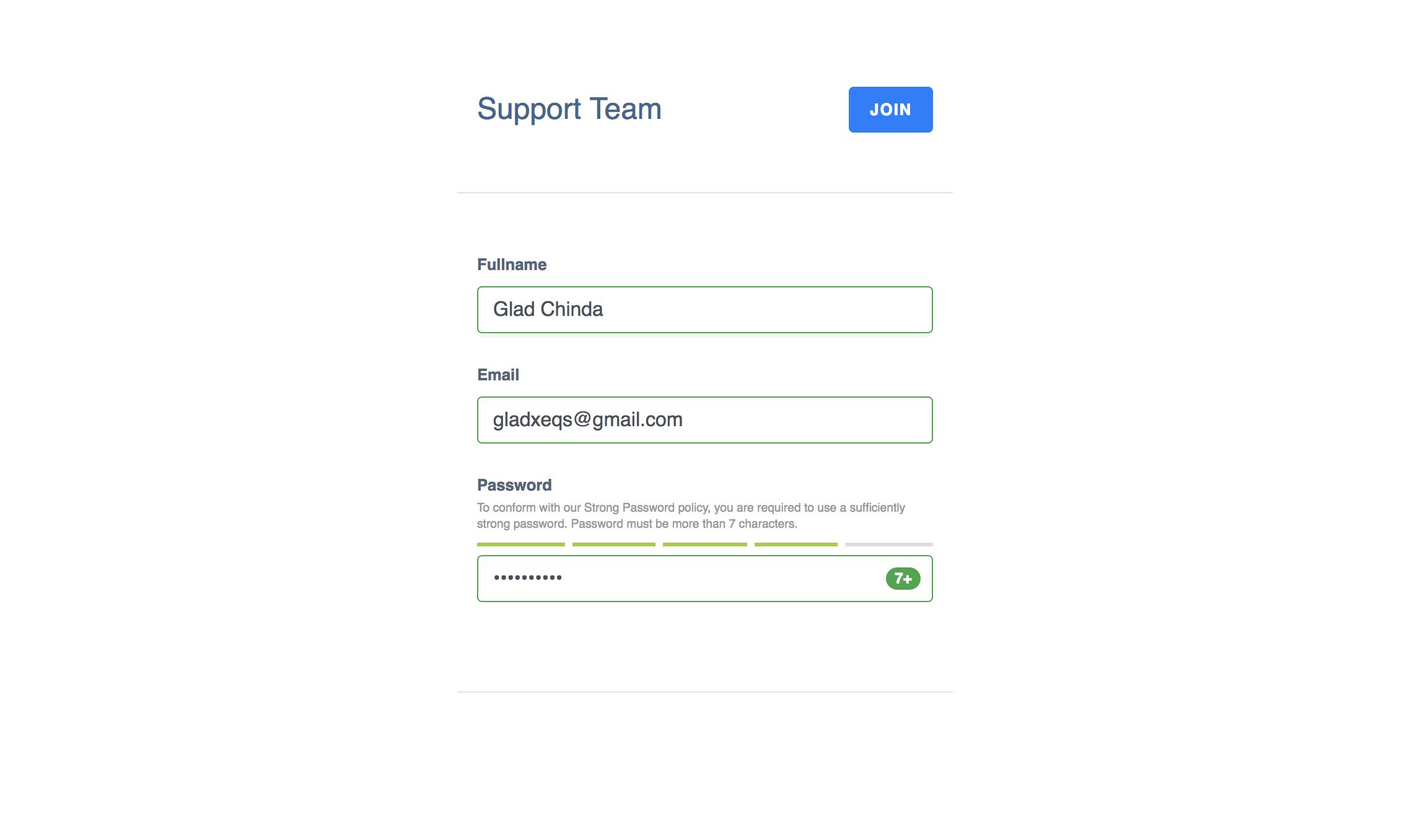
如果没有任何错误,当所有字段都有效时,屏幕将如下所示:
结论
在本教程中,您在 React 应用程序中创建了一个基于zxcvbnJavaScript 库的密码强度计。有关zxcvbn库的详细使用指南和文档,请参阅 GitHub 上的zxcvbn存储库。有关本教程的完整代码示例,请查看 GitHub 上的password-strength-react-demo存储库。您还可以在 Code Sandbox](https://codesandbox.io/s/8kkrpy7260)上获得本教程的[现场演示。
如果你对本文的 AngularJS 版本感兴趣,可以看看:Password Strength Meter in AngularJS。

React社区为您提供最前沿的新闻资讯和知识内容
更多推荐
 0
0 0
0- 0


 已为社区贡献7744条内容

所有评论(0)