Fluent UI React v9 components have customizable parts called "slots." An example of this is the icon slot of a Button which lets you supply an icon to the Button component.
Each component has top-level prop(s) for each supported slot(s). For example, Button has an icon slot, while Input has a root, contentBefore, and contentAfter slots.
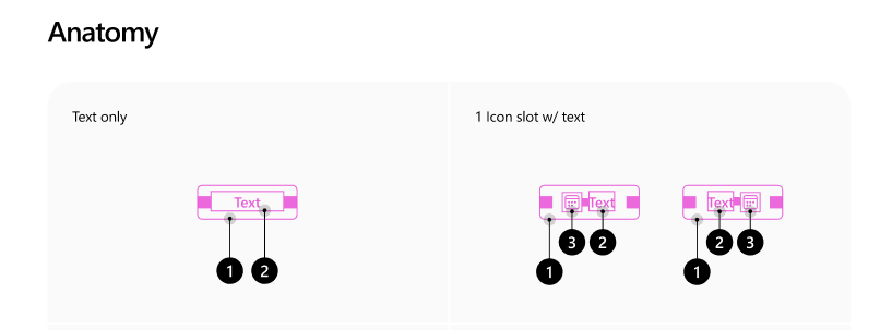
Slots are an integral part of a component's design and we refer to it as the component's anatomy.
The following is a basic example of the Button anatomy:

In the above example, you can see how there's a slot allocated for icon content that sits next to the textual content of the Button.
The slots API give you full control over the slot allowing you to:
- Pass content like text, images, and JSX
- Pass props for state, classes, and event handlers
- Change the type of the slot
- Change the slot entirely
The next set of examples will demonstrate how to customize the icon slot on the Button component, but the same patterns can be used on any of the slots across the component library.
Passing text, images, and JSX to slots
The easiest way to pass content to a slot is to do it directly.
Passing text/emoji to a Button icon slot
JSX:
<Button icon="🚀">Launch</Button>
HTML output:
<button type="button">
  <span>🚀</span>Launch
</button>
Passing image/svg to a Button icon slot
In this example we are using a wrapped SVG icons from @fluentui/react-icons
JSX:
<Button icon={<RocketRegular />}>Launch</Button>
HTML output:
<button type="button">
  <span>
    <svg>...</svg>
  </span>Launch
</button>
Passing JSX to a Button icon slot
JSX:
// Just a basic count down timer
const [countDown, updateCountDown] = React.useState(10);
  setTimeout(() => {
    if (countDown > 0) {
      updateCountDown(countDown - 1);
    } else {
      updateCountDown(10);
    }
  }, 1000);

<Button icon={<CounterBadge color="danger" count={countDown} />}>Launch</Button>
HTML output:
<button type="button">
  <span>
    <div>10</div>
  </span>Launch
</button>
You can find the combined example on CodeSandbox:
Passing props for state, CSS classes, and event handlers
When you need to pass more than just content to a slot, you can leverage the object notation to pass props. Those props are added to the slot itself, as opposed to the content that goes inside the slot.
For the content that gets passed in the slot you use the children prop that can accept primitive values, JSX, and a render function.
Passing data with the data props
JSX:
<Button
  icon={{
    children: "🚀",
    "data-foo": "bar"
  }}>
    Launch
</Button>
HTML output:
<button type="button">
  <span data-foo="bar">🚀</span>Launch
</button>
Passing CSS classes with className prop
Note: This example is using Griffel a CSS-in-JS engine that's used with Fluent UI React v9.
JSX:
const useStyles = makeStyles({
  slotBackground: {
    backgroundColor: tokens.colorBrandBackground,
    ...shorthands.borderRadius(tokens.borderRadiusCircular)
  }
});

const App = () => {
  const c = useStyles();
  return <Button
          icon={{
            children: "🚀",
            className: c.slotBackground
          }}>
          Launch
         </Button>
}
HTML output:
Note: Griffel will generate atomic CSS
<button type="button">
  <span class="...">🚀</span>Launch
</button>
Passing event handlers
In this example the event handlers are attached to the slot itself and not the content. So the counter will start when the mouse enters the slot and will stop when the mouse leaves the slot.
JSX:
const [countDown, updateCountDown] = React.useState(10);
const [count, setCount] = React.useState(false);

setTimeout(() => {
  if (count) {
    if (countDown > 0) {
       updateCountDown(countDown - 1);
    } else {
      updateCountDown(10);
    }
  }
}, 1000);

const onStartCounter = (ev: React.MouseEvent<HTMLButtonElement>) => {
  setCount(true);
};
const onStopCounter = (ev: React.MouseEvent<HTMLButtonElement>) => {
  setCount(false);
};

<Button
  icon={{
    children: <CounterBadge color="danger" count={countDown} />,
    onMouseEnter: onStartCounter,
    onMouseLeave: onStopCounter
  }}>
  Launch
</Button>
HTML output:
<button type="button">
  <span onMouseEnter="..." onMouseLeave="...">
    <div>10</div>
  </span>Launch
</button>
You can find the combined example on CodeSandbox:
Change the type of the slot
In the case of Button the icon slot is by default a span element. If you need to change the type of the slot you can use the same object notation and specify the type with the as property.
JSX:
<Button
  icon={{
    as: "a",
    href: "#launch",
    children: "🚀"
  }}>
  Launch
</Button>
HTML output:
<button type="button">
  <a href="#launch">🚀</a>Launch
</button>
However, in most cases you might find yourself wanting to change the type of the component itself. Which is achieved the same way leveraging the top level as prop on the component - because the component is a slot itself. Common use cases are for changing a Button to an anchor for navigational purposes like with react-router.
JSX
<Button as="a" icon="🚀">Launch</Button>
HTML output:
<a>
  <span>🚀</span>Launch
</a>
You can find the combined example on CodeSandbox:
Change the slot entirely
There are times where you many need to change the entire slot including its containing element.
This is an escape hatch in the slots API, so it's highly recommended to leverage techniques whenever possible.
Handing off the computed props that would have been applied to the slot is critical to being able to handle every slot override case conceivable. Without it, there are computed values locked in the component that the consumer cannot access when doing a replacement or augmentation, such as styles and states they may need to handle. An example of this is open state in an Accordion item, which is calculated by the Accordion parent and handed to the item.
So keep that in mind if you head down this path 😊.
JSX:
<Button
  icon={{
    children: (Icon, iconProps) => {
      return "🚀";
    }
  }}>
  Launch
</Button>
HTML output:
<button type="button">
  🚀Launch
</button>
You can find the combined example on CodeSandbox:
So there you have it. A whirlwind of use cases for customization with slots.
Check out the documentation to learn more about slots.
If you want to learn more about Fluent UI React v9 reach out to us via:
- GitHub: https://github.com/microsoft/fluentui
- Docs: https://react.fluentui.dev
- Twitter: https://twitter.com/fluentui
Enjoy!


 已为社区贡献7744条内容

所有评论(0)