

I like this particular plot and the ability to pass a function to the stat_func keyword to quickly plot up and visualize relationships between variables, but there's one thing. How do I 'turn off' or not plot the marginal distribution axes?
It looks nice but sometime I don't want this feature.
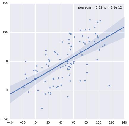
For example using this code:
import numpy as np
import seaborn as sns

x = np.arange(100) + np.random.randn(100)*20
y = np.arange(100) + np.random.randn(100)*20
sns.jointplot(x, y, kind='reg')
How can I remove the kde subplots on the top and right hand side of the main axes?


 已为社区贡献126442条内容

所有评论(0)