
CSS布局,上下布局,左右布局,一列固定,剩下的自适应屏幕大小
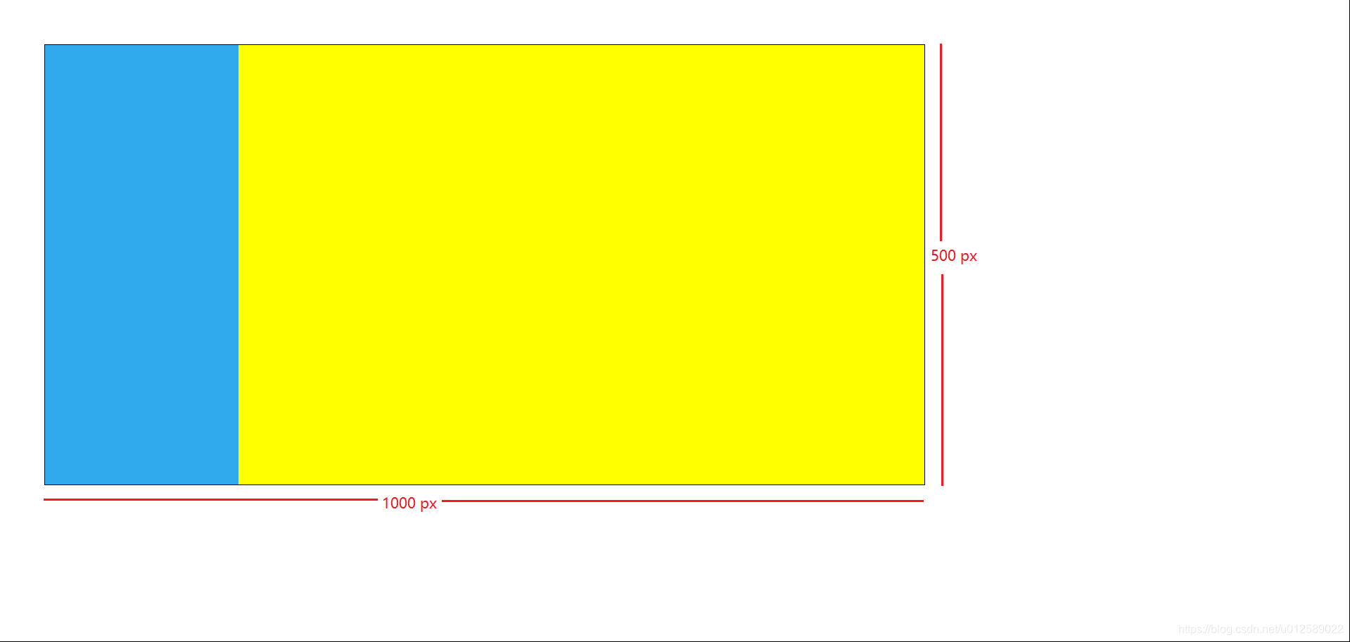
情形1:在固定容器大小内左右布局在一个1000*500大小的容器内,实现左侧固定宽度,右侧根据剩下空间自适应宽度的布局。HTML:<div class="wrapper"><div class="left"></div><div class="righ
·
情形1:在固定容器大小内左右布局
在一个1000*500大小的容器内,实现左侧固定宽度,右侧根据剩下空间自适应宽度的布局。
HTML:
<div class="wrapper">
    <div class="left"></div>
    <div class="right"></div>
</div>
CSS:
* {
    margin: 0;
    padding: 0;
}
html, body {
    width: 100%;
    height: 100%;
}
.wrapper {
    position: relative;
    top: 50px;
    left: 50px;
    border: 1px solid;
    width: 1000px;
    height: 500px;
}
.left {
    width: 220px;
    height: 100%;
    background-color: #2fa8ec;
}
.right {
    position: absolute;
    top: 0;
	bottom: 0;
    left: 220px;
    right: 0;
    background-color: yellow;
}
效果图:
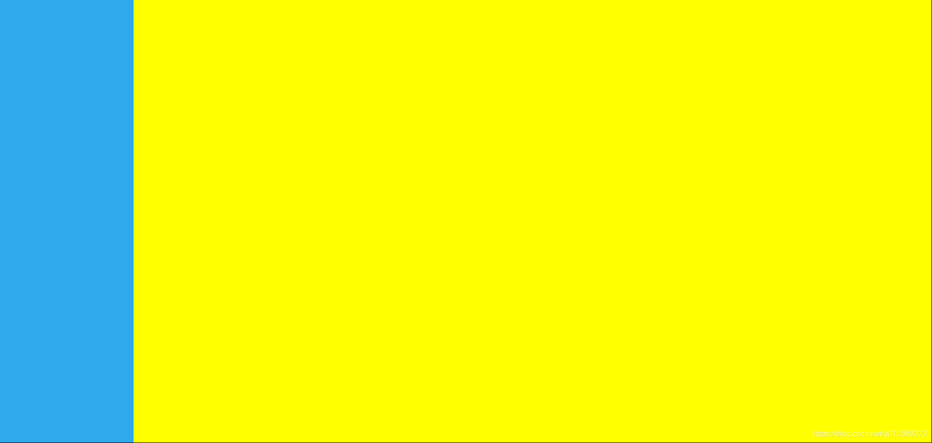
情形2:不在固定大小容器内,根据浏览器大小,左侧固定宽度,右侧自适应,与浏览器窗口等高。
HTML:
<body>
    <div class="left"></div>
    <div class="right"></div>
</body>
CSS:
* {
    margin: 0;
    padding: 0;
}
html, body {
    width: 100%;
    height: 100%;
}
.left {
    width: 220px;
    height: 100%;
    background-color: #2fa8ec;
}
.right {
    position: absolute;
    top: 0;
    left: 220px;
    right: 0;
    background-color: yellow;
    height: 100%;
}
效果图:
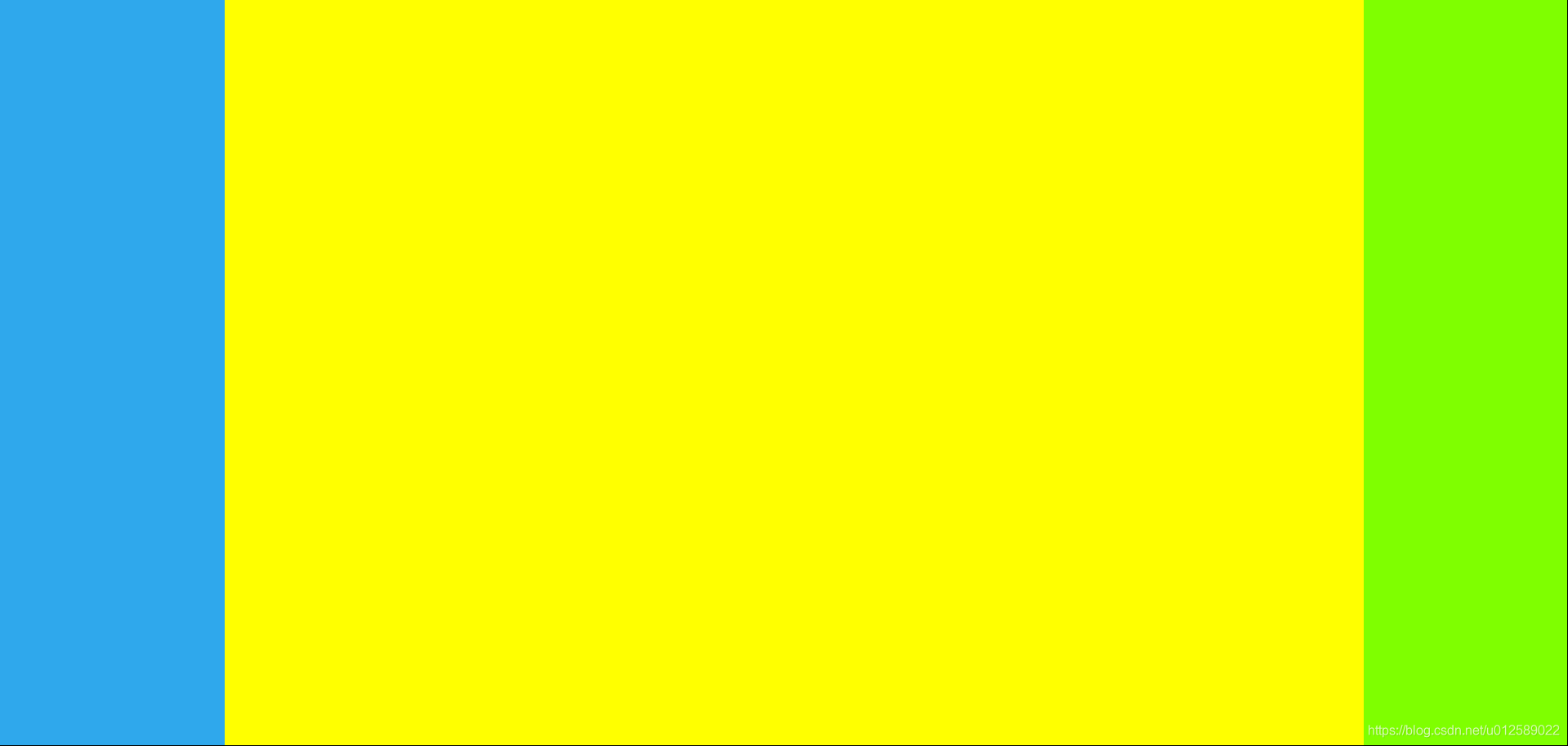
情形3:三列布局,左右固定,中间自适应大小
HTML:
<body>
    <div class="left"></div>
    <div class="center"></div>
    <div class="right"></div>
</body>
CSS:
* {
    margin: 0;
    padding: 0;
}
html, body {
    width: 100%;
    height: 100%;
}
.left {
    width: 220px;
    height: 100%;
    background-color: #2fa8ec;
}
.center {
    position: absolute;
    top: 0;
    left: 220px;
    right: 200px;
    bottom: 0;
    background-color: yellow;
}
.right {
    position: absolute;
    top: 0;
    right: 0;
    width: 200px;
    height: 100%;
    background-color: chartreuse;
}
效果图:
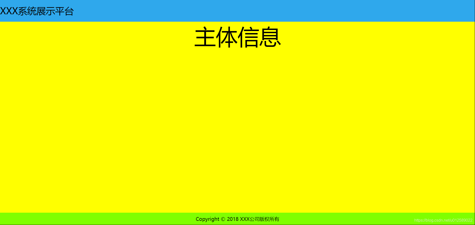
情形4:上下三列布局,头部和底部固定高度,中间自适应屏幕高度
常用于顶部显示logo、标题等内容,中间部分展示主体信息,底部显示公司版权信息等。
HTML:
<body>
    <div class="top">XXX系统展示平台</div>
    <div class="middle">主体信息</div>
    <div class="bottom">Copyright © 2018 XXX公司版权所有</div>
</body>
CSS:
* {
    margin: 0;
    padding: 0;
}
html, body {
    width: 100%;
    height: 100%;
}
.top {
    width: 100%;
    height: 70px;
    background-color: #2fa8ec;
    font-size: 30px;
    line-height: 70px;
}
.middle {
    position: absolute;
    top: 70px;
    bottom: 40px;
    width: 100%;
    background-color: yellow;
    font-size: 70px;
    text-align: center;
}
.bottom {
    position: absolute;
    bottom: 0;
    width: 100%;
    height: 40px;
    line-height: 40px; /*行高与高度相等,内容垂直居中*/
    background-color: chartreuse;
    text-align: center;
}
效果图:
Tips:
① 设置浏览器满屏,无滚动条
html, body {
    width: 100%;
    height: 100%;
}
② 对于自适应大小的一列(行),采用绝对定位方式,如果不设置高(宽)为100%的话,可以通过设置top、bottom、left、right来进行拉伸以显示;

权威|前沿|技术|干货|国内首个API全生命周期开发者社区
更多推荐
 7
7 0
0- 0


 已为社区贡献1条内容

所有评论(0)