
掌握Flutter基础容器组件能够开发美观的鸿蒙应用程序
·
📖 前言
基础容器是 Flutter 布局的基础,它们提供了最基本的布局能力,包括尺寸控制、内边距设置等。掌握这些基础容器组件,是构建复杂布局的前提。
🎯 基础容器组件概览
Flutter 提供了以下基础容器组件:
| 组件名 | 功能说明 | 适用场景 |
|---|---|---|
Container | 通用容器 | 宽高、内边距、装饰、变换 |
SizedBox | 固定尺寸容器 | 设置宽高、间距 |
Padding | 内边距 | 添加内边距 |
📦 Container 组件
Container 是 Flutter 中最常用的通用容器组件,它集成了宽高、内边距、外边距、装饰、变换等多种功能。
Container 组件特性
- ✅ 设置宽高尺寸
- ✅ 添加内边距(padding)和外边距(margin)
- ✅ 设置背景颜色、边框、圆角等装饰效果
- ✅ 应用变换(旋转、缩放、平移)
- ✅ 约束子组件的尺寸
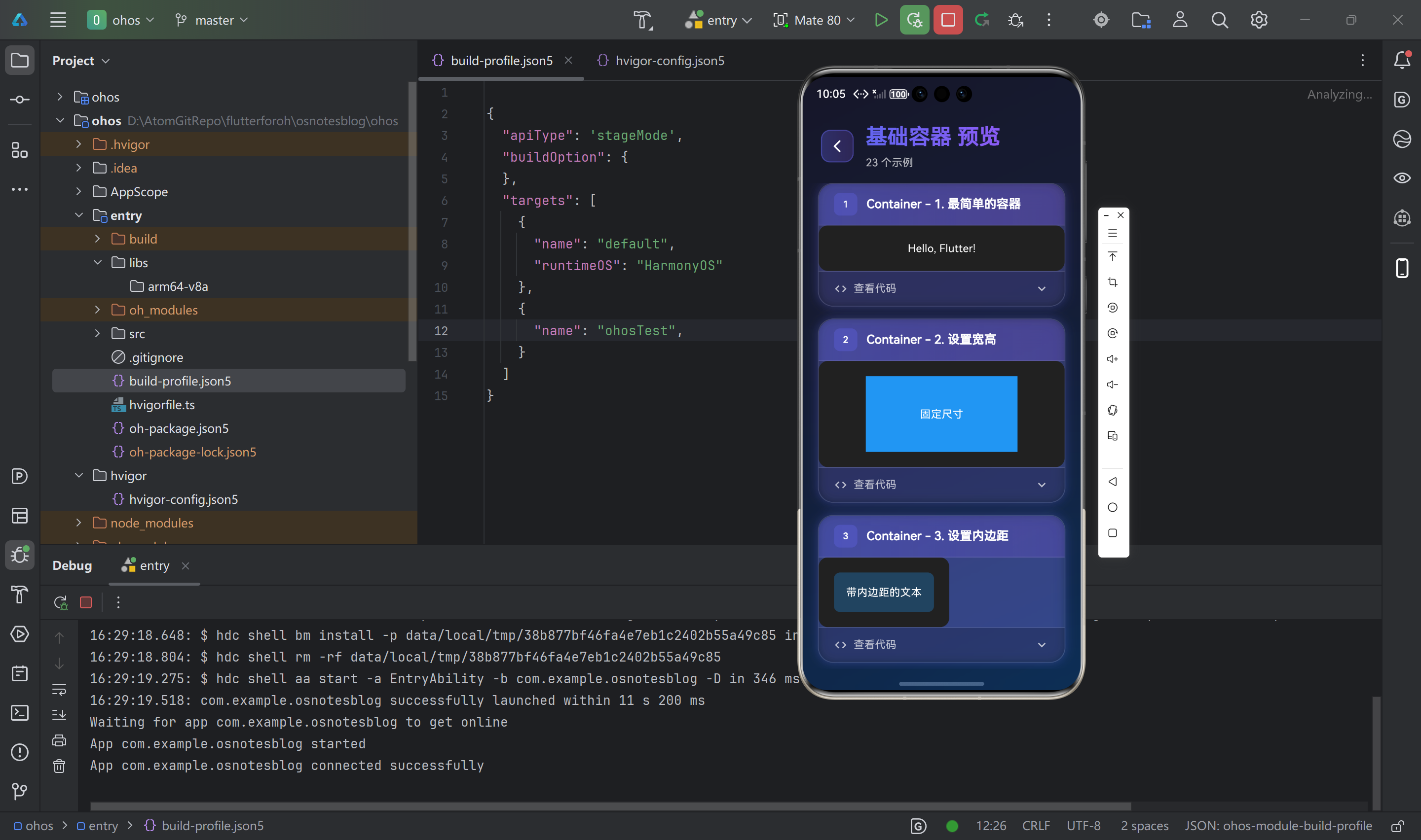
基础用法
// 最简单的容器
Container(
  child: Text('Hello, Flutter!'),
)

// 设置宽高
Container(
  width: 200,
  height: 100,
  color: Colors.blue,
  child: Center(child: Text('固定尺寸')),
)

// 设置内边距
Container(
  padding: EdgeInsets.all(16),
  child: Text('带内边距的文本'),
)

// 设置外边距
Container(
  margin: EdgeInsets.all(16),
  color: Colors.blue,
  child: Text('带外边距的容器'),
)
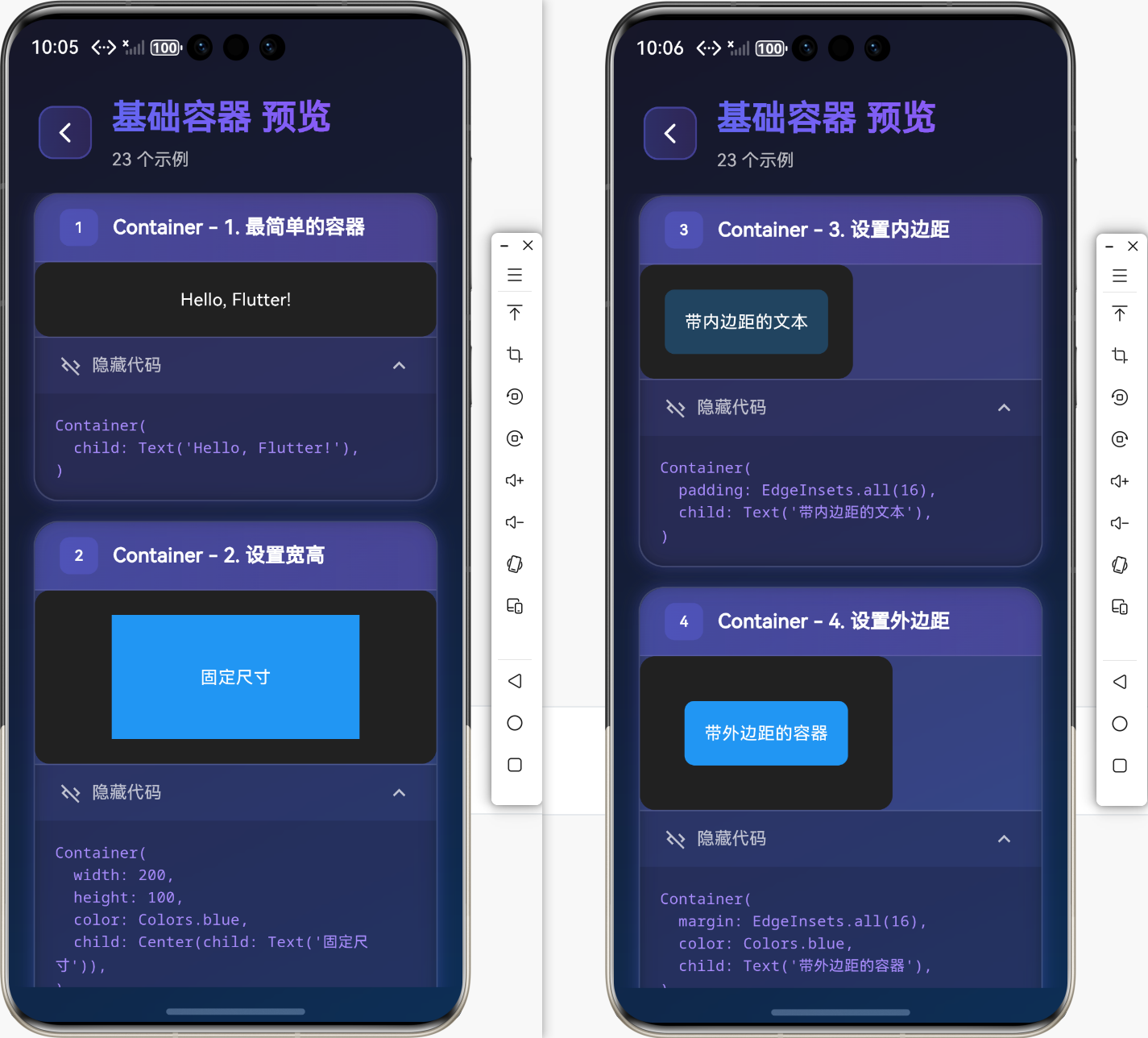
装饰效果
// 圆角边框
Container(
  width: 200,
  height: 100,
  decoration: BoxDecoration(
    color: Colors.blue,
    borderRadius: BorderRadius.circular(12),
  ),
  child: Center(child: Text('圆角容器')),
)

// 边框
Container(
  width: 200,
  height: 100,
  decoration: BoxDecoration(
    color: Colors.white,
    border: Border.all(
      color: Colors.blue,
      width: 2,
    ),
    borderRadius: BorderRadius.circular(8),
  ),
  child: Center(child: Text('带边框的容器')),
)

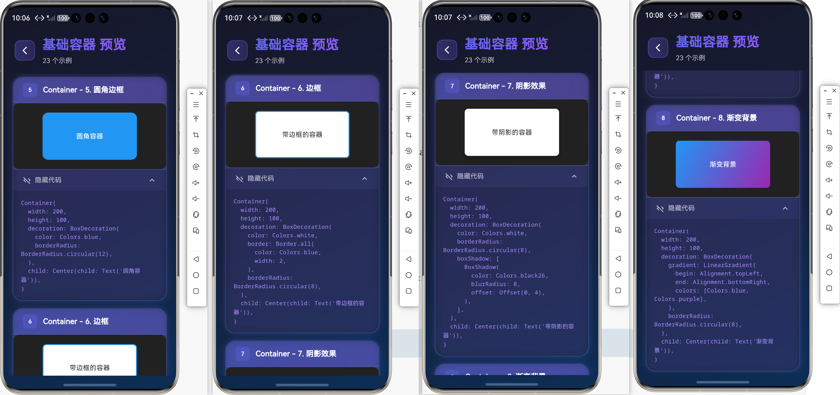
// 阴影效果
Container(
  width: 200,
  height: 100,
  decoration: BoxDecoration(
    color: Colors.white,
    borderRadius: BorderRadius.circular(8),
    boxShadow: [
      BoxShadow(
        color: Colors.black26,
        blurRadius: 8,
        offset: Offset(0, 4),
      ),
    ],
  ),
  child: Center(child: Text('带阴影的容器')),
)

// 渐变背景
Container(
  width: 200,
  height: 100,
  decoration: BoxDecoration(
    gradient: LinearGradient(
      begin: Alignment.topLeft,
      end: Alignment.bottomRight,
      colors: [Colors.blue, Colors.purple],
    ),
    borderRadius: BorderRadius.circular(8),
  ),
  child: Center(child: Text('渐变背景')),
)
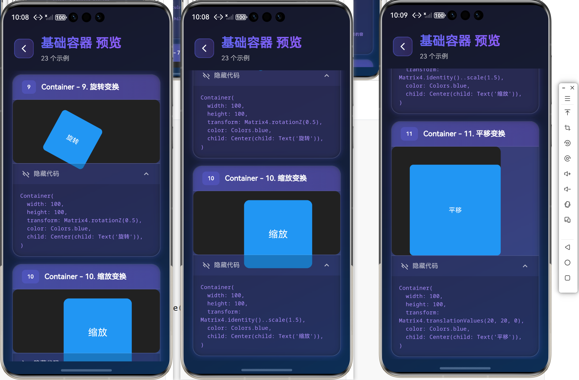
变换效果
// 旋转
Container(
  width: 100,
  height: 100,
  transform: Matrix4.rotationZ(0.5),
  color: Colors.blue,
  child: Center(child: Text('旋转')),
)

// 缩放
Container(
  width: 100,
  height: 100,
  transform: Matrix4.identity()..scale(1.5),
  color: Colors.blue,
  child: Center(child: Text('缩放')),
)

// 平移
Container(
  width: 100,
  height: 100,
  transform: Matrix4.translationValues(20, 20, 0),
  color: Colors.blue,
  child: Center(child: Text('平移')),
)
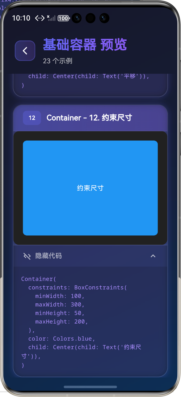
约束和尺寸
// 使用 constraints
Container(
  constraints: BoxConstraints(
    minWidth: 100,
    maxWidth: 300,
    minHeight: 50,
    maxHeight: 200,
  ),
  color: Colors.blue,
  child: Center(child: Text('约束尺寸')),
)

// 填充父容器
Container(
  width: double.infinity,
  height: double.infinity,
  color: Colors.blue,
  child: Center(child: Text('填充父容器')),
)
📏 SizedBox 组件
SizedBox 用于设置固定尺寸或间距,是 Flutter 中最简单、最高效的布局组件之一。
SizedBox 组件特性
- ✅ 设置子组件的固定宽度和高度
- ✅ 创建空白间距
- ✅ 限制子组件的最大/最小尺寸
- ✅ 作为布局约束工具
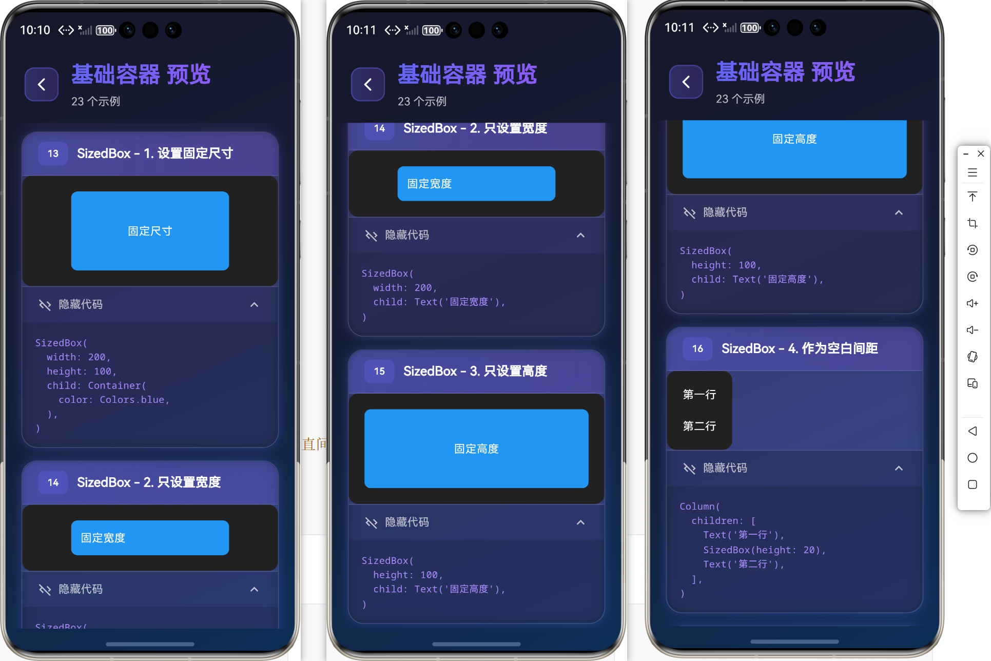
基础用法
// 设置固定尺寸
SizedBox(
  width: 200,
  height: 100,
  child: Container(
    color: Colors.blue,
  ),
)

// 只设置宽度
SizedBox(
  width: 200,
  child: Text('固定宽度'),
)

// 只设置高度
SizedBox(
  height: 100,
  child: Text('固定高度'),
)

// 作为空白间距
Column(
  children: [
    Text('第一行'),
    SizedBox(height: 20),  // 20像素的垂直间距
    Text('第二行'),
  ],
)
SizedBox 的常用形式
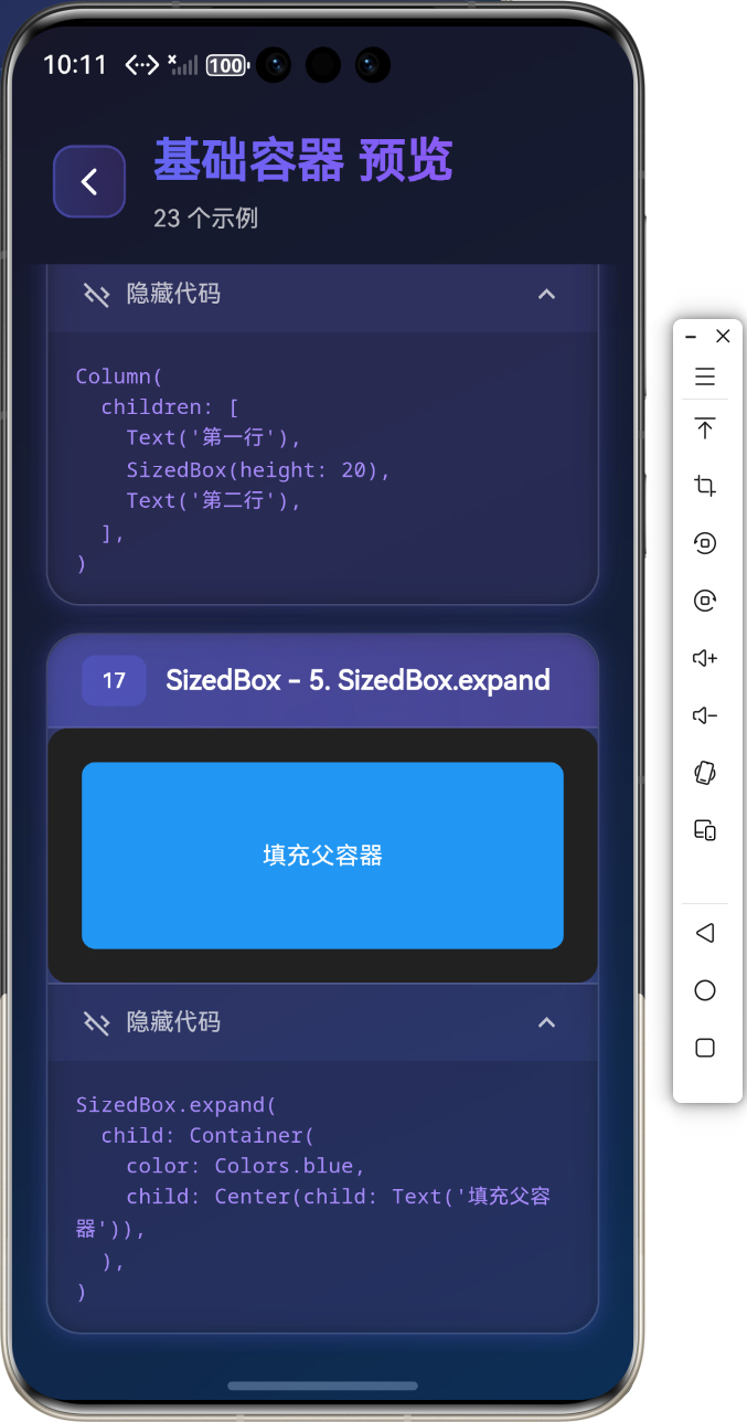
// SizedBox.expand(填充父容器)
SizedBox.expand(
  child: Container(
    color: Colors.blue,
    child: Center(child: Text('填充父容器')),
  ),
)

// SizedBox.shrink(收缩到最小)
SizedBox.shrink()

// SizedBox.fromSize(从 Size 创建)
SizedBox.fromSize(
  size: Size(200, 100),
  child: Container(color: Colors.blue),
)
📐 Padding 组件
Padding 用于内边距布局,可以给子组件添加内边距(padding)。
Padding 组件特性
- ✅ 给子组件添加内边距(padding)
- ✅ 控制子组件与父容器边缘的距离
- ✅ 改善 UI 的视觉效果和可读性
- ✅ 与其他布局组件配合使用
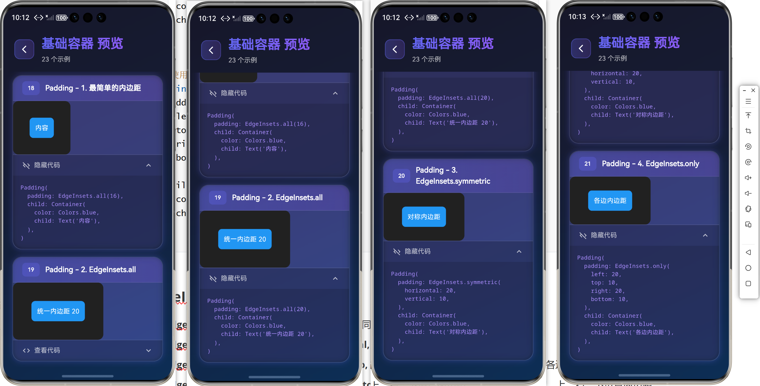
基础用法
// 最简单的内边距
Padding(
  padding: EdgeInsets.all(16),
  child: Container(
    color: Colors.blue,
    child: Text('内容'),
  ),
)

// 使用 EdgeInsets.all 设置统一内边距
Padding(
  padding: EdgeInsets.all(20),
  child: Container(
    color: Colors.blue,
    child: Text('统一内边距 20'),
  ),
)

// 使用 EdgeInsets.symmetric 设置对称内边距
Padding(
  padding: EdgeInsets.symmetric(
    horizontal: 20, // 左右内边距
    vertical: 10,  // 上下内边距
  ),
  child: Container(
    color: Colors.blue,
    child: Text('对称内边距'),
  ),
)

// 使用 EdgeInsets.only 设置各边内边距
Padding(
  padding: EdgeInsets.only(
    left: 20,
    top: 10,
    right: 20,
    bottom: 10,
  ),
  child: Container(
    color: Colors.blue,
    child: Text('各边内边距'),
  ),
)
EdgeInsets 详解
- EdgeInsets.all(double value): 所有边使用相同的内边距
- EdgeInsets.symmetric({double? horizontal, double? vertical}): 对称内边距
- EdgeInsets.only({double? left, double? top, double? right, double? bottom}): 指定各边内边距
- EdgeInsets.fromLTRB(double left, double top, double right, double bottom): 从左、上、右、下设置内边距
- EdgeInsets.zero: 无内边距
💡 实际应用场景
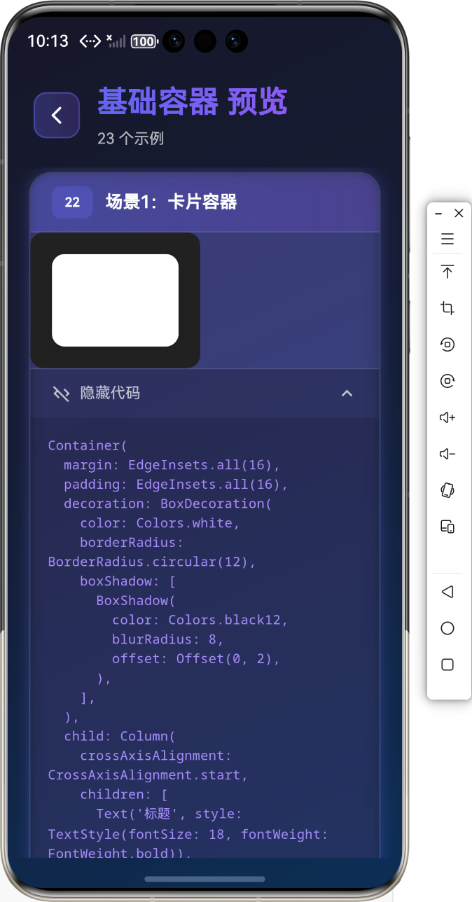
场景1:卡片容器
Container(
  margin: EdgeInsets.all(16),
  padding: EdgeInsets.all(16),
  decoration: BoxDecoration(
    color: Colors.white,
    borderRadius: BorderRadius.circular(12),
    boxShadow: [
      BoxShadow(
        color: Colors.black12,
        blurRadius: 8,
        offset: Offset(0, 2),
      ),
    ],
  ),
  child: Column(
    crossAxisAlignment: CrossAxisAlignment.start,
    children: [
      Text('标题', style: TextStyle(fontSize: 18, fontWeight: FontWeight.bold)),
      SizedBox(height: 8),
      Text('这是卡片内容'),
    ],
  ),
)
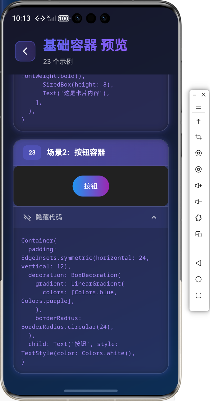
场景2:按钮容器
Container(
  padding: EdgeInsets.symmetric(horizontal: 24, vertical: 12),
  decoration: BoxDecoration(
    gradient: LinearGradient(
      colors: [Colors.blue, Colors.purple],
    ),
    borderRadius: BorderRadius.circular(24),
  ),
  child: Text('按钮', style: TextStyle(color: Colors.white)),
)
⚠️ 常见问题与解决方案
问题1:Container 的 color 和 decoration 不能同时使用
问题描述:设置了 decoration 后,直接设置 color 会报错。
解决方案:
// 错误写法
Container(
  color: Colors.blue,
  decoration: BoxDecoration(...), // 会报错
)

// 正确写法
Container(
  decoration: BoxDecoration(
    color: Colors.blue, // 在 decoration 中设置颜色
    borderRadius: BorderRadius.circular(8),
  ),
)
问题2:SizedBox 作为间距时子组件可选
问题描述:SizedBox 作为间距使用时,可以不提供 child。
解决方案:
Column(
  children: [
    Text('第一行'),
    SizedBox(height: 20), // 不需要 child
    Text('第二行'),
  ],
)
问题3:Padding 与 Container 的区别
问题描述:什么时候使用 Padding,什么时候使用 Container?
解决方案:
- 如果只需要设置内边距,使用
Padding(更轻量级) - 如果需要设置内边距、外边距、装饰等,使用
Container(功能更全面)
🎨 最佳实践
1. 组件选择指南
| 需求 | 推荐组件 |
|---|---|
| 简单容器 | Container |
| 仅设置尺寸 | SizedBox |
| 仅设置内边距 | Padding |
| 需要装饰效果 | Container |
| 需要变换效果 | Container |
2. 性能优化技巧
// 使用 const 构造函数
const SizedBox(height: 16)
// 避免不必要的重建
class MyWidget extends StatelessWidget {
final Widget child;
const MyWidget({required this.child});
Widget build(BuildContext context) {
return Container(child: child);
}
}
3. 代码组织
// 将复杂布局拆分为独立方法
Widget _buildCard() {
  return Container(
    padding: EdgeInsets.all(16),
    decoration: BoxDecoration(...),
    child: Column(...),
  );
}
📚 总结
通过本教程,我们学习了:
- ✅
Container组件的各种用法(尺寸、装饰、变换) - ✅
SizedBox组件的尺寸控制和间距创建 - ✅
Padding组件的内边距设置 - ✅ 实际应用场景和最佳实践
- ✅ 常见问题解决方案
基础容器是 Flutter 布局的基础,掌握好这些组件的用法,能够让你构建出各种复杂的界面!
🔗 相关资源
Happy Coding! 🎨✨
更多推荐
 17
17 0
0- 0


 已为社区贡献3条内容

所有评论(0)