
鸿蒙应用开发UI基础第九节: 线性布局容器Column/Row核心讲解与实战演示
【学习目标】
- 理解布局概念,Column / Row 的布局原理,掌握主轴、交叉轴的核心概念;
- 熟练使用 justifyContent / alignItems 控制组件对齐方式;
- 掌握 spacing、padding、margin 在线性布局中的作用,熟悉
margin失效原因及解决方案; - 掌握线性布局嵌套技巧,避免布局过深导致性能问题;
- 理解 alignSelf + ItemAlign 枚举的用法,实现子组件差异化交叉轴对齐;
一、工程结构
本节创建新工程 ColumnRowApplication(基于鸿蒙 API 12+ / Stage 模型),用于编写和运行线性布局(Row/Column)相关演示代码,工程核心目录结构如下:
ColumnRowApplication
├── AppScope
│   └── app.json5                  # 应用全局配置
├── entry                          # 主模块目录
│   ├── src/main
│   │   ├── ets                    # ArkTS 代码目录
│   │   │   ├── entryability       # 应用入口能力(启动/生命周期管理)
│   │   │   ├── entrybackupability # 备份入口能力(可选)
│   │   │   └── pages              # 页面目录(所有演示页面)
│   │   │       ├── AlignSelfPage.ets       # 子组件差异化对齐(alignSelf + ItemAlign)
│   │   │       ├── ColumnFlexAlignPage.ets # Column 主轴对齐(justifyContent)
│   │   │       ├── ColumnItemAlignPage.ets # Column 交叉轴对齐(alignItems)
│   │   │       ├── Index.ets              # 主入口页面(演示跳转入口)
│   │   │       ├── MarginPage.ets          # margin 失效问题及解决方案
│   │   │       ├── RowFlexAlignPage.ets    # Row 主轴对齐(justifyContent)
│   │   │       ├── RowItemAlignPage.ets    # Row 交叉轴对齐(alignItems)
│   │   ├── resources              # 资源目录
│   │   │   └── base
│   │   │       ├── element        # 基础元素配置
│   │   │       │   ├── color.json          # 颜色资源
│   │   │       │   ├── float.json          # 浮点数值
│   │   │       │   └── string.json         # 字符串资源
│   │   │       ├── media          # 媒体资源
│   │   │       └── profile        # 设备适配配置
│   │   └── module.json5           # 模块配置
└── build-profile.json5            # 工程构建配置
二、布局概述
组件按照布局规则有序排列,共同构成应用的完整页面。在ArkTS声明式UI体系中,所有页面均由自定义组件搭建,开发者需根据页面的视觉结构和适配需求,选择最合适的布局方式完成开发。
布局的核心作用是通过特定的容器组件或属性,精准控制页面中所有UI组件的尺寸大小和显示位置。为保证布局效果的一致性和适配性,实际开发中建议遵循以下流程:
- 确定页面骨架:梳理页面的整体布局结构(如“顶部导航+中间内容+底部操作”);
- 拆解元素构成:分析每个区域内的元素类型、数量及排列关系;
- 选择布局方案:针对不同区域的需求,选用适配的布局容器/属性(如线性布局、弹性布局)控制元素的位置和大小。
鸿蒙常用布局分类:
线性布局(Row、Column)、层叠布局(Stack)、弹性布局(Flex)、相对布局(RelativeContainer)、栅格布局(GridRow、GridCol)、选项卡(Tabs),后续会逐一讲解。
线性布局:最常用的核心布局之一
线性布局是ArkTS中使用频率最高的布局方式,其核心特征是将子组件沿单一固定方向依次排列,无默认换行行为。
1. 线性布局的两大核心组件
线性布局通过两个容器组件实现不同方向的排列,每个组件都有明确的“主轴”(即排列方向):
| 组件名 | 排列方向 | 主轴定义 | 直观效果 |
|---|---|---|---|
| Column | 垂直方向 | 子组件从上到下排列,垂直方向为Column的主轴 | 📝 元素1 📝 元素2 📝 元素3 |
| Row | 水平方向 | 子组件从左到右排列,水平方向为Row的主轴 | 📝 元素1 📝 元素2 📝 元素3 |
2. 线性布局的核心概念:主轴 & 交叉轴
理解这两个概念是掌握线性布局对齐、适配规则的关键,二者为垂直关系:
- 主轴:子组件的排列方向(Column=垂直,Row=水平)→ 决定组件“往哪个方向排”
- 交叉轴:与主轴垂直的方向(Column=水平,Row=垂直)→ 决定组件“在垂直方向如何对齐”
三、主轴对齐:justifyContent
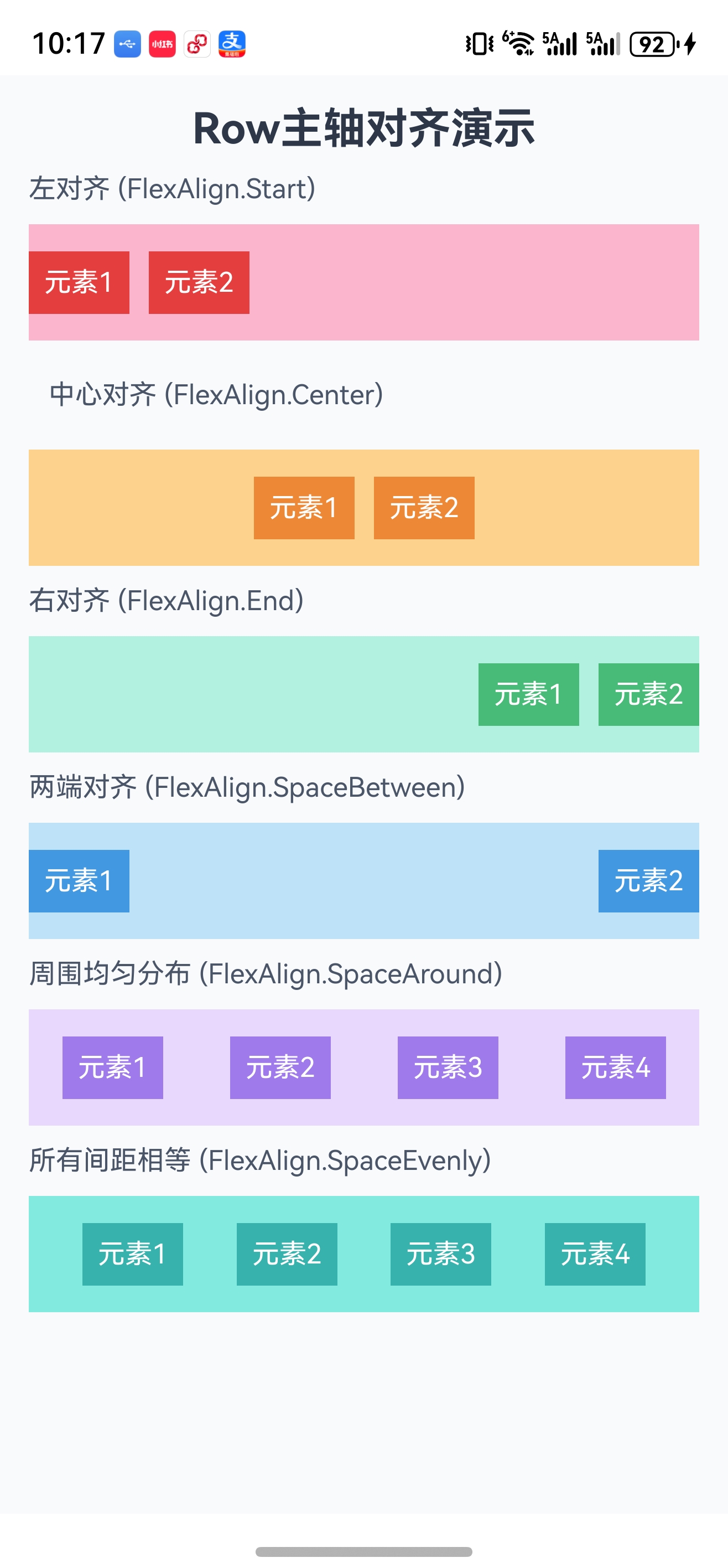
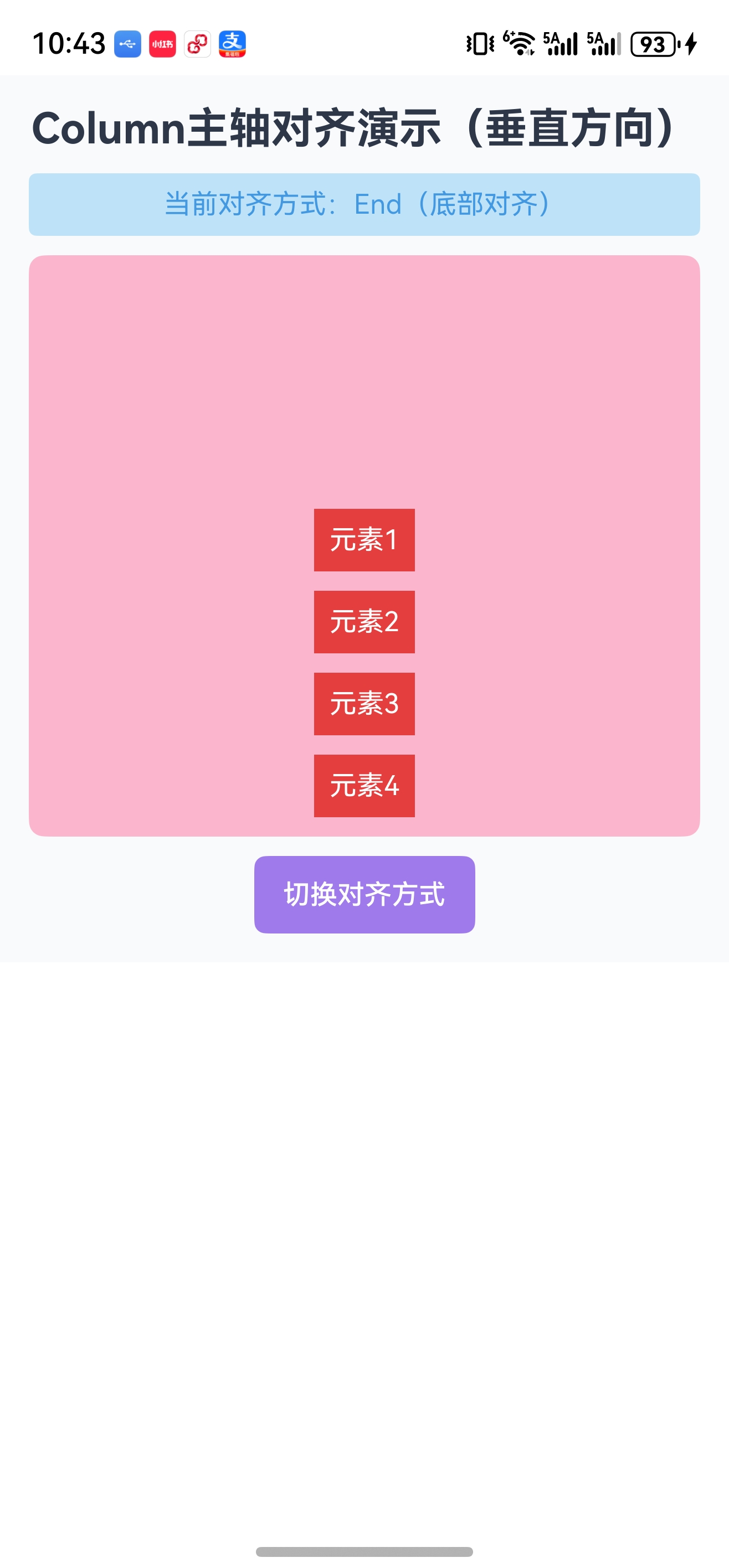
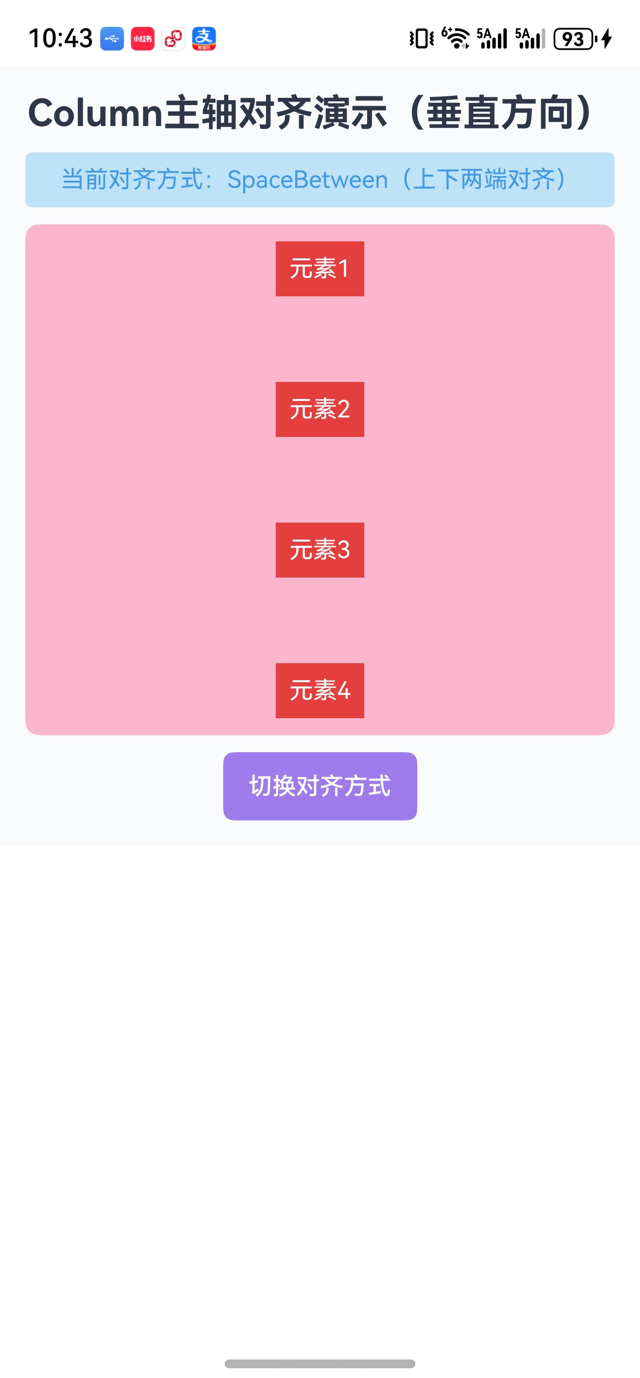
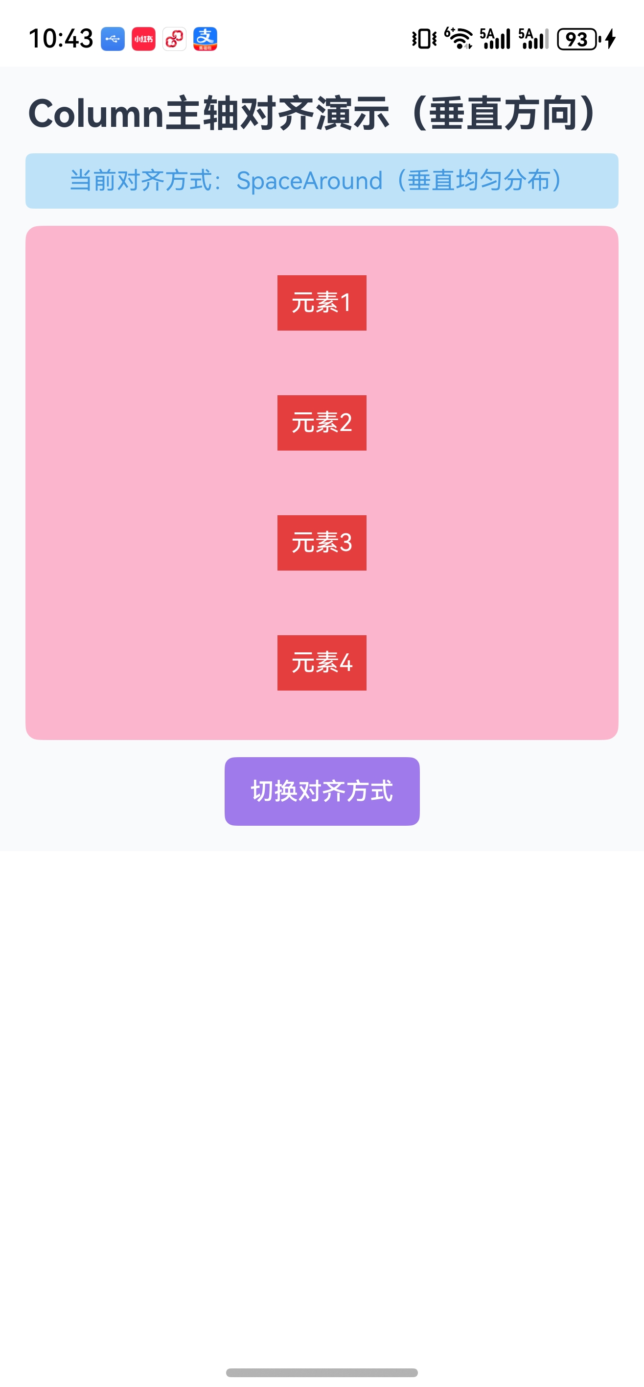
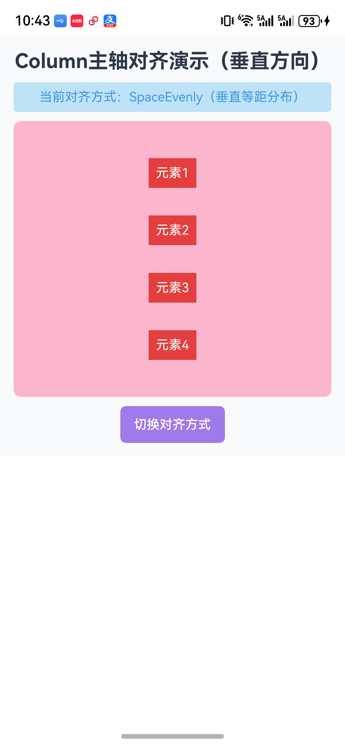
justifyContent 用于控制子组件在主轴方向上的对齐方式,参数为 FlexAlign 枚举,不同容器的主轴方向不同,但枚举值通用:
| FlexAlign 枚举值 | Row(水平主轴) | Column(垂直主轴) | 适用场景 |
|---|---|---|---|
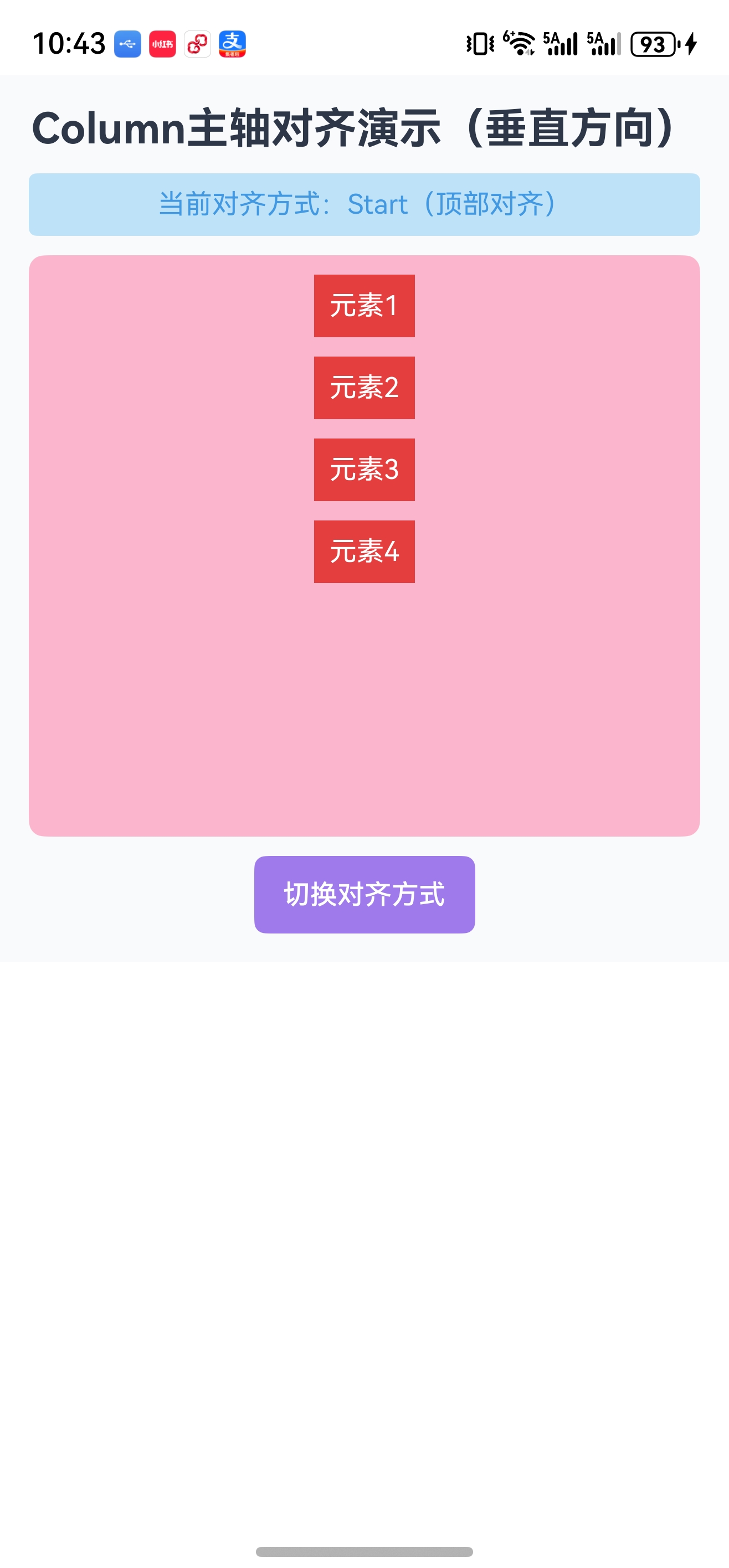
| Start | 左对齐(默认) | 顶部对齐(默认) | 基础靠左/靠上排列 |
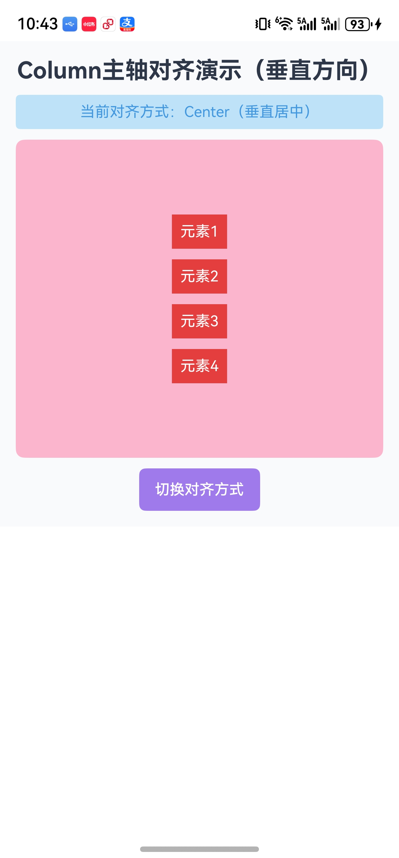
| Center | 水平居中 | 垂直居中 | 居中展示核心内容 |
| End | 右对齐 | 底部对齐 | 靠右/靠下排列 |
| SpaceBetween | 两端对齐(首尾贴边,中间均分) | 上下两端对齐(首尾贴边,中间均分) | 分散排列且首尾贴边 |
| SpaceAround | 每个组件两侧间距相等 | 每个组件上下间距相等 | 均匀分散排列 |
| SpaceEvenly | 所有间距完全相等 | 所有间距完全相等 | 严格等距排列 |
四、资源文件配置(统一管理颜色)
在 entry/src/main/resources/base/element/color.json 中配置颜色资源(统一管理,便于维护和多主题适配):
{
  "color": [
    { "name": "bg_page", "value": "#F7FAFC" },
    { "name": "text_primary", "value": "#333333" },
    { "name": "text_secondary", "value": "#666666" },
    { "name": "text_white", "value": "#FFFFFF" },
    { "name": "primary_red", "value": "#F53F3F" },
    { "name": "bg_red_light", "value": "#FEE2E2" },
    { "name": "primary_orange", "value": "#FF7D00" },
    { "name": "bg_orange_light", "value": "#FFF1E0" },
    { "name": "primary_green", "value": "#00B42A" },
    { "name": "bg_green_light", "value": "#E8FFE8" },
    { "name": "primary_blue", "value": "#165DFF" },
    { "name": "bg_blue_light", "value": "#E8F3FF" },
    { "name": "primary_purple", "value": "#722ED1" },
    { "name": "bg_purple_light", "value": "#F3E8FF" },
    { "name": "primary_teal", "value": "#00B4AA" },
    { "name": "bg_teal_light", "value": "#E0FFFE" },
    { "name": "bg_white", "value": "#FFFFFF" }
  ]
}
五、代码演示
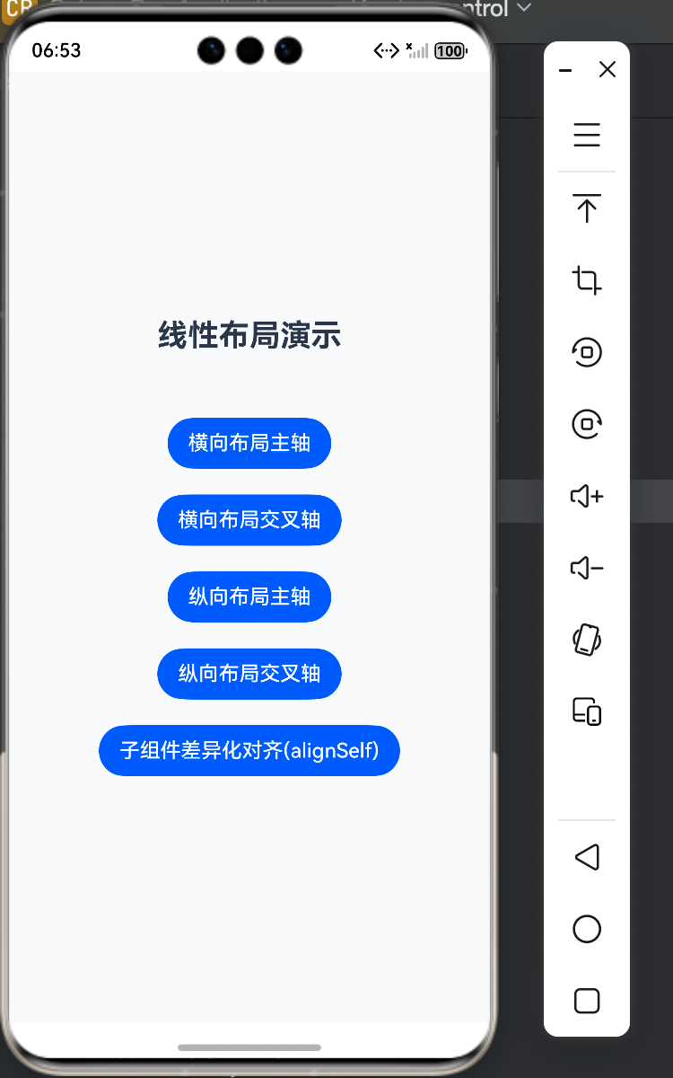
(一)页面主入口(Index.ets)
import router from '@ohos.router';

// 定义按钮数据的接口(规范数据结构)
interface ButtonItem {
  // 按钮显示文本
  title: string;
  // 跳转路由地址
  routerPath: string;
}

@Entry
@Component
struct Index {
  @State message: string = 'Hello World';

  // 定义按钮数据源(统一管理所有按钮的文本和路由)
  private buttonList: ButtonItem[] = [
    { title: "横向布局主轴", routerPath: "pages/RowFlexAlignPage" },
    { title: "横向布局交叉轴", routerPath: "pages/RowItemAlignPage" },
    { title: "纵向布局主轴", routerPath: "pages/ColumnFlexAlignPage" },
    { title: "纵向布局交叉轴", routerPath: "pages/ColumnItemAlignPage" },
    { title: "子组件差异化对齐(alignSelf)", routerPath: "pages/AlignSelfPage" },
    { title: "Margin不生效问题演示以及解决方案", routerPath: "pages/MarginPage" },
    { title: "宽高比约束(aspectRatio)", routerPath: "pages/AspectRatioPage" },
    { title: "占比适配(百分比/layoutWeight)", routerPath: "pages/LayoutWeightScalePage" },
    { title: "显隐控制(displayPriority)", routerPath: "pages/DisplayPriorityPage" },
    { title: "自适应拉伸(Blank)", routerPath: "pages/BlankStretchPage" }
  ];

  build() {
    Column({ space: 20 }) {
      // 页面标题
      Text("线性布局演示")
        .fontSize(24)
        .fontWeight(FontWeight.Bold)
        .fontColor($r('app.color.text_primary'))
        .margin({ bottom: 30 })

      // 动态生成按钮列表 ForEach 循环遍历生成按钮,后边我们会详细讲解ForEach相关内容。
      ForEach(
        // 1. 数据源:按钮数组
        this.buttonList,
        // 2. 渲染函数:遍历每个元素生成Button
        (item: ButtonItem) => {
          Button(item.title)
            .onClick(() => {
              router.pushUrl({ url: item.routerPath });
            });
        },
        // 3. 唯一标识:保证列表更新时的性能(用路由地址作为唯一key)
        (item: ButtonItem) => item.routerPath
      )
    }
    .width('100%')
    .height('100%')
    .justifyContent(FlexAlign.Center)
    .backgroundColor($r('app.color.bg_page'));
  }
}
运行效果
(二)Row 主轴水平(RowFlexAlignPage.ets)
@Entry
@Component
struct RowFlexAlignPage {
  build() {
    Column({ space: 10}) {
      Text("Row主轴对齐演示")
        .fontSize(22)
        .fontWeight(FontWeight.Bold)
        .textAlign(TextAlign.Center) // 文本居中
        .fontColor($r('app.color.text_primary'))
        .width('100%')

      // 说明文本:左对齐
      Text("左对齐 (FlexAlign.Start)")
        .fontSize(14)
        .fontColor($r('app.color.text_secondary'))
        .width('100%')

      // Row容器:水平布局,子组件间距10vp
      Row({ space: 10 }) {
        Text("元素1")
          .background($r('app.color.primary_red')) // 背景色
          .fontColor($r('app.color.text_white'))   // 文本色
          .padding(8) // 内边距8vp(上下左右)
          .borderRadius(4) // 圆角4vp
          .fontSize(14); // 字体大小
        Text("元素2")
          .background($r('app.color.primary_red'))
          .fontColor($r('app.color.text_white'))
          .padding(8)
          .borderRadius(4)
          .fontSize(14);
      }
      .justifyContent(FlexAlign.Start) // 主轴(水平)左对齐
      .width('100%')
      .height(60) // 固定高度60vp
      .backgroundColor($r('app.color.bg_red_light'))

      // 说明文本:居中对齐
      Text("中心对齐 (FlexAlign.Center)")
        .fontSize(14)
        .fontColor($r('app.color.text_secondary'))
        .width('100%')
        .margin(10); // 上下左右外边距10vp

      // Row容器:水平居中
      Row({ space: 10 }) {
        Text("元素1")
          .background($r('app.color.primary_orange'))
          .fontColor($r('app.color.text_white'))
          .padding(8)
          .borderRadius(4)
          .fontSize(14);
        Text("元素2")
          .background($r('app.color.primary_orange'))
          .fontColor($r('app.color.text_white'))
          .padding(8)
          .borderRadius(4)
          .fontSize(14);
      }
      .justifyContent(FlexAlign.Center) // 主轴(水平)居中
      .width('100%')
      .height(60)
      .backgroundColor($r('app.color.bg_orange_light'))

      // 说明文本:右对齐
      Text("右对齐 (FlexAlign.End)")
        .fontSize(14)
        .fontColor($r('app.color.text_secondary'))
        .width('100%')

      // Row容器:水平右对齐
      Row({ space: 10 }) {
        Text("元素1")
          .background($r('app.color.primary_green'))
          .fontColor($r('app.color.text_white'))
          .padding(8)
          .borderRadius(4)
          .fontSize(14);
        Text("元素2")
          .background($r('app.color.primary_green'))
          .fontColor($r('app.color.text_white'))
          .padding(8)
          .borderRadius(4)
          .fontSize(14);
      }
      .justifyContent(FlexAlign.End) // 主轴(水平)右对齐
      .width('100%')
      .height(60)
      .backgroundColor($r('app.color.bg_green_light'))

      // 说明文本:两端对齐
      Text("两端对齐 (FlexAlign.SpaceBetween)")
        .fontSize(14)
        .fontColor($r('app.color.text_secondary'))
        .width('100%')

      // Row容器:两端对齐
      Row({ space: 10 }) {
        Text("元素1")
          .background($r('app.color.primary_blue'))
          .fontColor($r('app.color.text_white'))
          .padding(8)
          .borderRadius(4)
          .fontSize(14);
        Text("元素2")
          .background($r('app.color.primary_blue'))
          .fontColor($r('app.color.text_white'))
          .padding(8)
          .borderRadius(4)
          .fontSize(14);
      }
      .justifyContent(FlexAlign.SpaceBetween) // 主轴两端对齐
      .width('100%')
      .height(60)
      .backgroundColor($r('app.color.bg_blue_light'))

      // 说明文本:周围均匀分布
      Text("周围均匀分布 (FlexAlign.SpaceAround)")
        .fontSize(14)
        .fontColor($r('app.color.text_secondary'))
        .width('100%')

      // Row容器:周围均匀分布
      Row({ space: 10 }) {
        Text("元素1")
          .background($r('app.color.primary_purple'))
          .fontColor($r('app.color.text_white'))
          .padding(8)
          .borderRadius(4)
          .fontSize(14);
        Text("元素2")
          .background($r('app.color.primary_purple'))
          .fontColor($r('app.color.text_white'))
          .padding(8)
          .borderRadius(4)
          .fontSize(14);
        Text("元素3")
          .background($r('app.color.primary_purple'))
          .fontColor($r('app.color.text_white'))
          .padding(8)
          .borderRadius(4)
          .fontSize(14);
        Text("元素4")
          .background($r('app.color.primary_purple'))
          .fontColor($r('app.color.text_white'))
          .padding(8)
          .borderRadius(4)
          .fontSize(14);
      }
      .justifyContent(FlexAlign.SpaceAround) // 主轴均匀分布
      .width('100%')
      .height(60)
      .backgroundColor($r('app.color.bg_purple_light'))

      // 说明文本:所有间距相等
      Text("所有间距相等 (FlexAlign.SpaceEvenly)")
        .fontSize(14)
        .fontColor($r('app.color.text_secondary'))
        .width('100%')

      // Row容器:等距分布
      Row({ space: 10 }) {
        Text("元素1")
          .background($r('app.color.primary_teal'))
          .fontColor($r('app.color.text_white'))
          .padding(8)
          .borderRadius(4)
          .fontSize(14);
        Text("元素2")
          .background($r('app.color.primary_teal'))
          .fontColor($r('app.color.text_white'))
          .padding(8)
          .borderRadius(4)
          .fontSize(14);
        Text("元素3")
          .background($r('app.color.primary_teal'))
          .fontColor($r('app.color.text_white'))
          .padding(8)
          .borderRadius(4)
          .fontSize(14);
        Text("元素4")
          .background($r('app.color.primary_teal'))
          .fontColor($r('app.color.text_white'))
          .padding(8)
          .borderRadius(4)
          .fontSize(14);
      }
      .justifyContent(FlexAlign.SpaceEvenly) // 主轴等距分布(API 10+)
      .width('100%')
      .height(60)
      .backgroundColor($r('app.color.bg_teal_light'))

    }
    .width('100%')
    .height('100%')
    .alignItems(HorizontalAlign.Start) // 交叉轴(水平)左对齐
    .padding(15) // 内边距15vp(防止内容贴边)
    .backgroundColor($r('app.color.bg_page'));
  }
}
运行效果
| Row 主轴对齐演示 |
|---|
 |
(三)Column 主轴垂直(ColumnFlexAlignPage.ets)
// @Styles:自定义样式函数(复用通用样式)
@Styles function textStyle(){
  .background($r('app.color.primary_red')) // 背景色
  .padding(8) // 内边距
  .borderRadius(4) // 圆角
}

// @Extend:扩展组件样式(给Text组件新增样式方法)
@Extend(Text) function textExtend(){
  .fontColor($r('app.color.text_white')) // 文本白色
  .fontSize(14); // 字体大小
}

// @Builder:自定义构建函数(复用UI结构)
@Builder function textBuilder(title:string ) {
  Text(title)
    .textExtend() // 调用扩展样式
    .textStyle(); // 调用自定义样式
}

// 接口定义:菜单选项类型
interface CustomMenuItem {
  label:string,        // 显示文本
  alignValue:FlexAlign // 对齐方式枚举值
}

@Entry
@Component
struct ColumnFlexAlignPage {
  // 状态变量:当前选中的对齐方式(响应式)
  @State currentAlign: FlexAlign = FlexAlign.Start;

  // 对齐方式数据源:便于遍历生成菜单
  private alignDataSource: CustomMenuItem[] = [
    { label: "顶部对齐(Start)", alignValue: FlexAlign.Start },
    { label: "居中对齐(Center)", alignValue: FlexAlign.Center },
    { label: "底部对齐(End)", alignValue: FlexAlign.End },
    { label: "两端对齐(SpaceBetween)", alignValue: FlexAlign.SpaceBetween },
    { label: "均匀分布(SpaceAround)", alignValue: FlexAlign.SpaceAround },
    { label: "等距分布(SpaceEvenly)", alignValue: FlexAlign.SpaceEvenly }
  ];

  build() {
    Column({ space: 10}) {
      // 页面标题
      Text("Column主轴对齐演示(垂直方向)")
        .fontSize(22)
        .fontWeight(FontWeight.Bold)
        .textAlign(TextAlign.Center)
        .fontColor($r('app.color.text_primary'))
        .width('100%')

      // 显示当前对齐方式
      Text(`当前对齐方式:${this.getAlignDesc()}`)
        .fontSize(14)
        .fontColor($r('app.color.primary_blue'))
        .padding(8)
        .backgroundColor($r('app.color.bg_blue_light'))
        .borderRadius(4)
        .width('100%')
        .textAlign(TextAlign.Center)

      // 核心演示区域:Column 主轴对齐
      Column({ space: 10 }) {
        textBuilder("元素1") // 调用构建函数
        textBuilder("元素2")
        textBuilder("元素3")
        textBuilder("元素4")
      }
      .justifyContent(this.currentAlign) // 绑定状态变量,动态切换
      .width('100%')
      .height(300) // 固定高度,便于观察垂直对齐
      .backgroundColor($r('app.color.bg_red_light'))
      .borderRadius(8)
      .padding(10); // 内边距,防止内容贴边

      Button("切换对齐方式")
      .fontSize(14)
      .padding({ left: 15, right: 15 }) // 左右内边距15vp
      .backgroundColor($r('app.color.primary_purple'))
      .fontColor($r('app.color.text_white'))
      .borderRadius(6)
      .bindMenu(this.AlignMenu) // 绑定自定义菜单

    }
    .width('100%')
    .padding(15)
    .backgroundColor($r('app.color.bg_page'));
  }

  // 自定义菜单构建器
  @Builder AlignMenu() {
    Menu() {
      // ForEach:遍历数组生成子组件
      ForEach(this.alignDataSource, (item:CustomMenuItem) => {
          MenuItem({ content: item.label })
            .onClick(() => {
              // 点击菜单项,更新状态变量
              this.currentAlign = item.alignValue;
            })
        }, (item:CustomMenuItem) => item.label) // 唯一标识,优化性能
    }
    .width(200) // 菜单宽度
    .backgroundColor($r('app.color.bg_white')) // 菜单背景色
    .fontColor($r('app.color.text_primary')) // 菜单文本色
  }

  // 辅助函数:转换对齐方式为描述文本
  getAlignDesc(): string {
    switch(this.currentAlign) {
      case FlexAlign.Start: return "Start(顶部对齐)";
      case FlexAlign.Center: return "Center(垂直居中)";
      case FlexAlign.End: return "End(底部对齐)";
      case FlexAlign.SpaceBetween: return "SpaceBetween(上下两端对齐)";
      case FlexAlign.SpaceAround: return "SpaceAround(垂直均匀分布)";
      case FlexAlign.SpaceEvenly: return "SpaceEvenly(垂直等距分布)";
      default: return "Start(默认)";
    }
  }
}
运行效果
| 顶部对齐 | 居中对齐 | 底部对齐 |
|---|---|---|
 |  |  |
| 上下两端对齐 | 垂直均匀分布 | 垂直等距分布 |
|---|---|---|
 |  |  |
六、交叉轴对齐:alignItems 与 alignSelf
交叉轴对齐是线性布局的核心适配能力,分为“全局对齐”和“子组件差异化对齐”两种场景:
6.1 全局交叉轴对齐:alignItems
控制容器内所有子组件在交叉轴方向上的对齐方式,参数类型由容器类型决定:
Column 容器(交叉轴为水平方向)
- 参数类型:
HorizontalAlign - 可选值:
- HorizontalAlign.Start:左对齐
- HorizontalAlign.Center:水平居中(默认)
- HorizontalAlign.End:右对齐
Row 容器(交叉轴为垂直方向)
- 参数类型:
VerticalAlign - 可选值:
- VerticalAlign.Top:顶部对齐
- VerticalAlign.Center:垂直居中(默认)
- VerticalAlign.Bottom:底部对齐
6.2 子组件差异化对齐:alignSelf + ItemAlign
alignSelf 用于单独控制某个子组件在交叉轴上的对齐方式,优先级高于父容器的 alignItems,取值为 ItemAlign 枚举:
| ItemAlign 枚举值 | 中文含义 | Row(垂直交叉轴) | Column(水平交叉轴) |
|---|---|---|---|
Auto | 自动继承 | 继承父容器 alignItems | 继承父容器 alignItems |
Start | 交叉轴头部对齐 | 顶部对齐 | 左对齐 |
Center | 交叉轴居中对齐 | 垂直居中 | 水平居中 |
End | 交叉轴尾部对齐 | 底部对齐 | 右对齐 |
Baseline | 文本基线对齐 | 不同字号文本按基线对齐 | 不同字号文本按基线对齐 |
Stretch | 交叉轴拉伸填充 | 未设置高度时,拉伸至父容器高度 | 未设置宽度时,拉伸至父容器宽度 |
关键区分
| 特性 | alignItems(容器级) | alignSelf(子组件级) |
|---|---|---|
| 作用范围 | 所有子组件 | 单个子组件 |
| 参数类型 | Column → HorizontalAlign Row → VerticalAlign | ItemAlign(通用枚举) |
| 优先级 | 低 | 高(覆盖容器设置) |
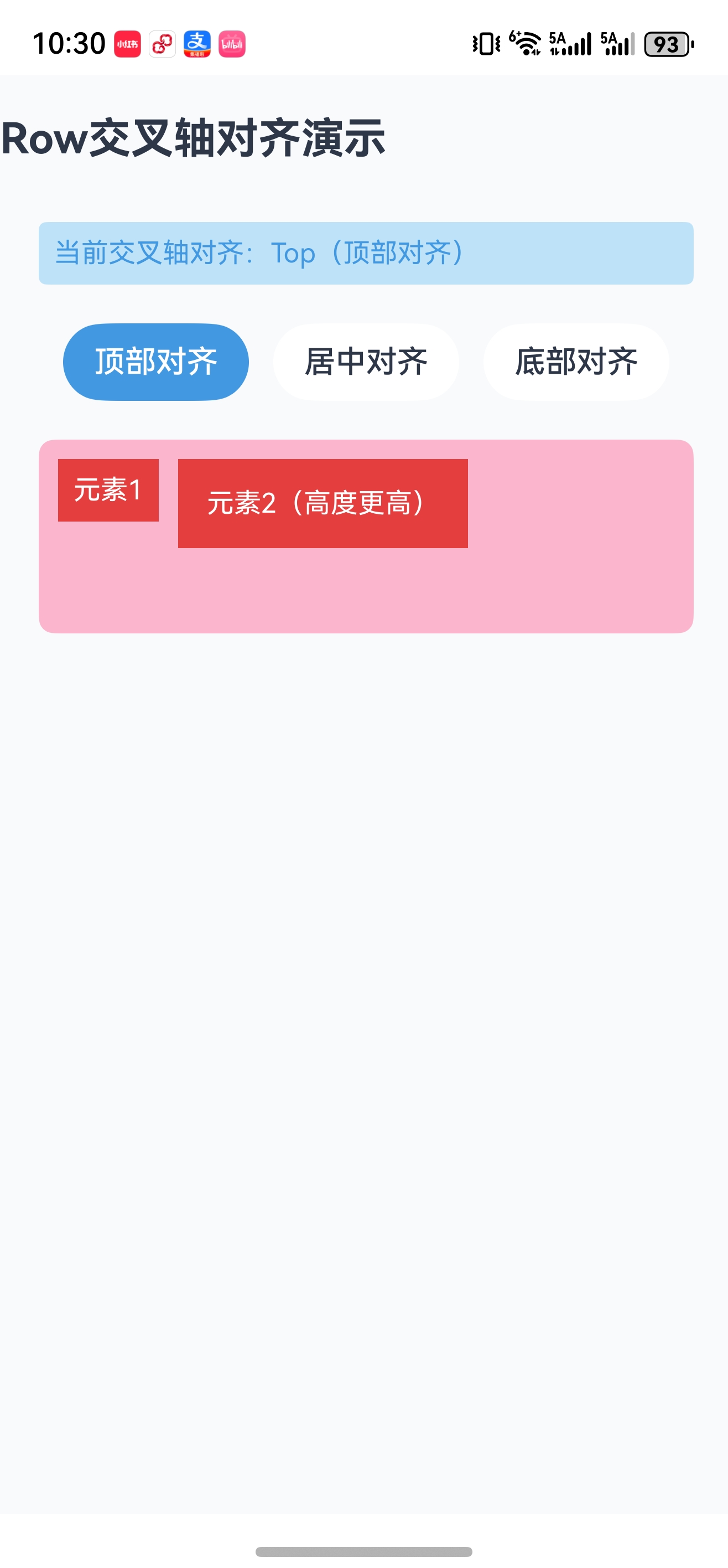
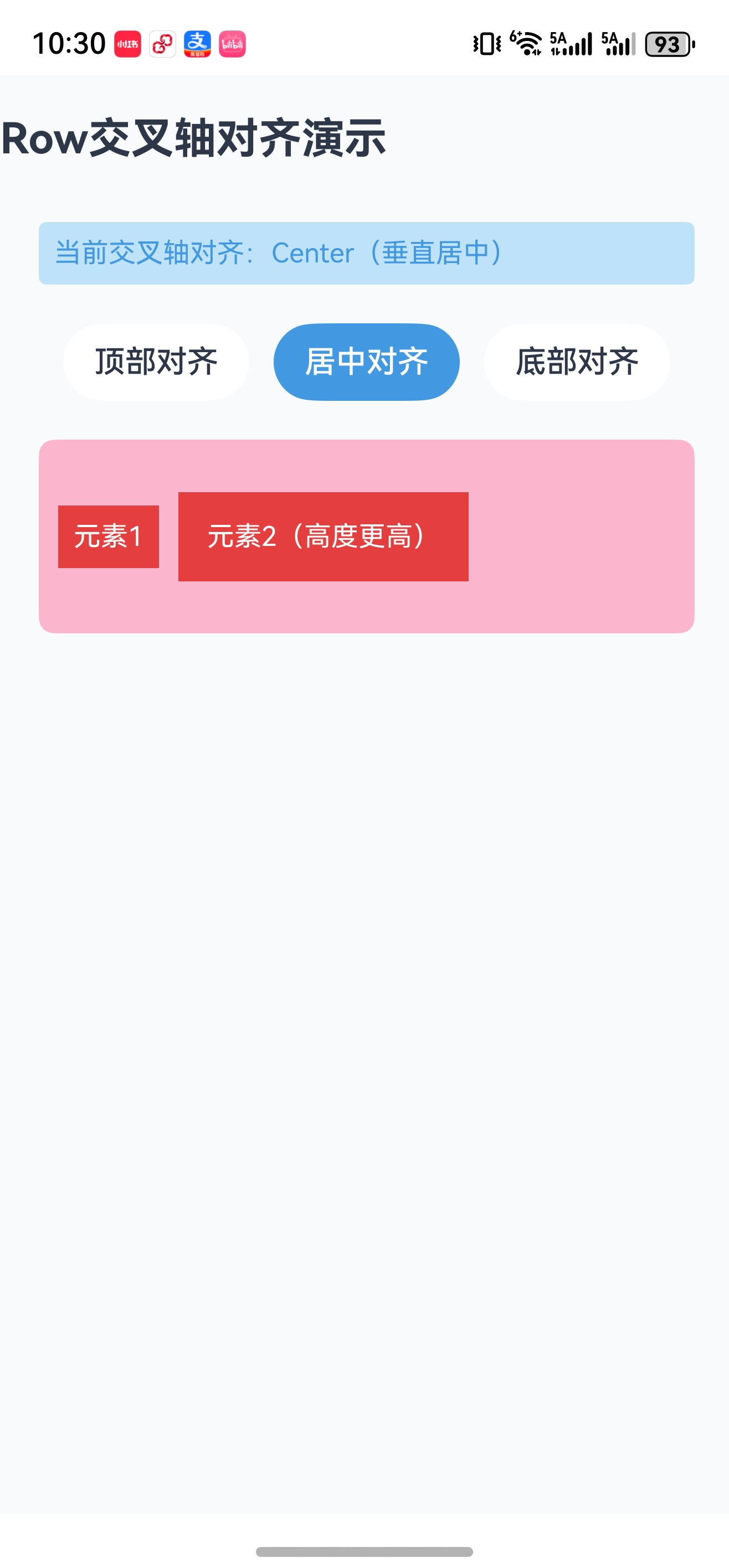
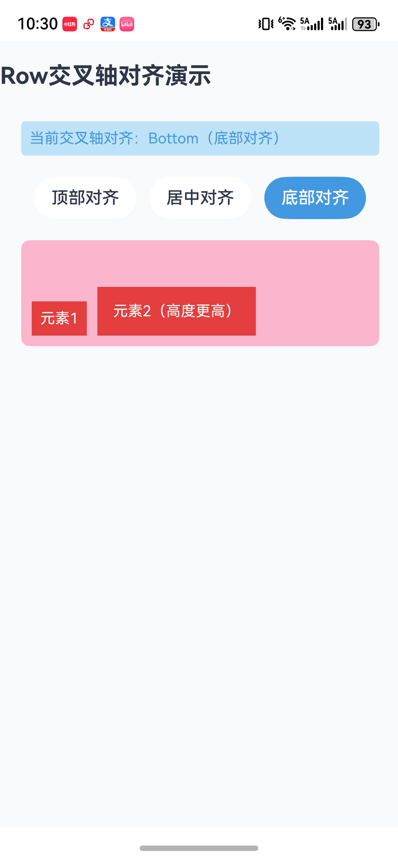
6.3 代码演示(Row 交叉轴对齐)
@Entry
@Component
struct RowItemAlignPage {
  // 状态变量:当前交叉轴对齐方式(Row的交叉轴是垂直方向)
  @State currentAlign: VerticalAlign = VerticalAlign.Top;

  build() {
    Column({ space: 20 }) {
      // 页面标题
      Text("Row交叉轴对齐演示")
        .fontSize(22)
        .fontWeight(FontWeight.Bold)
        .fontColor($r('app.color.text_primary'))
        .margin({ bottom: 10, top: 20 }); // 上下外边距

      // 显示当前对齐方式
      Text(`当前交叉轴对齐:${this.getAlignDesc()}`)
        .fontSize(14)
        .fontColor($r('app.color.primary_blue'))
        .padding(8)
        .backgroundColor($r('app.color.bg_blue_light'))
        .borderRadius(4)
        .width('90%')
        .margin({ left: 20 }); // 左侧外边距20vp

      // 按钮组:切换对齐方式
      Row({ space: 10 }) {
        Button("顶部对齐")
          .onClick(() => this.currentAlign = VerticalAlign.Top)
          // 动态样式:选中状态高亮
          .backgroundColor(this.currentAlign === VerticalAlign.Top ? $r('app.color.primary_blue') : $r('app.color.bg_white'))
          .fontColor(this.currentAlign === VerticalAlign.Top ? $r('app.color.text_white') : $r('app.color.text_primary'));

        Button("居中对齐")
          .onClick(() => this.currentAlign = VerticalAlign.Center)
          .backgroundColor(this.currentAlign === VerticalAlign.Center ? $r('app.color.primary_blue') : $r('app.color.bg_white'))
          .fontColor(this.currentAlign === VerticalAlign.Center ? $r('app.color.text_white') : $r('app.color.text_primary'));

        Button("底部对齐")
          .onClick(() => this.currentAlign = VerticalAlign.Bottom)
          .backgroundColor(this.currentAlign === VerticalAlign.Bottom ? $r('app.color.primary_blue') : $r('app.color.bg_white'))
          .fontColor(this.currentAlign === VerticalAlign.Bottom ? $r('app.color.text_white') : $r('app.color.text_primary'));
      }
      .width('90%')
      .justifyContent(FlexAlign.SpaceEvenly) // 按钮等距分布
      .margin({ left: 20 });

      // 核心演示区域:Row 交叉轴对齐
      Row({ space: 10 }) {
        Text("元素1")
          .background($r('app.color.primary_red'))
          .fontColor($r('app.color.text_white'))
          .padding(8) // 内边距较小
          .borderRadius(4)
          .fontSize(14);
        Text("元素2(高度更高)")
          .background($r('app.color.primary_red'))
          .fontColor($r('app.color.text_white'))
          .padding(15) // 内边距更大,高度更高
          .borderRadius(4)
          .fontSize(14);
      }
      .alignItems(this.currentAlign) // 绑定状态变量,动态切换
      .width('90%')
      .height(100) // 固定高度,便于观察垂直对齐
      .backgroundColor($r('app.color.bg_red_light'))
      .borderRadius(8)
      .padding(10)
      .margin({ left: 20 });

    }
    .width('100%')
    .height('100%')
    .alignItems(HorizontalAlign.Start) // 交叉轴(水平)左对齐
    .backgroundColor($r('app.color.bg_page'));
  }

  // 辅助函数:转换对齐方式为描述文本
  getAlignDesc(): string {
    switch(this.currentAlign) {
      case VerticalAlign.Top: return "Top(顶部对齐)";
      case VerticalAlign.Center: return "Center(垂直居中)";
      case VerticalAlign.Bottom: return "Bottom(底部对齐)";
      default: return "Center(默认)";
    }
  }
}
运行效果
| 顶部对齐 | 居中对齐 | 底部对齐 |
|---|---|---|
 |  |  |
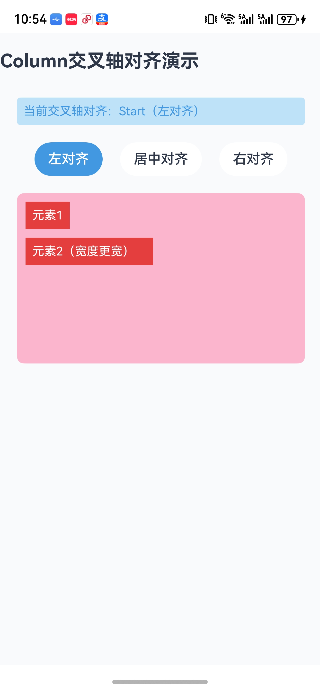
6.4 代码演示(Column 交叉轴对齐)
@Entry
@Component
struct ColumnItemAlignPage {
  // 状态变量:当前交叉轴对齐方式(Column的交叉轴是水平方向)
  @State currentAlign: HorizontalAlign = HorizontalAlign.Start;

  build() {
    Column({ space: 20 }) {
      // 页面标题
      Text("Column交叉轴对齐演示")
        .fontSize(22)
        .fontWeight(FontWeight.Bold)
        .fontColor($r('app.color.text_primary'))
        .margin({ bottom: 10, top: 20 });

      // 显示当前对齐方式
      Text(`当前交叉轴对齐:${this.getAlignDesc()}`)
        .fontSize(14)
        .fontColor($r('app.color.primary_blue'))
        .padding(8)
        .backgroundColor($r('app.color.bg_blue_light'))
        .borderRadius(4)
        .width('90%')
        .margin({ left: 20 });

      // 按钮组:切换对齐方式
      Row({ space: 10 }) {
        Button("左对齐")
          .onClick(() => this.currentAlign = HorizontalAlign.Start)
          .backgroundColor(this.currentAlign === HorizontalAlign.Start ? $r('app.color.primary_blue') : $r('app.color.bg_white'))
          .fontColor(this.currentAlign === HorizontalAlign.Start ? $r('app.color.text_white') : $r('app.color.text_primary'));

        Button("居中对齐")
          .onClick(() => this.currentAlign = HorizontalAlign.Center)
          .backgroundColor(this.currentAlign === HorizontalAlign.Center ? $r('app.color.primary_blue') : $r('app.color.bg_white'))
          .fontColor(this.currentAlign === HorizontalAlign.Center ? $r('app.color.text_white') : $r('app.color.text_primary'));

        Button("右对齐")
          .onClick(() => this.currentAlign = HorizontalAlign.End)
          .backgroundColor(this.currentAlign === HorizontalAlign.End ? $r('app.color.primary_blue') : $r('app.color.bg_white'))
          .fontColor(this.currentAlign === HorizontalAlign.End ? $r('app.color.text_white') : $r('app.color.text_primary'));
      }
      .width('90%')
      .justifyContent(FlexAlign.SpaceEvenly)
      .margin({ left: 20 });

     // 核心演示区域:Column 交叉轴对齐
     Column({ space: 10 }) {
       Text("元素1")
          .background($r('app.color.primary_red'))
          .fontColor($r('app.color.text_white'))
          .padding(8)
          .borderRadius(4)
          .fontSize(14);
       Text("元素2(宽度更宽)")
          .background($r('app.color.primary_red'))
          .fontColor($r('app.color.text_white'))
          .padding(8)
          .borderRadius(4)
          .fontSize(14)
          .width(150); // 固定宽度,便于观察水平对齐
     }
     .alignItems(this.currentAlign) // 绑定状态变量
     .width('90%')
     .height(200) // 固定高度
     .backgroundColor($r('app.color.bg_red_light'))
     .borderRadius(8)
     .padding(10)
     .margin({ left: 20 });

    }
    .width('100%')
    .height('100%')
    .alignItems(HorizontalAlign.Start)
    .backgroundColor($r('app.color.bg_page'));
  }

  // 辅助函数:转换对齐方式为描述文本
  getAlignDesc(): string {
    switch(this.currentAlign) {
      case HorizontalAlign.Start: return "Start(左对齐)";
      case HorizontalAlign.Center: return "Center(水平居中)";
      case HorizontalAlign.End: return "End(右对齐)";
      default: return "Center(默认)";
    }
  }
}
运行效果
| 左对齐 | 居中对齐 | 右对齐 |
|---|---|---|
 | 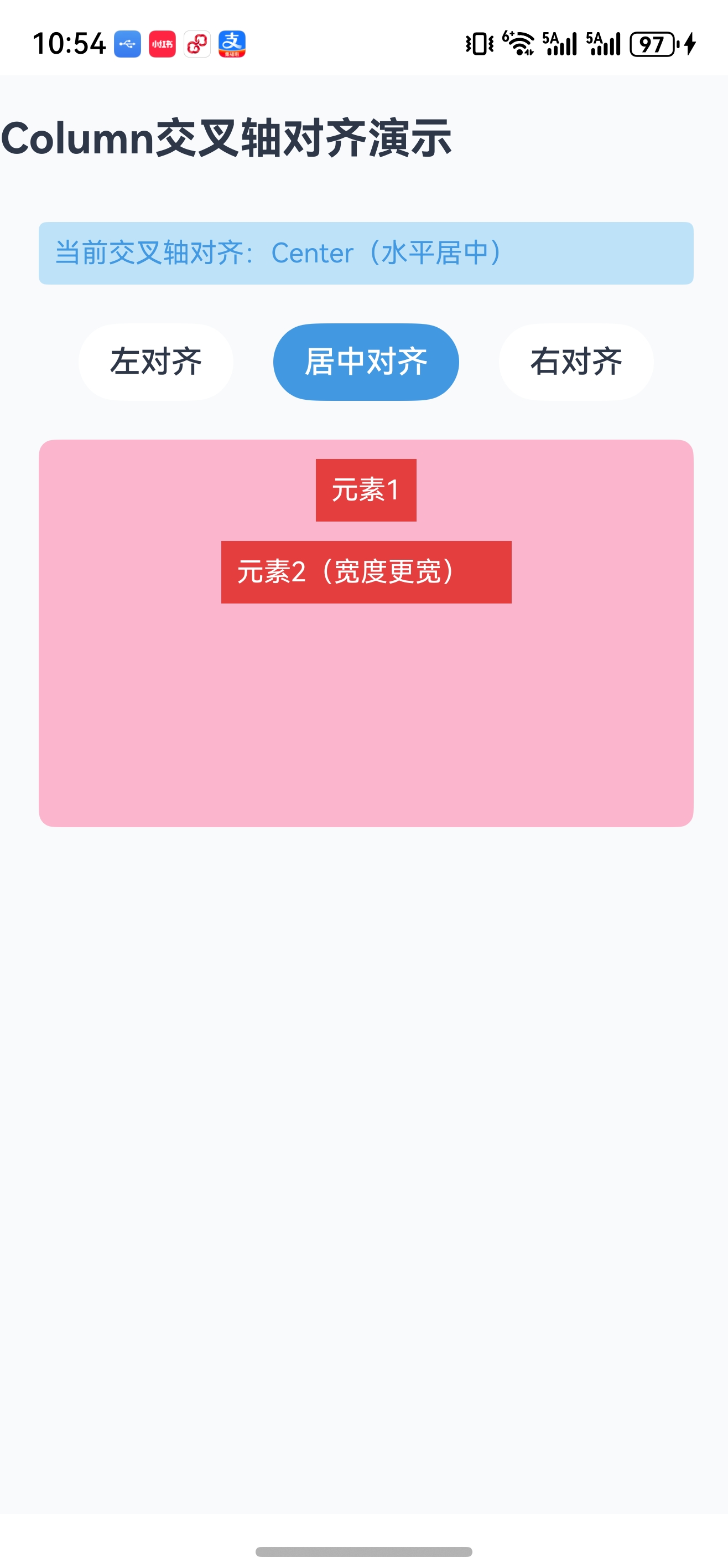 | 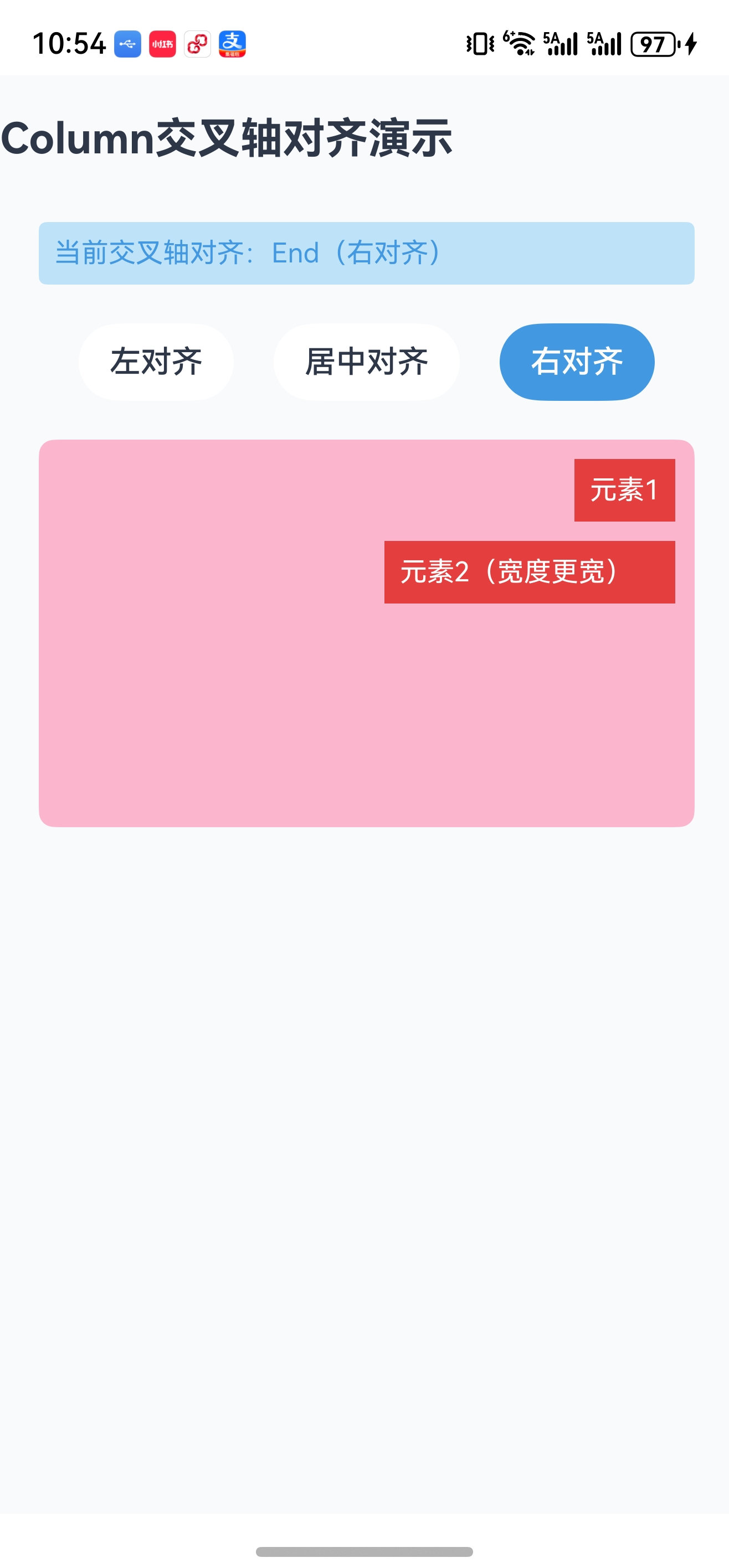 |
6.5 代码演示(alignSelf 与 ItemAlign)
@Entry
@Component
struct AlignSelfPage {
  build() {
    Column({ space: 20 }) {
      // 页面标题
      Text("alignSelf 与 ItemAlign 演示")
        .fontSize(22)
        .fontWeight(FontWeight.Bold)
        .fontColor($r('app.color.text_primary'))
        .width('100%')
        .textAlign(TextAlign.Center);

      // 说明文本
      Text("父容器alignItems=Center,但子组件通过alignSelf单独设置对齐")
        .fontSize(14)
        .fontColor($r('app.color.text_secondary'))
        .width('90%')
        .textAlign(TextAlign.Center)
        .padding(8)
        .backgroundColor($r('app.color.bg_blue_light'))
        .borderRadius(4);

      // 核心演示区域:子组件差异化对齐
      Row({ space: 10 }) {
        // 子组件1:alignSelf=Start → 交叉轴(垂直)顶部对齐
        Text("Start")
          .background($r('app.color.primary_red'))
          .fontColor($r('app.color.text_white'))
          .padding(8)
          .borderRadius(4)
          .fontSize(14)
          .alignSelf(ItemAlign.Start); // 覆盖父容器的alignItems

        // 子组件2:alignSelf=Auto → 继承父容器的alignItems(Center)
        Text("Auto(Center)")
          .background($r('app.color.primary_blue'))
          .fontColor($r('app.color.text_white'))
          .padding(8)
          .borderRadius(4)
          .fontSize(14)
          .alignSelf(ItemAlign.Auto);

        // 子组件3:alignSelf=End → 交叉轴(垂直)底部对齐
        Text("End")
          .background($r('app.color.primary_green'))
          .fontColor($r('app.color.text_white'))
          .padding(8)
          .borderRadius(4)
          .fontSize(14)
          .alignSelf(ItemAlign.End);

        // 子组件4:alignSelf=Stretch → 交叉轴(垂直)拉伸填充
        Text("Stretch")
          .background($r('app.color.primary_purple'))
          .fontColor($r('app.color.text_white'))
          .padding(8)
          .borderRadius(4)
          .fontSize(14)
          .alignSelf(ItemAlign.Stretch); // 未设置高度时,拉伸至父容器高度
      }
      .alignItems(VerticalAlign.Center) // 父容器交叉轴默认居中
      .width('90%')
      .height(120) // 固定高度,便于观察拉伸效果
      .backgroundColor($r('app.color.bg_red_light'))
      .borderRadius(8)
      .padding(10);

      // Baseline 基线对齐演示标题
      Text("Baseline 文本基线对齐")
        .fontSize(16)
        .fontWeight(FontWeight.Bold)
        .margin({ top: 10, bottom: 5 })
        .width('100%')
        .textAlign(TextAlign.Center);

      // Baseline 演示:不同字号文本按基线对齐
      Row({ space: 10 }) {
        Text("小字号")
          .fontSize(12) // 小字号
          .background($r('app.color.primary_orange'))
          .fontColor($r('app.color.text_white'))
          .padding(8)
          .borderRadius(4)
          .alignSelf(ItemAlign.Baseline); // 按文本基线对齐

        Text("中字号")
          .fontSize(16) // 中字号
          .background($r('app.color.primary_orange'))
          .fontColor($r('app.color.text_white'))
          .padding(8)
          .borderRadius(4)
          .alignSelf(ItemAlign.Baseline);

        Text("大字号")
          .fontSize(20) // 大字号
          .background($r('app.color.primary_orange'))
          .fontColor($r('app.color.text_white'))
          .padding(8)
          .borderRadius(4)
          .alignSelf(ItemAlign.Baseline);
      }
      .width('90%')
      .height(80)
      .backgroundColor($r('app.color.bg_orange_light'))
      .borderRadius(8)
      .padding(10);
    }
    .width('100%')
    .height('100%')
    .padding(15)
    .backgroundColor($r('app.color.bg_page'));
  }
}
运行效果
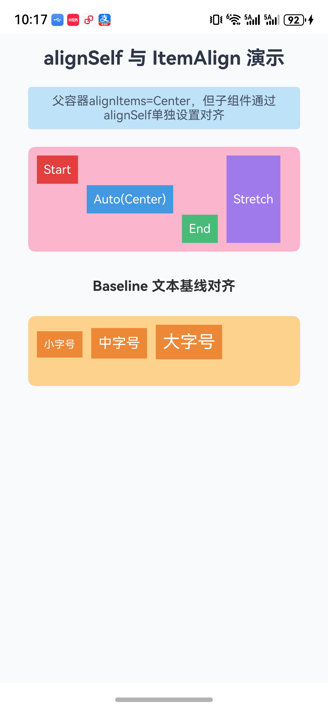
七、间距控制:spacing / padding / margin
线性布局的间距控制是页面美观的关键,三类间距各司其职,需区分使用:
7.1 三类间距核心区别
| 间距类型 | 作用对象 | 核心作用 | 使用示例 |
|---|---|---|---|
spacing | 容器属性(Column/Row) | 控制子组件之间的间距(仅同方向) | Column({ space: 10 }) |
padding | 组件通用属性 | 控制组件内部与子组件的间距(四边) | .padding(10) 或 .padding({ top: 5, left: 10 }) |
margin | 组件通用属性 | 控制组件外部与其他组件的间距(四边) | .margin(10) 或 .margin({ bottom: 5, right: 10 }) |
7.2 spacing 参数规则
- spacing 仅支持单数值,所有子组件之间间距相同;
- 若需差异化间距,需为子组件单独设置 margin;
- spacing 优先级低于子组件的 margin(子组件margin会覆盖spacing)。
7.3 margin / padding 多参数写法
| 写法 | 含义 | 等价写法 |
|---|---|---|
margin(10) | 四边均为10vp | margin({ top:10, right:10, bottom:10, left:10 }) |
margin({ top:10, left:20 }) | 仅设置指定方向 | —— |
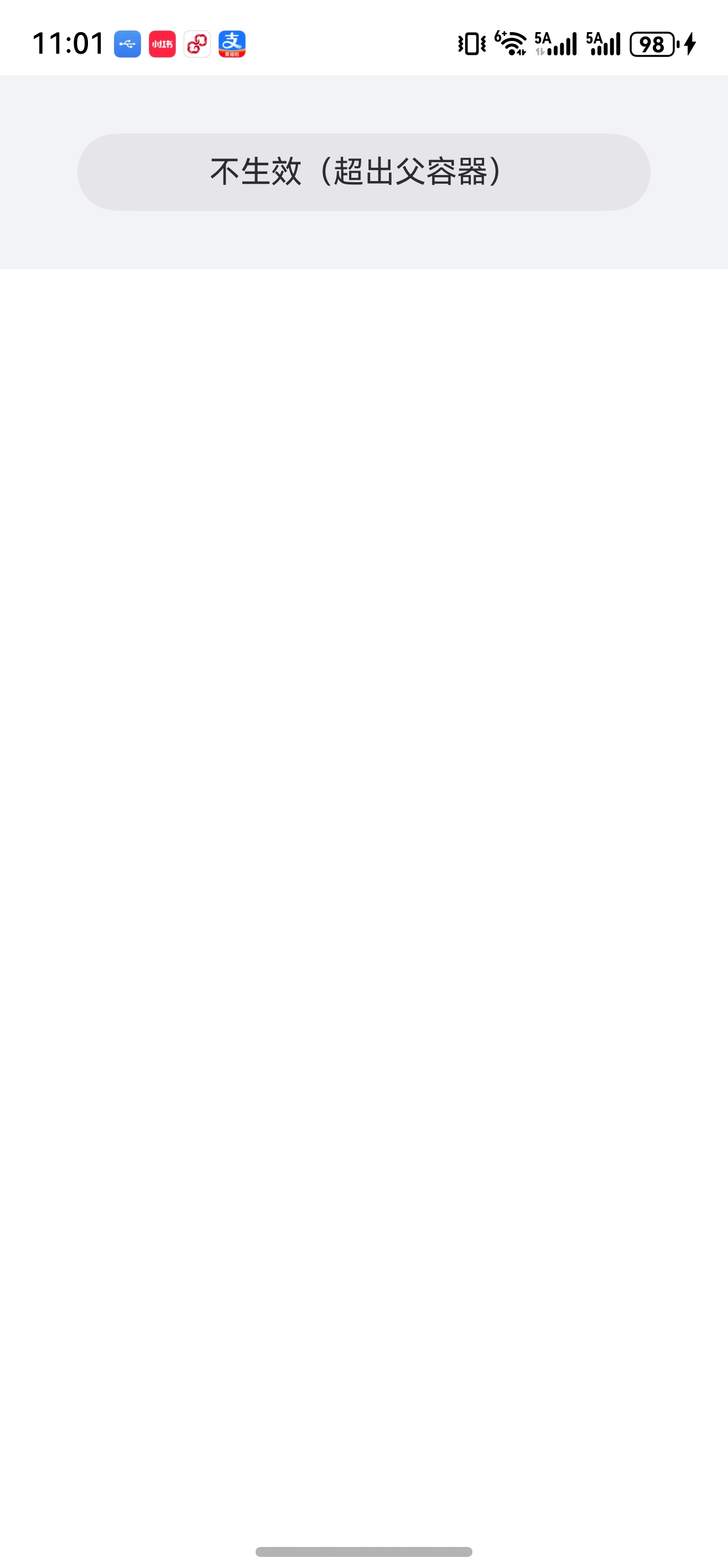
7.4 margin 失效问题演示
@Entry
@Component
struct MarginPage {
  build() {
    Column() {
      Text('不生效(超出父容器)')
        .margin({ left: 40, right: 40 }) // 左右外边距40vp
        .width('100%') // 宽度100% → 内容+margin > 父容器宽度,margin失效
        // 解决方案1:扣除左右margin总和(运算符两侧必须有空格)
        // .width('calc(100% - 80vp)')
        // 解决方案2:限制最大宽度
        // .constraintSize({ maxWidth: '100%' })
        .height(40) // 固定高度
        .backgroundColor('#E5E5EA') // 背景色
        .borderRadius(20) // 圆角
        .textAlign(TextAlign.Center); // 文本居中
    }
    .width('100%')
    // 解决方案3:外层padding替代子组件margin
    // .padding({ left: 40, right: 40 })
    .height(100) // 固定高度
    .backgroundColor('#f1f3f5') // 背景色
    .justifyContent(FlexAlign.Center) // 垂直居中
    .margin({ bottom: 8 }); // 底部外边距
  }
}
7.5 失效原因
- 子组件宽度(内容宽度 + 左右margin)> 父容器宽度 → 溢出,margin 视觉上失效;
- 子组件高度(内容高度 + 上下margin)> 父容器高度 → 被压缩或截断,margin 失效;
- 子组件设置
width: 100%时,margin 会被挤压,无法显示。
7.6 解决方案
- calc 计算宽度:扣除 margin 占用的空间
.width('calc(100% - 80vp)')
注意:运算符(+/-/*/÷)两侧必须有空格,否则语法报错; - 限制最大尺寸:避免子组件超出父容器
.constraintSize({ maxWidth: '100%' }); - 父容器 padding 替代:最推荐的方案,无需计算
父容器设置.padding({ left: 40, right: 40 }),子组件去掉 margin 并设置width: 100%。
7.7 运行效果对比
| 设置margin左右40vp不生效 | 方案1:calc扣除margin总和 |
|---|---|
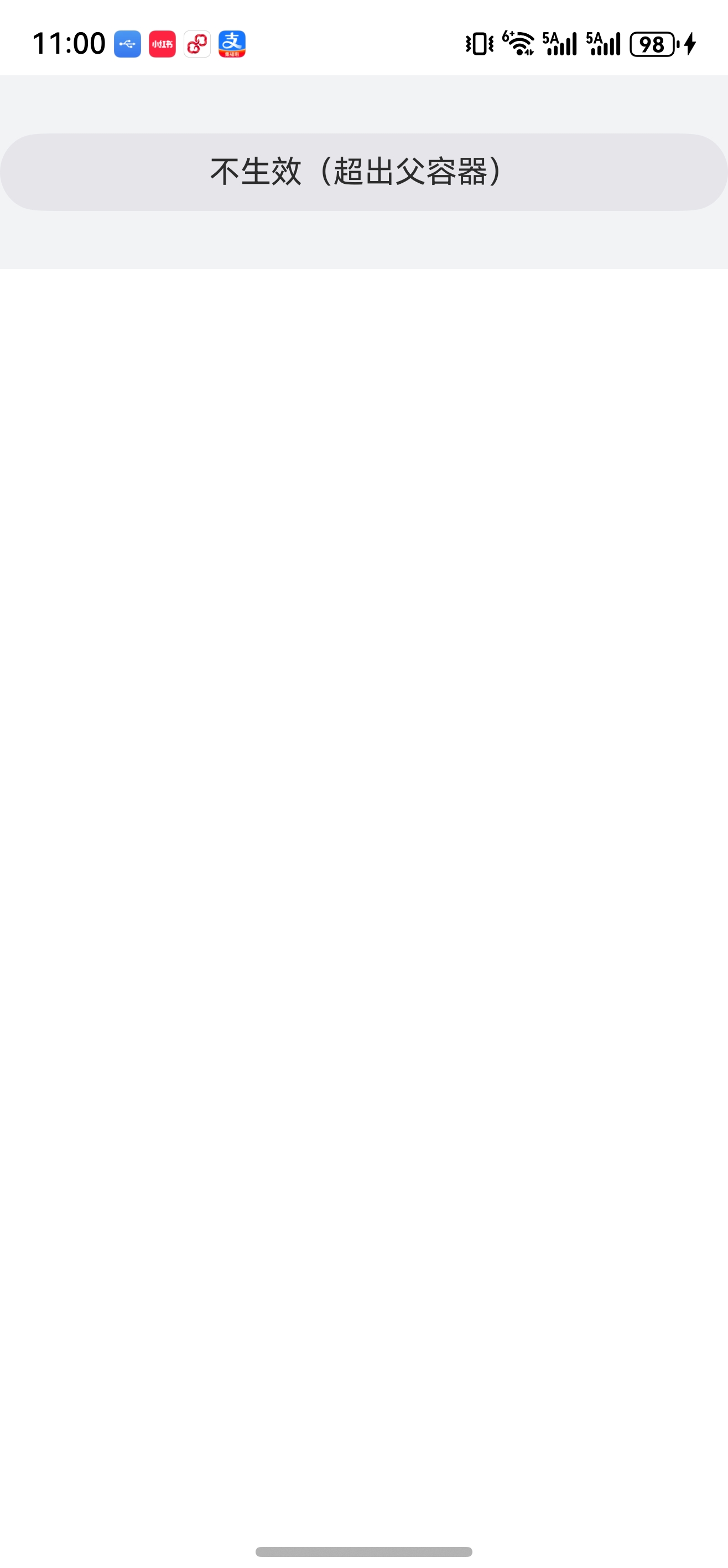 |  |
| 方案2:限制最大宽度 | 方案3:父容器padding替代 |
|---|---|
| |
八、布局嵌套技巧(避免过深)
- 过深的布局嵌套会导致额外开销
- 布局计算复杂度增加:每层嵌套需递归计算子元素尺寸和位置
- 渲染性能下降:嵌套层级过深易引发丢帧
- 嵌套层级不建议超过4层,超过建议优化布局,或用扁平化布局等其他高级组件替代(先做了解即可);
8.1 反例(嵌套过深,不推荐)
Row() {
  Row(){  // 冗余容器
    Image()
    Text()
  }
  Image()
}
8.2 正例(简化嵌套,推荐)
Row() {
  Image()
  Text()
  Image()
}
九、内容总结
- 线性布局核心是主轴+交叉轴:Column 主轴垂直、交叉轴水平;Row 主轴水平、交叉轴垂直;
- 主轴对齐用
justifyContent(FlexAlign 枚举),交叉轴全局对齐用alignItems(Column→HorizontalAlign / Row→VerticalAlign); alignSelf(ItemAlign 枚举)优先级高于alignItems,可实现子组件差异化交叉轴对齐;- 间距控制:
spacing控子组件间距、padding控内边距、margin控外边距,三类间距各司其职; margin失效多因子组件尺寸超出父容器,优先用父容器padding替代,其次用calc计算宽度;- 布局嵌套不超过4层,复杂布局拆分为自定义组件,避免性能问题。
十、代码仓库
- 工程名称:ColumnRowApplication
- 仓库地址:https://gitee.com/HarmonyOS-UI-Basics/harmony-os-ui-basics.git
十一、下节预告
下一节将学习 线性布局进阶:自适应约束,包括 aspectRatio 宽高比约束、layoutWeight/百分比占比、displayPriority 显隐控制、Blank 自适应拉伸等高级特性,掌握线性布局的全场景适配能力。
更多推荐
 52
52 0
0- 0


 已为社区贡献2条内容

所有评论(0)