
uni-app x 学习系列(五)—— 视图容器 之 View 视图组件
·
<view> 是 UNI-APP 中布局的基本元素,类似于 HTML 中的 <div> 标签,主要用于创建块级容器。
示例:index.uvue
<template>
  <view class="container">
    <view class="header">
      <text>轮播图展示</text>
    </view>
    <view>
		<!-- 轮播图 -->
      <swiper>
        <swiper-item>
          <image class="carousel" src="/static/logo.png"></image>
        </swiper-item>
        <swiper-item>
          <image class="carousel" src="/static/logo.png"></image>
        </swiper-item>
      </swiper>
    </view>
    <view class="categories">
    <view class="item">
      <text class="item-text">第一个视图</text>
    </view>
    <view class="item">
      <text class="item-text">第二个视图</text>
    </view>
    <view class="item">
      <text class="item-text">第三个视图</text>
    </view>
    </view>
  </view>
</template>

<script>
	export default {
		data() {
			return {

			}
		},
		onLoad(event : OnLoadOptions) { // 类型非必填,可自动推导
		    console.log('my 页面加载')
		},
		onShow() {
		    console.log('my 页面显示')
		},
		onHide() {
		    console.log('my 页面隐藏')
		},
		methods: {

		}
	}
</script>

<style scoped>

.header{
  margin: 10px 0;
  padding: 10px;
  text-align: center;
}

.carousel {
	height: 300px;
	margin: 10px auto 0 auto;
}

.item {
  margin: 10px 0;
  padding: 10px;
  border: 1px solid #ccc;
}

.item-text {
  font-size: 16px;
  color: #333;
}
</style>
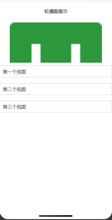
页面效果:
更多推荐
 1
1 0
0- 0


 已为社区贡献1条内容

所有评论(0)