
鸿蒙Flutter Container深度解析:容器层次结构与变换详解
引言
在Flutter开发中,Container是最常用的布局容器组件之一。它不仅仅是一个简单的盒子,而是一个由多个组件组合而成的复杂布局系统。理解Container的内部层次结构和变换机制,对于构建高效、可维护的UI至关重要。
一、Container构造函数详解
1.1 构造函数参数
Container({
  Key? key,
  this.alignment,           // 子组件对齐方式
  this.padding,             // 内边距
  this.color,               // 背景颜色(与decoration互斥)
  this.decoration,          // 背景装饰
  this.foregroundDecoration, // 前景装饰(覆盖子组件)
  double? width,            // 宽度
  double? height,           // 高度
  BoxConstraints? constraints, // 尺寸约束
  this.margin,              // 外边距
  this.transform,           // 变换矩阵
  this.transformAlignment,  // 变换对齐方式
  this.child,               // 子组件
  this.clipBehavior = Clip.none, // 裁剪行为
})
1.2 核心属性说明
| 属性 | 类型 | 作用 | 注意事项 |
|---|---|---|---|
| alignment | AlignmentGeometry | 子组件对齐方式 | 影响子组件在容器内的位置 |
| padding | EdgeInsetsGeometry | 内边距 | 内容与容器边界之间的空白 |
| margin | EdgeInsetsGeometry | 外边距 | 容器与其他组件之间的空白 |
| color | Color | 背景颜色 | 与decoration互斥 |
| decoration | Decoration | 背景装饰 | 可包含颜色、边框、阴影等 |
| transform | Matrix4 | 变换矩阵 | 不影响布局尺寸,只影响绘制位置 |
| constraints | BoxConstraints | 尺寸约束 | 优先级高于width/height |
二、Container内部层次结构
2.1 组件组合顺序
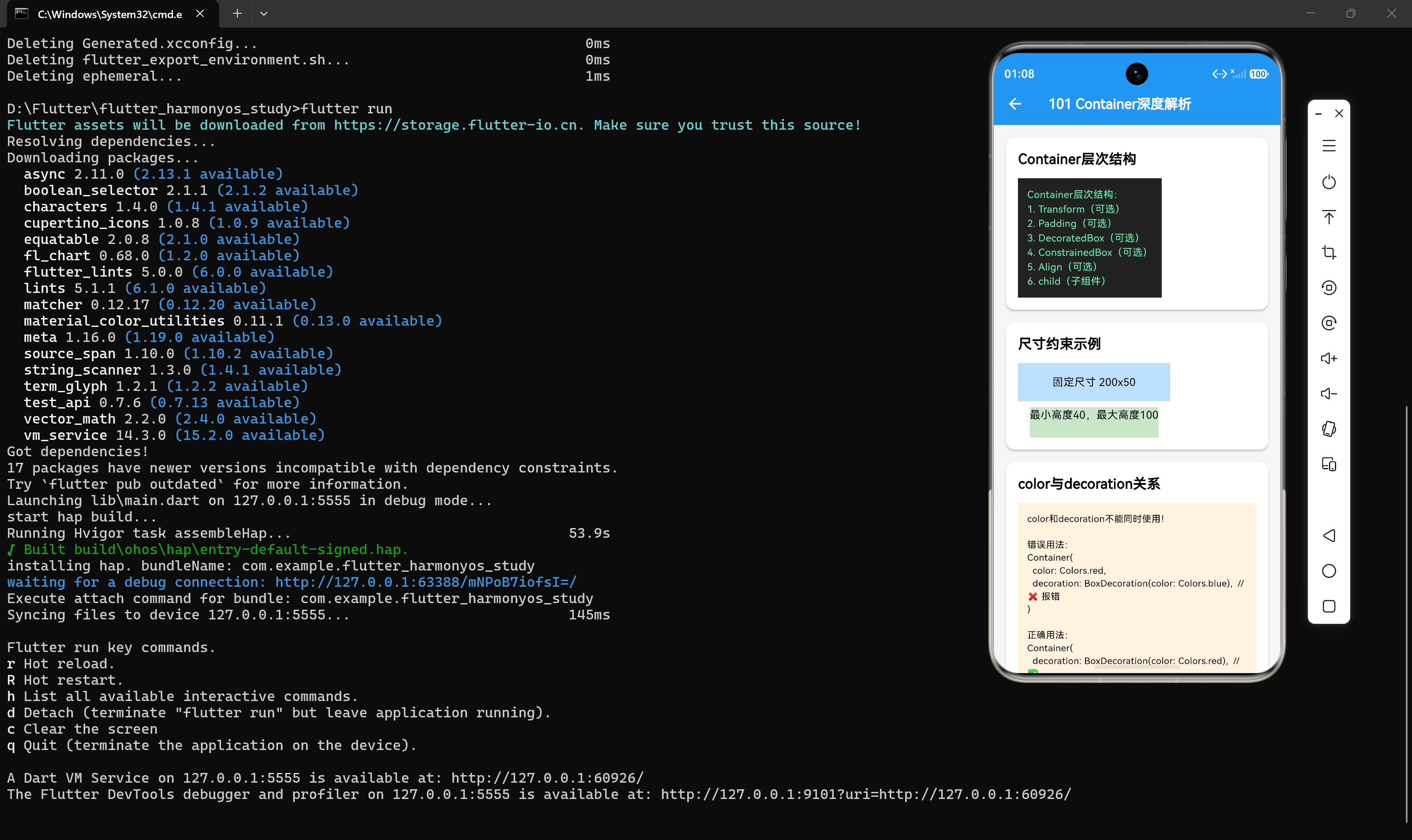
Container内部由多个组件按特定顺序组合而成,理解这个顺序对于正确使用Container至关重要:
1. Transform(变换层)
2. Margin(外边距层)
3. Clip(裁剪层)
4. Padding(内边距层)
5. DecoratedBox(装饰层)
6. ConstrainedBox(约束层)
7. Align(对齐层)
8. child(子组件)
这个顺序决定了各个属性的作用范围和优先级。
2.2 层次结构图示
┌─────────────────────────────────────┐
│         Transform(变换)            │
│  ┌─────────────────────────────┐    │
│  │        Margin(外边距)      │    │
│  │  ┌───────────────────────┐  │    │
│  │  │      Clip(裁剪)      │  │    │
│  │  │  ┌─────────────────┐  │  │    │
│  │  │  │   Padding(内边距)│  │  │    │
│  │  │  │  ┌─────────────┐  │  │  │    │
│  │  │  │  │DecoratedBox │  │  │  │    │
│  │  │  │  │ (装饰层)   │  │  │  │    │
│  │  │  │  │  ┌─────────┐ │  │  │  │    │
│  │  │  │  │  │Constrained│ │  │  │  │    │
│  │  │  │  │  │ Box(约束)│ │  │  │  │    │
│  │  │  │  │  │  ┌─────┐ │ │  │  │  │    │
│  │  │  │  │  │  │Align│ │ │  │  │  │    │
│  │  │  │  │  │  │(对齐)│ │ │  │  │  │    │
│  │  │  │  │  │  │  ┌───┘ │ │  │  │  │    │
│  │  │  │  │  │  │  │child│ │ │  │  │  │    │
│  │  │  │  │  │  │  └─────┘ │ │  │  │  │    │
│  │  │  │  │  │  └─────────┘ │  │  │  │    │
│  │  │  │  │  └───────────────┘  │  │  │    │
│  │  │  │  └─────────────────────┘  │  │    │
│  │  │  └───────────────────────────┘  │    │
│  │  └─────────────────────────────────┘    │
│  └─────────────────────────────────────────┘
└─────────────────────────────────────────────┘
2.3 各层作用详解
1. Transform层
Transform是最外层,负责应用几何变换。变换不会影响布局尺寸,但会改变组件的绘制位置。
Container(
  transform: Matrix4.rotationZ(0.1),
  width: 100,
  height: 100,
  color: Colors.blue,
)
2. Margin层
Margin位于Transform内部,控制容器与外部组件的间距。
Container(
  margin: EdgeInsets.symmetric(horizontal: 16, vertical: 8),
  child: Text('内容'),
)
3. Clip层
Clip层根据clipBehavior属性决定是否裁剪超出边界的内容。
Container(
  clipBehavior: Clip.antiAlias,
  decoration: BoxDecoration(borderRadius: BorderRadius.circular(8)),
  child: Image.network('https://example.com/image.jpg'),
)
4. Padding层
Padding控制内容与容器边界的内部间距。
Container(
  padding: EdgeInsets.all(16),
  child: Text('带内边距的内容'),
)
5. DecoratedBox层
DecoratedBox负责绘制背景装饰,包括颜色、边框、阴影、渐变和背景图片。
Container(
  decoration: BoxDecoration(
    color: Colors.white,
    borderRadius: BorderRadius.circular(12),
    boxShadow: [BoxShadow(blurRadius: 4)],
  ),
)
6. ConstrainedBox层
ConstrainedBox应用尺寸约束,限制容器的最大/最小尺寸。
Container(
  constraints: BoxConstraints(
    minHeight: 40,
    maxHeight: 100,
  ),
  child: Text('内容'),
)
7. Align层
Align层控制子组件在容器内的对齐方式。
Container(
  alignment: Alignment.centerRight,
  child: Text('右对齐内容'),
)
三、尺寸约束机制
3.1 尺寸确定规则
Container的尺寸确定遵循以下优先级:
- constraints属性:如果设置了constraints,优先应用约束
- width/height属性:如果设置了具体的宽度和高度,使用指定尺寸
- 子组件尺寸:如果没有设置尺寸且有子组件,自适应子组件尺寸
- 最小尺寸:如果没有子组件且没有设置尺寸,容器尽可能小
3.2 约束传递
Container会将约束传递给子组件,但子组件的实际尺寸还受其他因素影响:
// 父容器设置约束
Container(
  constraints: BoxConstraints(maxWidth: 300),
  child: Container(
    width: 400,  // 不会生效,受父约束限制
    child: Text('内容'),
  ),
)
3.3 常用约束场景
// 固定尺寸
Container(width: 200, height: 100)

// 最小尺寸
Container(constraints: BoxConstraints(minHeight: 50))

// 最大尺寸
Container(constraints: BoxConstraints(maxWidth: 300))

// 范围约束
Container(
  constraints: BoxConstraints(
    minWidth: 100,
    maxWidth: 300,
    minHeight: 50,
    maxHeight: 200,
  ),
)
四、color与decoration的关系
4.1 互斥问题
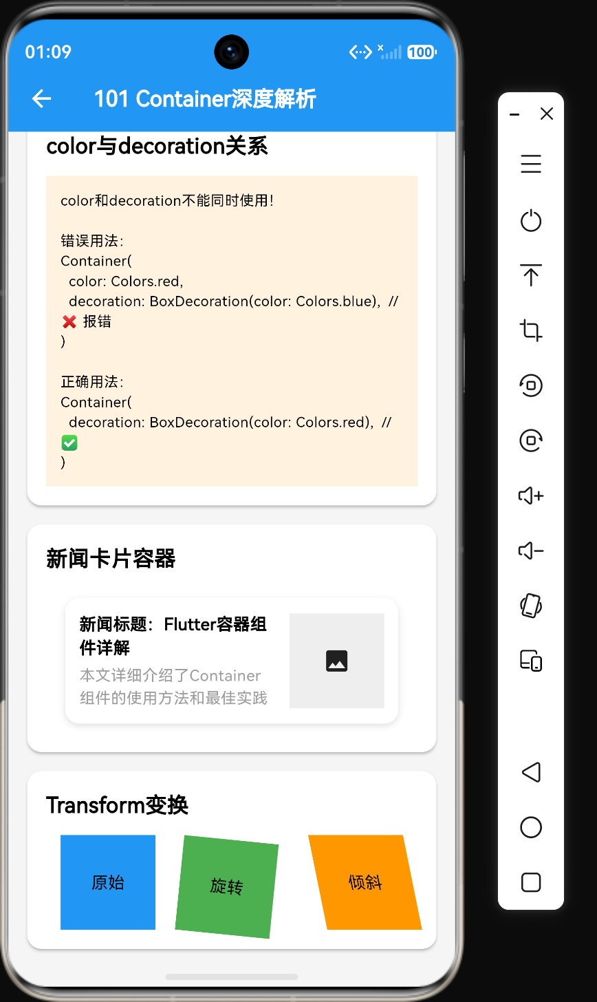
color和decoration不能同时使用,这是一个常见的错误:
// ❌ 错误:color和decoration互斥
Container(
  color: Colors.red,
  decoration: BoxDecoration(color: Colors.blue),
)
4.2 正确用法
当需要使用decoration时,应通过BoxDecoration.color设置颜色:
// ✅ 正确:通过decoration设置颜色
Container(
  decoration: BoxDecoration(color: Colors.red),
)

// ✅ 正确:简单颜色使用color属性
Container(
  color: Colors.red,
)

// ✅ 正确:复杂装饰使用decoration
Container(
  decoration: BoxDecoration(
    color: Colors.white,
    borderRadius: BorderRadius.circular(8),
    border: Border.all(color: Colors.grey),
  ),
)
4.3 foregroundDecoration
foregroundDecoration用于设置前景装饰,会覆盖在子组件之上:
Container(
  decoration: BoxDecoration(color: Colors.blue),
  foregroundDecoration: BoxDecoration(
    gradient: LinearGradient(
      colors: [Colors.transparent, Colors.black.withOpacity(0.3)],
    ),
  ),
  child: Text('内容'),
)
五、Transform变换详解
5.1 变换矩阵
Matrix4是Flutter中用于几何变换的核心类,支持多种变换操作:
// 旋转
Matrix4.rotationZ(0.1)  // 绕Z轴旋转0.1弧度
Matrix4.rotationX(0.1)  // 绕X轴旋转
Matrix4.rotationY(0.1)  // 绕Y轴旋转

// 平移
Matrix4.translationValues(10, 20, 0)  // X平移10,Y平移20

// 缩放
Matrix4.scale(1.5)  // 放大1.5倍
Matrix4.scale(0.8, 1.2)  // X缩小0.8倍,Y放大1.2倍

// 倾斜
Matrix4.skewX(0.2)  // X方向倾斜
Matrix4.skewY(0.2)  // Y方向倾斜

// 组合变换
Matrix4.identity()
  ..rotateZ(0.1)
  ..translate(10, 20)
  ..scale(1.5)
5.2 变换对齐方式
transformAlignment属性控制变换的原点:
Container(
  width: 100,
  height: 100,
  color: Colors.blue,
  transform: Matrix4.rotationZ(0.2),
  transformAlignment: Alignment.center,  // 围绕中心旋转
  child: Text('内容'),
)
5.3 变换效果展示
Row(
  mainAxisAlignment: MainAxisAlignment.spaceAround,
  children: [
    Container(
      width: 80,
      height: 80,
      color: Colors.blue,
      child: const Center(child: Text('原始')),
    ),
    Container(
      width: 80,
      height: 80,
      transform: Matrix4.rotationZ(0.1),
      color: Colors.green,
      child: const Center(child: Text('旋转')),
    ),
    Container(
      width: 80,
      height: 80,
      transform: Matrix4.skewX(0.2),
      color: Colors.orange,
      child: const Center(child: Text('倾斜')),
    ),
  ],
)
5.4 变换注意事项
- 变换不影响布局:Transform变换只改变绘制位置,不影响组件在布局中的尺寸和位置
- 性能影响:复杂的变换会增加绘制开销,应避免频繁变换
- 裁剪问题:变换后的内容可能超出容器边界,需要设置clipBehavior
六、新闻卡片实战案例
6.1 基础新闻卡片
Container(
  margin: EdgeInsets.symmetric(horizontal: 16, vertical: 8),
  padding: EdgeInsets.all(12),
  decoration: BoxDecoration(
    color: Colors.white,
    borderRadius: BorderRadius.circular(12),
    boxShadow: [
      BoxShadow(
        color: Colors.grey[300]!,
        blurRadius: 4,
        offset: Offset(0, 2),
      ),
    ],
  ),
  child: Row(
    children: [
      Expanded(
        child: Column(
          crossAxisAlignment: CrossAxisAlignment.start,
          children: [
            Text('新闻标题:Flutter容器组件详解', style: TextStyle(fontWeight: FontWeight.bold)),
            SizedBox(height: 4),
            Text('本文详细介绍了Container组件的使用方法和最佳实践', style: TextStyle(color: Colors.grey, fontSize: 13)),
          ],
        ),
      ),
      SizedBox(width: 12),
      Container(width: 80, height: 80, color: Colors.grey[200], child: Center(child: Icon(Icons.image))),
    ],
  ),
)
6.2 带图片的新闻卡片
Container(
  margin: EdgeInsets.symmetric(horizontal: 16, vertical: 8),
  decoration: BoxDecoration(
    color: Colors.white,
    borderRadius: BorderRadius.circular(12),
    boxShadow: [
      BoxShadow(
        color: Colors.grey[300]!,
        blurRadius: 4,
        offset: Offset(0, 2),
      ),
    ],
  ),
  child: Column(
    crossAxisAlignment: CrossAxisAlignment.start,
    children: [
      ClipRRect(
        borderRadius: BorderRadius.only(
          topLeft: Radius.circular(12),
          topRight: Radius.circular(12),
        ),
        child: Image.network(
          'https://picsum.photos/400/200',
          height: 150,
          width: double.infinity,
          fit: BoxFit.cover,
        ),
      ),
      Padding(
        padding: EdgeInsets.all(16),
        child: Column(
          crossAxisAlignment: CrossAxisAlignment.start,
          children: [
            Text('科技新闻:Flutter 3.0发布', style: TextStyle(fontSize: 18, fontWeight: FontWeight.bold)),
            SizedBox(height: 8),
            Text('Flutter 3.0带来了多项新功能和性能优化...'),
          ],
        ),
      ),
    ],
  ),
)
6.3 变换效果的新闻标签
Container(
  transform: Matrix4.rotationZ(-0.05),
  padding: EdgeInsets.symmetric(horizontal: 8, vertical: 4),
  decoration: BoxDecoration(
    color: Colors.red,
    borderRadius: BorderRadius.circular(4),
  ),
  child: Text('热门', style: TextStyle(color: Colors.white, fontSize: 12)),
)
七、Container嵌套优化
7.1 嵌套问题分析
在实际开发中,我们经常会看到多层嵌套的Container:
// ❌ 不良示例:多层嵌套
Container(
  margin: EdgeInsets.all(16),
  child: Container(
    padding: EdgeInsets.all(12),
    child: Container(
      color: Colors.blue,
      child: Text('内容'),
    ),
  ),
)
这种嵌套方式会增加Widget树的深度,影响性能。
7.2 优化方案
将多个Container的属性合并到一个Container中:
// ✅ 优化后:合并属性
Container(
  margin: EdgeInsets.all(16),
  padding: EdgeInsets.all(12),
  color: Colors.blue,
  child: Text('内容'),
)
7.3 复杂场景优化
对于复杂的布局,可以使用组合组件:
// ✅ 优化前:多层嵌套
Container(
  margin: EdgeInsets.all(16),
  child: Container(
    padding: EdgeInsets.all(12),
    decoration: BoxDecoration(
      color: Colors.white,
      borderRadius: BorderRadius.circular(8),
    ),
    child: Text('内容'),
  ),
)

// ✅ 优化后:合并属性
Container(
  margin: EdgeInsets.all(16),
  padding: EdgeInsets.all(12),
  decoration: BoxDecoration(
    color: Colors.white,
    borderRadius: BorderRadius.circular(8),
  ),
  child: Text('内容'),
)
八、Container与其他组件对比
8.1 Container vs SizedBox
| 组件 | 特点 | 适用场景 |
|---|---|---|
| Container | 综合布局组件,支持装饰 | 需要背景、边距、装饰的场景 |
| SizedBox | 纯粹的尺寸控制组件 | 仅需要控制尺寸或间距 |
// SizedBox:仅控制尺寸
SizedBox(width: 100, height: 50)

// Container:可设置尺寸和装饰
Container(
  width: 100,
  height: 50,
  color: Colors.blue,
)
8.2 Container vs DecoratedBox
| 组件 | 特点 | 适用场景 |
|---|---|---|
| Container | 综合布局组件 | 需要布局+装饰 |
| DecoratedBox | 仅装饰功能 | 仅需要装饰效果 |
// DecoratedBox:仅装饰
DecoratedBox(
  decoration: BoxDecoration(color: Colors.blue),
  child: Padding(padding: EdgeInsets.all(16), child: Text('内容')),
)

// Container:布局+装饰
Container(
  padding: EdgeInsets.all(16),
  color: Colors.blue,
  child: Text('内容'),
)
8.3 Container vs Card
| 组件 | 特点 | 适用场景 |
|---|---|---|
| Container | 完全自定义 | 需要精细控制布局和装饰 |
| Card | Material设计风格 | 标准卡片样式 |
// Card:Material设计风格
Card(
  elevation: 4,
  child: Padding(padding: EdgeInsets.all(16), child: Text('卡片内容')),
)

// Container:完全自定义
Container(
  decoration: BoxDecoration(
    color: Colors.white,
    borderRadius: BorderRadius.circular(12),
    boxShadow: [BoxShadow(blurRadius: 4)],
  ),
  child: Padding(padding: EdgeInsets.all(16), child: Text('容器内容')),
)
九、性能优化建议
9.1 减少嵌套层级
避免不必要的Container嵌套,合并属性。
9.2 使用const构造函数
对于不变的Container,使用const构造函数:
// ✅ 优化后
const Container(
  padding: EdgeInsets.all(16),
  child: Text('标题'),
)
9.3 避免过度使用Container
对于简单场景,使用更轻量的组件:
// ✅ 优化后:直接使用Text
Text('内容')

// ❌ 不良示例
Container(child: Text('内容'))
9.4 合理使用Transform
避免频繁变换,对于动画场景,考虑使用AnimatedContainer:
AnimatedContainer(
  duration: Duration(milliseconds: 300),
  transform: Matrix4.rotationZ(_angle),
  child: Text('动画内容'),
)
十、总结
通过本文的学习,我们掌握了Container组件的核心用法:
- 层次结构:理解Container内部的8层组件组合顺序
- 尺寸控制:通过width、height、constraints控制容器尺寸
- 边距管理:通过padding和margin控制内外边距
- 装饰效果:通过decoration添加背景、边框、圆角和阴影
- 变换操作:通过transform实现旋转、缩放、平移等效果
- 布局优化:减少嵌套层级,合并属性
- 性能优化:使用const构造函数,避免过度使用
Container是Flutter布局的基础组件,掌握好它的使用技巧对于构建高质量的UI至关重要。在实际开发中,应根据具体需求选择合适的组件,避免过度使用Container,以提高应用性能。
参考资料
- Flutter官方文档:https://api.flutter.dev/flutter/widgets/Container-class.html
- BoxDecoration文档:https://api.flutter.dev/flutter/painting/BoxDecoration-class.html
- Matrix4文档:https://api.flutter.dev/flutter/vector_math/Matrix4-class.html
更多推荐
 4
4 0
0- 0


 已为社区贡献2条内容

所有评论(0)