
HarmonyOS应用开发实战:猫猫大作战-`Row` 容器的横排套路、`justifyContent` 水平排列、`alignItems` 垂直对齐
前言
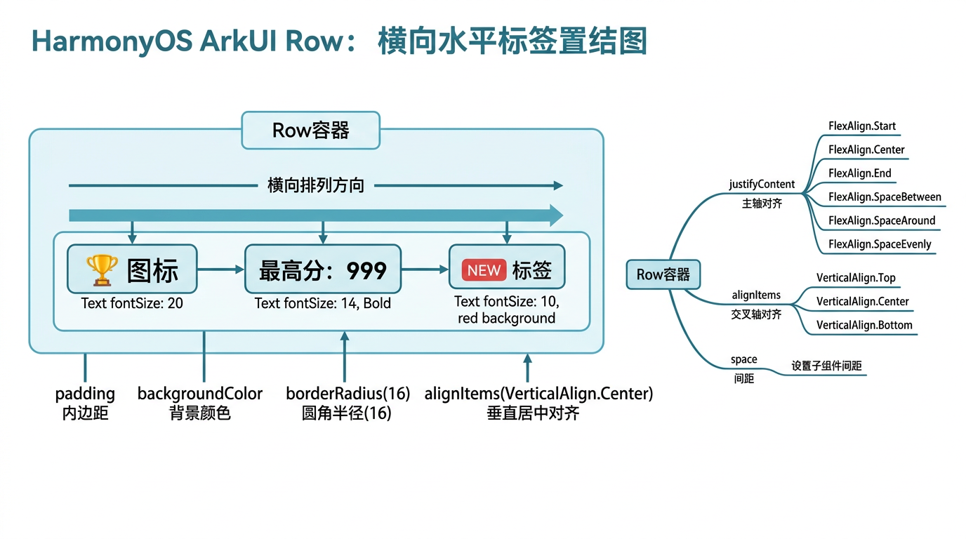
游戏主菜单除了标题和按钮,常有一个「最高分徽章」——把🏆图标、分数数字、NEW 标三个元素横排成一个小徽章,挂在标题上方或右上角。这种「图标 + 文字 + 标签」的横排组合是 Row 容器最经典的场景。
本篇以「猫猫大作战」主菜单的最高分徽章为锚点,把 Row 容器的横排套路、justifyContent 水平排列、alignItems 垂直对齐、margin 子间距讲透。读完本篇你将能独立写出:三段横排徽章、两端贴边横排、图标按钮组三种横排布局。
提示:本系列不讲 ArkTS 基础语法与环境搭建,假设你已跟完第 1–7 篇。
一、场景拆解:最高分徽章规格
打开 entry/src/main/ets/pages/Index.ets 的 MainMenuView,最高分徽章横排三段:
// 来源:entry/src/main/ets/pages/Index.ets  MainMenuView() 改造片段
Row() {
  Text('🏆').fontSize(20)

  Text(`最高分: ${this.highScore}`)
    .fontSize(14)
    .fontColor('#2C3E50')
    .fontWeight(FontWeight.Bold)
    .margin({ left: 6 })

  if (this.isNewHigh) {
    Text('NEW')
      .fontSize(10)
      .fontColor('#FFFFFF')
      .backgroundColor('#E74C3C')
      .borderRadius(4)
      .padding({ left: 4, right: 4, top: 2, bottom: 2 })
      .margin({ left: 6 })
  }
}
.padding({ left: 12, right: 12, top: 6, bottom: 6 })
.backgroundColor('rgba(255,255,255,0.7)')
.borderRadius(16)
.alignItems(VerticalAlign.Center)
.margin({ bottom: 16 })
徽章规格拆解:
| 维度 | 取值 | 作用 |
|---|---|---|
| 容器 | Row |
三段横排 |
| 子间距 | margin.left: 6 |
图标/文字/NEW 标之间 6vp |
| 内边距 | padding 12/6 |
内容与徽章边呼吸空间 |
| 底色 | rgba(255,255,255,0.7) |
半透明白,浮在渐变蓝上 |
| 圆角 | 16 |
胶囊形徽章 |
| 垂对齐 | VerticalAlign.Center |
三段顶部对齐(文字基线居中) |
关键经验:徽章圆角 16(比卡片 12 大,比按钮 28 小)——胶囊感但不全圆,是「徽章」专属甜区。
二、Row 容器核心属性速览
Row 是水平线性容器,子元素自左而右排列。
2.1 本篇用到的属性
| 属性 | 类型 | 作用 | 本篇取值 |
|---|---|---|---|
space |
number | 子元素统一间距 | 未用(用 margin 单独控) |
width |
string | number | 容器宽度 | 不设(内容撑开) |
height |
string | number | 容器高度 | 不设(内容撑开) |
padding |
Padding | number | 内边距 | { left: 12, right: 12, top: 6, bottom: 6 } |
backgroundColor |
string | Color | 背景色 | rgba(255,255,255,0.7) |
borderRadius |
number | 圆角 | 16 |
alignItems |
VerticalAlign 枚举 | 子元素垂直对齐 | Center |
justifyContent |
FlexAlign 枚举 | 子元素水平排列 | 未用(自然排) |
2.2 Row vs Column 主轴
| 容器 | 主轴 | justifyContent 控 |
alignItems 控 |
|---|---|---|---|
Row |
水平 ↔ | 水平排列 | 垂直对齐 |
Column |
垂直 ↓ | 垂直排列 | 水平对齐 |
记忆:Row 的 alignItems 用 VerticalAlign,Column 的 alignItems 用 HorizontalAlign——别搞反。
三、alignItems 垂直对齐三值
VerticalAlign.Top      // 顶对齐
VerticalAlign.Center   // 居中
VerticalAlign.Bottom   // 底对齐
3.1 徽章用 Center(三段顶部对齐)
Row() {
  Text('🏆').fontSize(20)
  Text(`最高分: ${this.highScore}`).fontSize(14).margin({ left: 6 })
}
.alignItems(VerticalAlign.Center)
Center 让🏆(20 字号)和文字(14 字号)垂直居中对齐——视觉基线居中,最自然。
3.2 三值视觉对比
假设 Row 高 40,🏆 20 字号,文字 14 字号:
| 模式 | 🏆 | 文字 | 说明 |
|---|---|---|---|
Top |
顶贴 0 | 顶贴 0 | 都顶对齐,但字号不同底部错乱 |
Center |
居中 | 居中 | 基线居中,最自然 |
Bottom |
底贴 40 | 底贴 40 | 都底对齐,顶部错乱 |
实战经验:横排混合字号内容(图标 + 文字),默认用 Center。Top/Bottom 只在三段同字号时用。
四、margin 子间距的两种控法
4.1 单独 margin(本项目写法)
Row() {
  Text('🏆').fontSize(20)
  Text(`最高分: ${this.highScore}`).fontSize(14).margin({ left: 6 })
  Text('NEW').fontSize(10).margin({ left: 6 })
}
每个子元素 margin.left: 6 单独控间距。
优点:可以不均匀——NEW 标离文字近(6),离屏边远(无 margin)。
4.2 Row space 统一间距
Row({ space: 6 }) {
  Text('🏆').fontSize(20)
  Text(`最高分: ${this.highScore}`).fontSize(14)
  Text('NEW').fontSize(10)
}
优点:简洁,所有子元素均 6vp。
缺点:必须均匀,无法让 NEW 离文字更近。
4.3 取舍
| 场景 | 推荐 |
|---|---|
| 三段间距均匀 | space: 6 |
| 间距不均匀 | margin.left 单独控 |
| 首尾不空中间空 | space + 首尾 margin.left: 0 |
五、justifyContent 水平排列实战
5.1 自然排(默认 Start)
Row() {
  Text('🏆').fontSize(20)
  Text(`最高分: ${this.highScore}`).fontSize(14).margin({ left: 6 })
}
// justifyContent 不写,默认 Start,左贴边
徽章用自然排——三段从左贴边依次排。
5.2 两端贴边(SpaceBetween)
HUD 底栏三段(得分/预告/控制)用 SpaceBetween:
Row() {
  Text(`得分: ${this.score}`).fontSize(16)
  Column() { /* 预告区 */ }
  Row() { /* 控制按钮组 */ }
}
.width('100%')
.justifyContent(FlexAlign.SpaceBetween)
.alignItems(VerticalAlign.Center)
SpaceBetween 让首尾贴边、中间均分——经典 HUD 三栏。
5.3 居中(Center)
加载页加载图标 + 文字居中:
Row() {
  LoadingProgress().width(24).color('#2ECC71')
  Text('加载中...').fontSize(14).fontColor('#95A5A6').margin({ left: 8 })
}
.width('100%')
.justifyContent(FlexAlign.Center)
.alignItems(VerticalAlign.Center)
5.4 六值视觉示意
Row 宽 100,3 个子元素各宽 10:
| 模式 | 左 | 中 | 右 | 说明 |
|---|---|---|---|---|
Start |
10 | 10 | 10 | 首贴左,依次排 |
Center |
35 | 10 | 35 | 居中,左右空对称 |
End |
70 | 10 | 10 | 尾贴右,依次排 |
SpaceBetween |
0 | 35 | 0 | 首尾贴边,中间 35 |
SpaceAround |
17.5 | 17.5 | 17.5 | 每元素左右空对称 |
SpaceEvenly |
17.5 | 17.5 | 17.5 | 含首尾,全均分 |
六、完整代码:三种横排徽章对比
6.1 最高分徽章(本项目)
Row() {
  Text('🏆').fontSize(20)
  Text(`最高分: ${this.highScore}`)
    .fontSize(14).fontColor('#2C3E50').fontWeight(FontWeight.Bold)
    .margin({ left: 6 })
  if (this.isNewHigh) {
    Text('NEW')
      .fontSize(10).fontColor('#FFFFFF').backgroundColor('#E74C3C')
      .borderRadius(4).padding({ left: 4, right: 4, top: 2, bottom: 2 })
      .margin({ left: 6 })
  }
}
.padding({ left: 12, right: 12, top: 6, bottom: 6 })
.backgroundColor('rgba(255,255,255,0.7)')
.borderRadius(16)
.alignItems(VerticalAlign.Center)
.margin({ bottom: 16 })
6.2 HUD 底栏三栏(SpaceBetween)
Row() {
  Text(`得分: ${this.score}`).fontSize(16).fontColor('#2C3E50')
  Column() {
    Text('下一个').fontSize(12).fontColor('#95A5A6')
    Text(this.nextCatEmoji).fontSize(24)
  }.alignItems(HorizontalAlign.Center)
  Row() {
    Button('暂停').width(80).height(40).backgroundColor('#95A5A6')
    Button('重开').width(80).height(40).backgroundColor('#E74C3C').margin({ left: 8 })
  }
}
.width('100%').padding({ left: 16, right: 16 })
.justifyContent(FlexAlign.SpaceBetween)
.alignItems(VerticalAlign.Center)
6.3 图标按钮组(space 统一)
Row({ space: 8 }) {
  Button('暂停') { SymbolGlyph($r('sys.symbol.pause')).fontSize(16).fontColor(Color.White) }
    .width(40).height(40).backgroundColor('#95A5A6').borderRadius(20)
  Button('重开') { SymbolGlyph($r('sys.arrow.clockwise')).fontSize(16).fontColor(Color.White) }
    .width(40).height(40).backgroundColor('#E74C3C').borderRadius(20)
  Button('设置') { SymbolGlyph($r('sys.gear')).fontSize(16).fontColor(Color.White) }
    .width(40).height(40).backgroundColor('#2C3E50').borderRadius(20)
}
.alignItems(VerticalAlign.Center)
三个圆形图标按钮均 8vp 间距,space 最简洁。
七、调试技巧:横排怎么量
- 加临时 border:给
Row和子元素都加.border({ width: 1, color: Color.Red }),看清边界。 justifyContent验 width:水平排列不生效,Row是否设了width?没设宽度内容撑开无空可排。alignItems验字号:垂直居中错乱,多半是子元素字号差异大——Center解,或统一字号。- 真机看徽章:预览器渲染接近真机,但 Emoji 字形可能差异,以真机为准。
八、性能与最佳实践
Row比Flex高效:不需要 flexGrow/shrink 时用Row,单 pass 布局性能优。space比多个margin高效:均匀间距用space,容器一次算。alignItems默认Center:Row 默认就是垂直居中,不写也居中,但明确写出更可读。borderRadius别超过高度一半:徽章高度 = padding.top+bottom + 内容高 ≈ 28,圆角 16 没问题;超过 14 视觉像气泡。
总结
本篇我们从最高分徽章切入,掌握 Row 容器的横排套路、justifyContent 水平排列、alignItems 垂直对齐、space/margin 间距控制四大要点,并给出了徽章、HUD 三栏、图标按钮组三种横排布局的完整代码。核心要点:横排用 Row,垂直对齐 Center,均匀间距 space,不均匀 margin。
下一篇我们将继续主菜单,拆解 Stack 叠层容器的状态页面叠层用法。
如果这篇文章对你有帮助,欢迎点赞👍、收藏⭐、关注🔔,你的支持是我持续创作的动力!
相关资源:
- 「猫猫大作战」项目源码:本仓库
entry/src/main/ets/pages/Index.ets - 线性布局 (Row/Column) 官方指南
- Row API 参考
- FlexAlign 枚举
- 开源鸿蒙跨平台社区
- HarmonyOS 开发者官方文档首页
- 系列索引:本仓库
articles/INDEX.md
更多推荐
 2
2 0
0- 0


 已为社区贡献2条内容

所有评论(0)